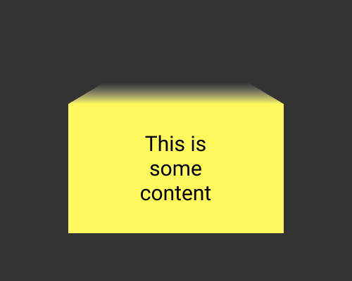
Add a fading gradient to a shape above a container so that it looks like the container is a 3D shape fading into the distance.
Use this if you want to add depth to your design. It’s got a “retro future” effect, so it might help or hurt your brand. The example below is a rectangle, and this easiest, but you could use the same effect for other shapes.
This will make layout more difficult. Do you align other elements to the top of the container, or the top of the fading gradient? You’ll need to experiment.
