Use a dark grey instead of black throughout your interface.
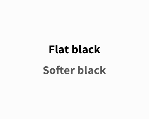
Flat blacks - with a brightness value of 0 - tend to have an uncomfortable amount of contrast with other colours. Lower contrast values, like you'd get between light grey and dark grey, can be easier on the eyes than pure white and pure black.
Most users won't realise that the dark grey is not a black, but the interface will look better.
You don't need to soften the black a lot to get the right effect.