Use a lighter colour for elements that are otherwise more visually heavier.
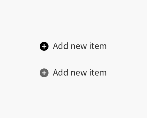
If you have an element that is made up of more surface area, and is therefore more visually heavy, you can change the colour so that it is lighter than other elements that are not as heavy. In the example below the Plus icon is visually heavy compared to the text, so when the two are the same colour - as in the upper example - the icon feels too heavy.
By making the plus icon a lighter grey, it feels less heavy next to the text, and they feel like they're similar weights even though the colours are different.
You'll need to tweak colours and see what "feels" right in cases like these, because the relative weights of icons and text depend on how much surface area they take up. It's not easy to plan the right colour choices ahead of time.