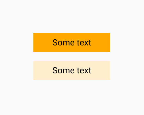
Use a tint or shade of the colour you want so that it has low contrast with its background.
If you use colour to signify meaning in a busy interface, lots of saturated colours can distract the viewer. A low contrast colour means you can still use colour for meaning, but it will not distract their attention as much. It also makes any overlaid text easier to read.
Since these colours are faint, check them for colour vision issues like colour blindness. Also as you can see in the example below, lower contrast colours give you a softer edge. Watch out that the edge isn’t too hard to notice.