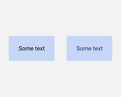
When placing text on a coloured background, colour the text as well. Either a light tint for dark backgrounds, or a dark shade for light backgrounds.
Pure black text against a coloured background can look out of place. If you add some colour to the text, it’ll feel like it fits in more, and suit your branding more on top. Using shades and tints of the same colour keeps the interface as monotone, and means that it stays simple.
If there’s no enough contrast between the foreground and background colours, you’ll run into accessibility/contrast issues. This technique works best if the dark colour is almost-black, and the light colour is almost-white.