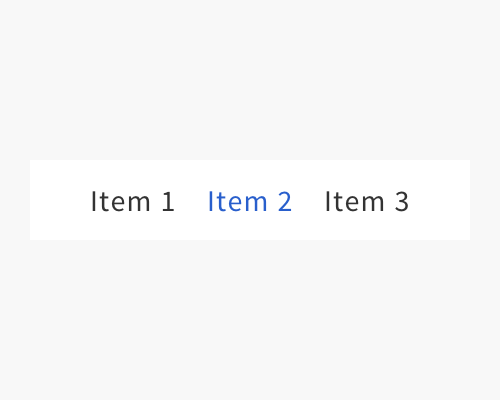
Change the colour of the selected item in a menu or list.
If you want to add more colour to an interface, like your brand colours, you can try using them to show that a menu item is selected. This is quite a subtle way of doing it, because you're not adding other lines or elements to show that a menu item is highlighted.
Only using colour to highlight a menu item, especially if it's a subtle colour, might not work very well for long menus. The change might not be obvious enough for someone scanning through a long list to see which one is currently selected.
If your user has a form of colour blindness, using only colour can be risky - they might not be able to tell the difference between the colour and the regular menu items.
If you have very few menu items, your user might have a hard time knowing that the colour is signifying that the menu item is selected. This technique is easier to understand if there are enough "default" menu items for the user to notice that the selected one looks different.