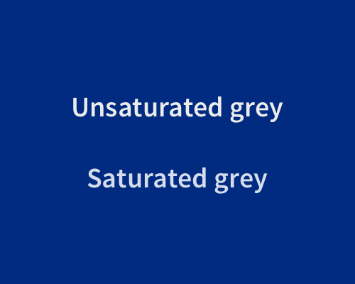
Add a small amount of colour saturation to grey text.
Flat grey text can look too flat against strong colours. Adding a small amount of brand colour saturation to grey text can make it look more at home with other brand colours in the interface.
You don't need to add a lot of colour saturation. In the second example below the grey has had 10% colour saturation added to it, using the same colour as the background.
