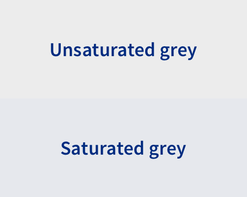
Add a small amount of colour saturation to a grey background.
If you have flat grey backgrounds, you can make "feel" nicer by adding a small amount of colour saturation. Try, for example, adding 5% saturation of blue to a flat grey. People won't often notice that the grey is not a flat grey, but it will work better with other colourful elements on your site.
It's easy to think that you need to increase saturation of a colour until it's obvious that it's a colour and not a greyscale shade, but that's not true. The second example below has just 3% colour saturation and you can see the difference compared to the unsaturated grey above it.
