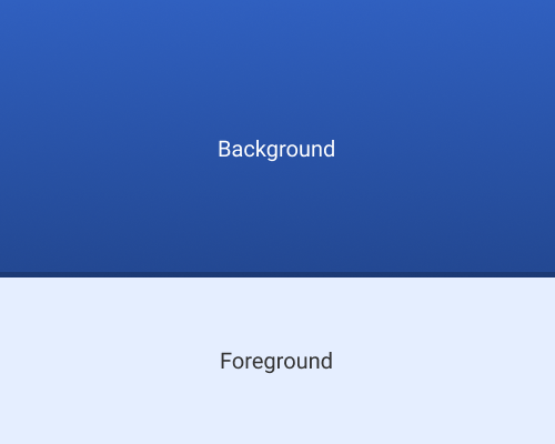
Add a thick border around, or background shape behind, an element, and make it semi-transparent.
If you have an element that you want to highlight, a semi-transparent border or shape behind the element can provide it with more edge contrast against a background, but without being very distracting, like a solid colour border might be. You can also do this using a stroke along the edge of an element, like a slide-up card in a mobile design, as in the second example below.
This is especially useful if your foreground element does not contrast very well with the background, but you don't want to dim the whole background like you might see with a lightbox effect. You might not want to dim the background if the background has content that the user will want to read at the same time they're interacting with the foreground element, like in the case of slide-up designs.
Both of the examples below use black as the border colour, but it works with white too. This can be a subtle way of showing that an element is interactive, since it's similar to the surround on a physical button.
If your background is likely to be dark, your semi-transparent border will need to be less transparent than if your background is a lighter colour.

