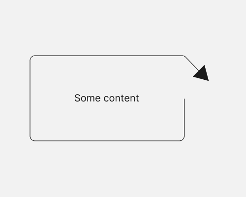
Change the border around a container so that it provides some practical visual value.
This can help to visually link different elements, but keep the design compact because you make use of existing elements, as opposed to—for example—drawing an arrow between a regular container and some other element.
In the example below I’ve (poorly) edited a border so that it turns into an arrow to point at some other content on a page. But there are many options you could explore when it comes to changing the standard border around a container.
This will usually lead to a container with an uneven border, which can make layout harder.
