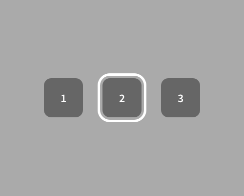
Add a thick border around the element that's in focus, but with a gap between the element and its border.
This is a visually heavy technique, so use it if you think that other focus states won't stand out. The gap between the element and the border means that the border won't interfere with the element as much, and also makes the focus area larger, so it will be more noticeable.
A focus state like this needs to be quite bold to be noticed, so make sure you have the space to include it. Also make sure that your interface style supports a thick border like this. It ends up looking quite "chunky", and a lot of interfaces use thinner lines and less noticeable focus states.
