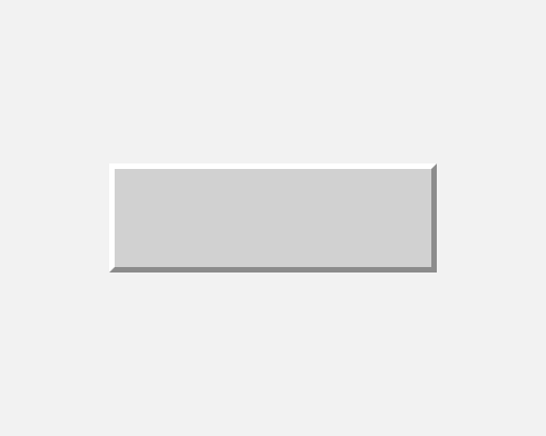
Add very bright strokes to the top-left edges of a button, and very dark strokes to the bottom-right edges. If possible, have the borders meet at the corners with a 45 degree join.
If you want to recreate the button effects from operating systems like Windows 95, you'll need to use quite extreme colours for the light and dark portions of the button. This will make it very clear to people that this is a clickable button.
This will make your interface look dated, but you might be trying to do that.
