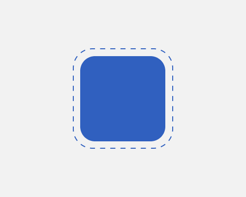
Add a border to an element but make it a dotted line.
This helps to call attention to an element and is visually lighter than a solid border. In the example below I've put some space between the element and the border because this is more noticeable. There's no reason you shouldn't use a dotted border directly on the element, though.
Dotted lines remind some people of "cut here" guides from the world of paper, so this technique might give the impression that something is temporary/could disappear.
