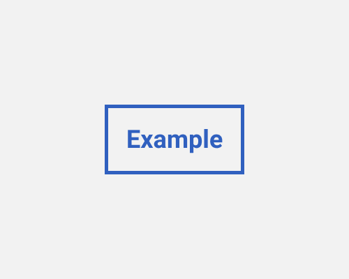
Put a border around a button, and make the body of the button transparent.
Ghost buttons, which are made using just the border of the button and whatever text the button contains, are less visually heavy, so if you want the button to blend in, or if the button is not the primary action, you might want to de-emphasise it in this way.
Ghost buttons can be confusing in terms of people knowing that they're buttons. They don't have signifiers like depth and a solid background to help. One way to help avoid this is to put rounded corners on the border, since rounded corners is a style commonly used for buttons.
If the background behind the ghost button is visually busy, you might need to make the border and text of the button very obvious. Otherwise, they could be lost against the background.
