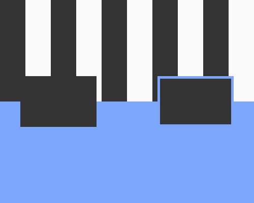
Add a heavy border around an element to act as a background for that element.
If you have an element sitting on a background that's visually busy, or that you can't control such as user-uploaded content, it can be hard to make sure that the element contrasts well with the background. Adding a thick border acts as a background for that element only, and will help the element stand out. In the example below, the dark rectangle on the right has had a border added in the same colour as the background in the lower half, to give it the effect of extending that background.
If the border is too thin, it might not help visually separate the element from the busy background. In the example below I used a thickness of 5 pixels.
If the border is the same colour as some of the visually busy background - if I had used a black or white border for the dark rectangle in the example below - it might appear to be more a part of that background than you'd like. You'll need to choose the right colour to contrast with all likely background colours.
