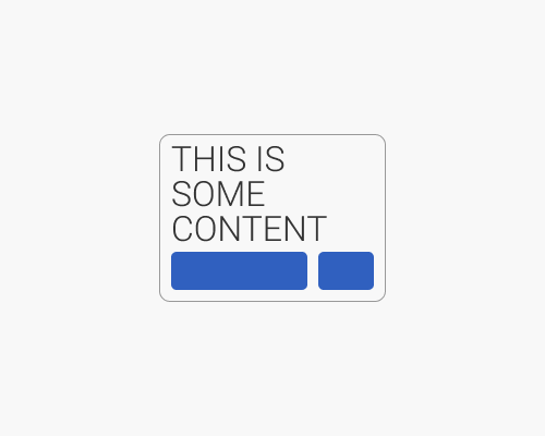
Put a border around an area of content to show its edges.
It's always nice when content creates a "shape" of its own, thanks to gestalt principles. But sometimes our content is not symmetrical, or we can't be sure of what shape it'll take because it is generated.
Putting a border around the area where content appears helps to make sure the viewer knows how the layout works, visually, even if the content isn't filling in all of the gaps. In the example below the content is all left-aligned, and if there was no border the user might think the layout looks off.
Too much of this can feel visually heavy or noisy, so if you do need to use borders in this way, it's best to make them subtle.
