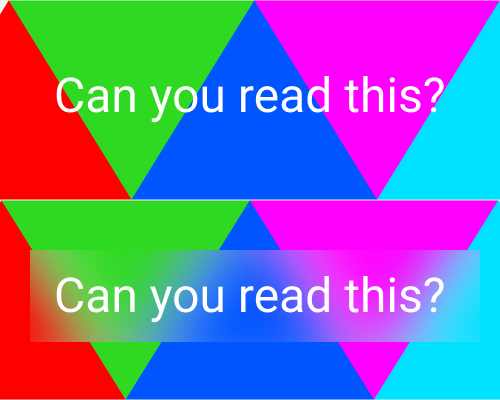
Put a shape behind some text, but in front of the background, and apply a blur to the shape.
If you have visually bright or noisy imagery behind some text, or changing imagery and you can't be sure whether the text will always be readable, you can blur just the area behind the text to make sure it has higher contrast against the background.
Use this technique if you don't want to hide or blur the whole image behind the text. For example, you might have very nice photography in a hero area on your website, and you might not want to hide it completely.
Even with this blurred background for the text, if the background image is too distracting it might make the text hard to read.
If all the blur effect does is soften areas of contrast in the background, you might still find that the bright colours are not working well with the text, even with the blur applied.
