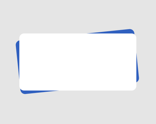
Repeat a shape to use as the shape’s background, but tilt the background shape compared to the foreground shape.
This adds visual interest to the page, and a certain amount of quirkiness, which makes the design feel more approachable. It also adds depth and highlights the foreground element.
Note that you can use more than one background shape, e.g. if you want a “stack of paper” effect.
You might need to make the tilted shape a slightly different size than the foreground shape, either width or height. I needed to make the background shape wider in the example below in order to have the shape poke out from behind the foreground shape on all sides.
This might interfere with how neat your alignment looks across the page, so be aware of that.
