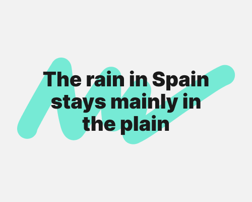
Draw a squiggle behind an element.
A squiggle can be more expressive than a blob or a rectangle. It also gives you more control over how the element fits in the layout. If you need the element to feel like it’s heavier on the left, the squiggle can help with that.
A squiggle catches the eye because it’s visually energetic. This might distract the viewer from the element that’s in the foreground.
