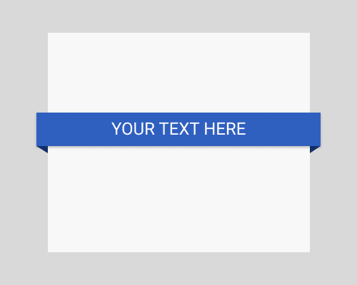
Put a rectangle or curved strip of background colour behind some text, give it a drop shadow, extend it past the left and right of the page or container, and add shapes that make it look like it extends backwards away from the user, and behind the page or container. These added shapes should be a darker shade of the same colour used for the ribbon.
This is quite a classic technique, which means you don't see it very often any more. This is a way to make text stand out, add some visual flair, and give your page a lot of realistic looking depth. Ribbons also have cultural meanings, like success, and quality.
Don't forget the drop-shadow, unless you want the ribbon to look like it's sitting on the page.
If the angle of the shapes added to the bottom of the ribbon where it extends past the container create an angle that's too steep, the ribbon might look strange. Aim for 45 degrees, and tweak if it doesn't look right.