Use a subtly different background colour, like light grey instead of white, as a background for a secondary area inside a container.
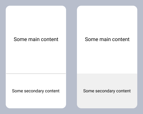
If an area inside a container, like a card, modal, or drop-down menu, is going to contain secondary content, then instead of separating the two areas using a line - like in the left-hand example below - you can use a different background colour. This lets the user know that the content is separated, but also gives them some idea of how important they are compared to each other.
In the right-hand example below, the primary area is white, and the secondary area is light grey. The secondary area should use a slightly more dull colour, so that it lets the user know which area is more important through brightness. Using a brighter colour as a background for a less important area will be confusing.