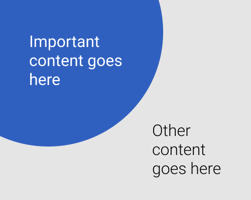
Create a circle shape and have it spilling beyond the outside edge or corner of the interface. Put an element in front of it.
This lets you highlight interface elements compared to other things on the screen. It also gives you a big chance to use branding colours as a background without needing to take up the full width of the screen. It's also more visually interesting, and especially if you use a circle, it feels softer more natural.
Of course, you're not limited to circles - use other shapes if you like.
Your element has to be quite close to the edge to use this as a background technique, or you'll need a gigantic circle. It's not suitable for websites that have centred elements and can be any width, for that reason.
This will be a very visually heavy element, so you'll need to make sure the rest of the interface isn't drowned out by it.
