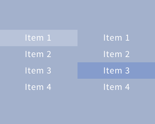
Use a darker or lighter version of the background colour in a menu to highlight the currently selected item.
This is quite a subtle way of highlighting menu items, because it fits into the interface quite well - it's only a lightening or darkening of the menu background colour, so it doesn't add too much visual weight.
Make sure there's enough contrast between the highlight, the background, and the content. If there isn't, the user might not immediately notice which menu item is highlighted.
