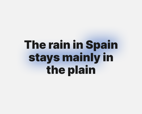
Put blurred shapes behind text.
A blurred background highlight like this promotes specific text but avoids hard edges if that doesn’t suit your brand.
This can hurt the contrast of the text, and make it harder to read. You can see this happen a little in the example below.
