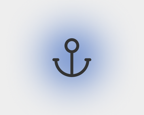
Put a shape behind an element, colour it, and very heavily blur it.
This is a way to add colour to a design without affecting the layout too much. This can help with branding, as well as contrast - the colour you choose for the shape might be a better background colour for the element than the page colour.
In a world of mostly-flat design, heavily blurred elements like this can look a bit odd and "wispy", so make sure it fits your brand/style before you use it. Unless you blur the shape a lot, you run the risk of it being visually heavy enough that it does start to affect your layout.
