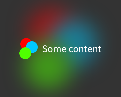
Take an element that you're already using in the foreground, or is related to the content in some way, and put it in the background. Blur it heavily, and lower the opacity.
This is an interesting way of providing a background that matches your foreground content. I've seen it used with album art - it's not possible to see the image, but it adds a different feel to each song you're playing in an app. This technique adds variety based on your content, but doesn't distract too much from the foreground content.
In the example below I blurred the background element very heavily, then overlayed it with a 50% opacity black layer. You'll need to get quite extreme with the blurring and overlay to make sure the background doesn't interfere with the foreground.
You can do this with a light colour scheme, but it ends up feeling more like frosted glass, and gives a different impression than with a dark colour scheme.
