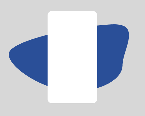
Place a blob of colour or texture behind an element you want to highlight. To add a 3D effect, have the element finish behind the bottom edge of the blob.
This is useful if you want to add some colour to a design, and highlight something specific like an app screenshot, because it takes up the same "space" as the screenshot, and looks more interesting than highlighting the entire section of the page. It also lets you highlight something that's otherwise sitting alone in white space. The block of colour can be something other than solid - this is a good way to show off an illustration style by adding texture or lines, for example.
The second example below provides a 3D effect by making it look like the element is inside the "hole" created by the blob of colour.
The colour or imagery you choose should not be too distracting that the element you're trying to highlight gets lost. Darker colours are better.
If you're trying the 3D effect, using a gradient from light at the top to dark at the bottom gives the imperssion that the bottom of the blob is further away.

