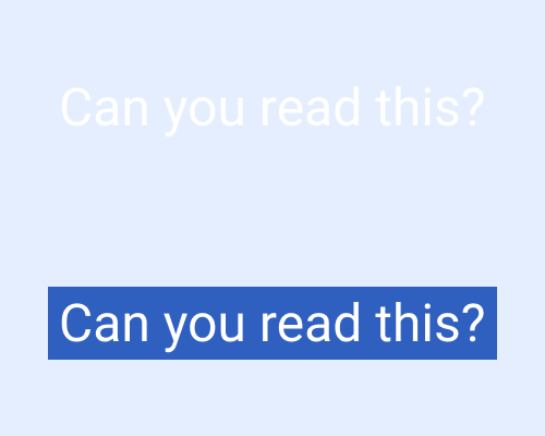
Put block of colour behind text, slightly larger than the text itself.
If you've got a background image that's visually busy or distracting, any text that sits on top of it can be hard to read. Adding a background just behind the text means it'll be easier to read. It also means that the background won't be darkened or blurred, which is ideal if the imagery is a big focus.
If you're using dynamic imagery, such as photos that change every time the page is reloaded, any background you add behind the text will cover up part of the photo. It's worth checking the results against as many photos as you can and on different screen sizes to make sure the important parts of the photos aren't being covered up.
