Insights:
I’m a product designer that has experience working at consumer and immature design organizations that rely heavily on execution and shipping products.
I think visual design is pivotal to a great experience—not just aesthetics, but accessibility and quality.
The ability to iterate until you find the answers. A lot of start ups don’t have time for personas, workshops, etc. (or even have a budget for research), so it’s imperative to use good intuition and craft to solve a problem.
Ironically, a principle product designer at LinkedIn mentioned the same thing when I interviewed for a role on the internal tools team.
Ian Spalter (Head of Instagram Japan) says the first two things he looks for in a candidate is product thinking and a high level of craft.
It was along the lines of, “theres a lot of ambiguity on the internal tools team (managing so many stakeholders), so sometimes you have to iterate until you find the answer”.
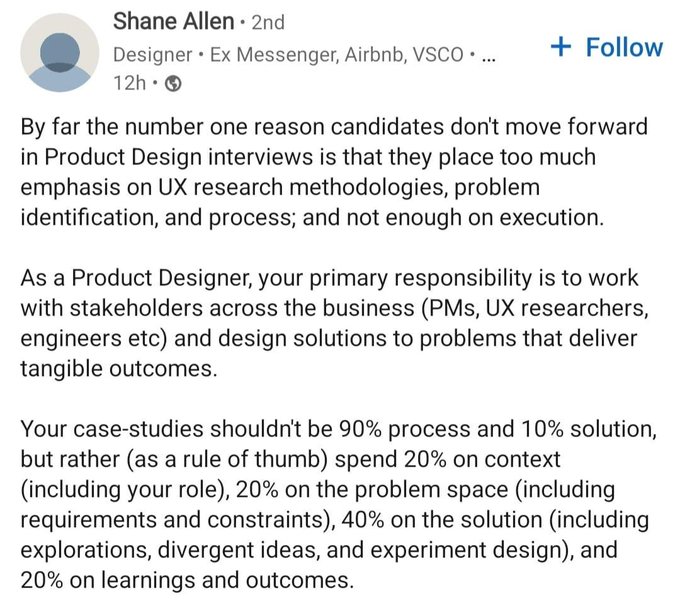
Here’s a relevant post on LinkedIn. When this person talks about execution, he means visual design/iterating.
I do, but I don’t think it’s just related to the industry—a lot of casual users will notice when the UI on an app isn’t great. There’s even a lot of people criticizing Mastodon because it doesn’t have the design of Twitter.
I’ve seen a lot of interviews with product design hiring managers really caring about giving their users an A+ experience and the conversation usually ends with craftsmanship to make that happen.
Honestly I have yet to be in an organization that values process. It’s pretty much the wild wild west for most tech companies.
I’ve been working in product design since 2019, so I still have a long ways to go.
I’ve been thinking about this, but my team doesn’t necessarily have an official design process. The team (and Disney+) is nascent, so there’s a bunch of kinks that need to get ironed out.
Here’s my personal process: Every problem has an eventual answer, or at least a possible one. Once you’ve identified and agreed on the problem, then your research should inform the constraints and the details of that possible answer. What you’re looking for is to conceptualize a “box” to put that answer in. This basically becomes the last step of the design or flow. When that user has completed that task, or is satisfied with the result, that is your box.
As for how visual design has a place in it: you execute and iterate until you find the right answer.
It’s definitely a high bar with an immature team.
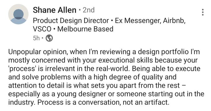
Read this LinkedIn post about how things have changed in the design industry.
Disney+ has design review sessions for every team and I’m always seeing senior and principle product designers bring some serious heat (aspirational concepts too) to those sessions. They set the tone on how we get work done at Disney.
Hulu sessions (that I’m a part of) are motivational as well.
All of it, but here are some of the main things that are hard to learn:
Layout can get tricky. It’s something that a lot of people can’t necessarily teach well or provide detailed instructions on how to improve in this area. It’s basically the sum of its parts.
Understanding typography: It’s easy to make something look like an incoherent mess when you don’t know what you’re doing with typefaces.
Having good aesthetics: I recently came across a slack channel discussion with design leaders having a discussion about most designers lacking aesthetics:
“There are a surprising number of designers who can’t do visually interesting website layouts. Like they are only good at putting product UI together and can’t do dramatic advertisements or magazine covers or more “visual” stuff than just functional plus beauty”.
This is another thing that can’t be taught and it’s something that you have to learn yourself.
I got better at this by copying print design work and marketing sites like Apple. Most people are not going to put in that time and effort.
Good UI and an understanding of design fundamentals will take any company far. I’ve seen so many brilliant UX Designers that had great research/methods, but the execution failed—there has to balance of solving problem well and executing it well.
Let’s use street/highway signs for an example: Someone that understands color theory and typography created those signs. When you view a speed limit sign, the first thing you notice is the number because it’s of the upmost importance (and a stop sign is red for obvious reasons). Imagine if someone with a lack of fundamentals created those signs. Imagine if there was no rhyme or reason to why they look a certain way. When it comes to digital design, it’s crucial that you get it right when it comes to a surface experience. Especially if you’re solving a critical problem that has serious consequences if you mess it up.
I got my start in product design in the wake of COVID—the market was brutal and unforgiving. Having a solid level of craft was the skill that got my foot in the door and it still is getting me interviews today. Last year, companies like LinkedIn, Google (who only look at candidates with degrees), and Meta reached out to me because of my craft. I always mention to people early in their career to focus on fundamentals and making their work look appealing.
“Focus on your visual skills because your process is easier to learn through experience”—my instructor, Elizabeth Lin.
I know there’s more to user experience then visual design, but if someone really wants to get their foot in the door and have a long career, then they should focus on their craft.