Vertical grids are very useful in visual design. In short, you divide your canvas into rows just like you might divide it into columns for a horizontal grid. Aligning your content to this vertical grid means the end result will have better vertical rhythm and look more deliberate and ordered.
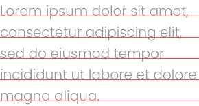
When you read about vertical grids on the internet, such as the very popular 8pt grid, you often see suggestions that you align the baseline of your text to the grid lines.

I don’t find it easy to think about vertical grids this way, especially not on the web. By default CSS does not base its spacing and alignment on the baseline of text.
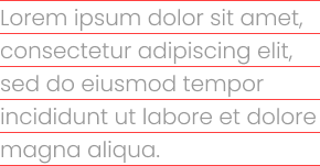
Instead I think in terms of boxes. Here’s the way I approach vertical grids:

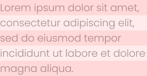
It might be even easier to visualise if I show blocks instead of vertical grid lines.

One advantage of this approach is that it makes alignment easier. Let’s look at an example. Here’s some text and an image:

The baseline of this text is aligned to the grid. The grey image to its right is also aligned to the grid, but it’s not aligned well to the block of text. It’s too high. If I use the next grid line down, it’ll be too low. If I want to align the image with the block of text I’ll need to ignore the grid lines.
What a waste of perfectly good grid lines.
If I treat the text as a block and fill the grid with it instead, I get this:

Now the text and image are aligned nicely and can share the same grid lines.
This approach also helps developers because this is how HTML and CSS handle text: as a block. Your designs will translate more easily into code.
Note that if you have text of different sizes that sits side by side, it looks better if the baselines align. This approach might not be best in that case.