People talk about horizontal and vertical grids a lot. But I’d argue hierarchical grids are the most common type of grid used in interface design.
To create a hierarchical grid you split the available space for an interface into sections. Then you might split those sections again into sub-sections.
Here’s the Figma interface with the hierarchical grid lines laid over it. Large dotted lines are the initial sections. Small dotted lines are the sub-sections.
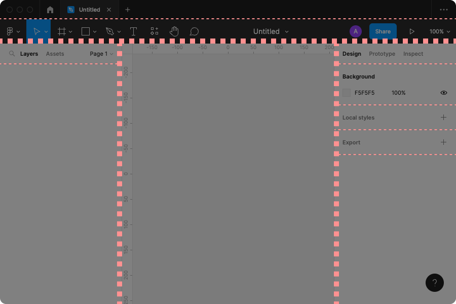
The major sections are the toolbar at the top, the layer list on the left, and the properties panel on the right.
You can see that each of the sections has then been split into two or more sub-sections:
A modular grid is a similar concept to a hierarchical grid. The available area is split into blocks. Content is then placed inside one or more blocks:
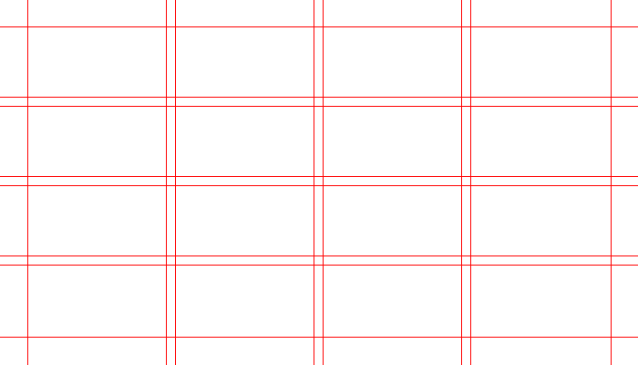
But modular grids are strict: you set up the columns and rows at the start, because that’s what decides how the number and size of modules. This works well for printed material, where you need to work with a specific page size that won’t change.
A hierarchical grid is easier to understand: take the space, and divide it then sub-divide it how you want.
This works well for software interfaces, where the window or device size can easily change. It works well with the process where you decide how the interface responds to different window sizes.
For example, maybe in Figma you want the canvas to shrink as the window does, but you want the layer list and property panel to stay the same size. A hierarchical grid suits this type of thinking better.
In terms of interaction design, a hierarchical grid also encourages you to put related things close together: “This section will be for everything related to layers. Oh, I forgot I needed these extra layer controls. I should split the layers section into two sub-sections, then.”