“HSB” stands for Hue, Saturation, and Brightness. It’s an easier way to work with colour. Your design software should support HSB in its colour picker. A quick search online will turn up articles that can explain HSB better than I can here. The rest of this guide will assume you work in the HSB colour system.
You can change the “feel” of a hue if you change the saturation and brightness. Pick from one of these zones in the colour picker to suit the feel you want.
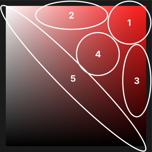
Even at the same “brightness” value in the HSB colour system, some colours look brighter than others. Yellow is brighter than blue, for example.
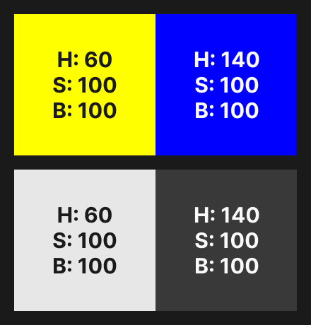
When I want to check if two colours have the same perceived brightness, I look at them through a colour blindness simulator that has a monochrome filter.
You should be aware of this when you use more than one colour, which is covered later.
Pure black—with a brightness value of 0—often has as uncomfortable amount of contrast with other colours.
It is claimed that pure black allows some screens to turn off pixels and save energy. I cannot find any evidence that it saves a noticeable amount of energy.
In some situations, pure white feels too bright on a screen.
Raise/lower the brightness values on blacks/whites a little to soften them.
If a colour is connotative it means viewers associate some meaning of their own with it. This might be personal, but it is also often cultural. Lots of people from the same culture might associate that colour with that meaning. For example, red is associated with “danger”.
If a colour is denotive it means the designer associated the colour with a meaning. For example, blue could be associated with “interactive”.
Note that a colour can often be both connotative and denotive. As a designer you’re in control of the denotive associations, but not the connotative associations. You should make sure they don’t clash. For example, if red is associated with both “danger” and “interactive”, people might think it’s dangerous to use interactive elements.
You should choose colours that match the concept of the design. Think about what that concept should be, and choose colours that match it.
Generally you should use fewer colours. Colours need to work together, and that’s harder the more colours you use.
On top of that, colour has more impact if you use less of it, because it has less to compete with.
Often it’s enough to only choose colours that will have a practical meaning. For example, you might only choose one colour and use it to signify that elements are interactive.
Another common approach, especially in application interfaces (versus websites) is to rely on content for colour. If you have illustrations, screenshots, or product photographs, for example. The colour in that imagery might be enough to make your design feel colourful.
Contrast helps us to easily tell colours apart. This is important when it helps us understand what we look at. A simple example is text: you cannot see the text if it does not have good contrast with the background. You can use a contrast checker to see whether a background/foreground combination has high enough contrast.
The 60-30-10 rule comes from the world of interior design, as far as I know. It says that 60% of your colour palette should be a neutral background colour. 30% of your colour palette should be a secondary colour (e.g. for your text) that doesn’t grab too much attention, but which contrasts well with the background colour. 10% of your colour palette should be an accent colour or colours, to grab attention.
It is common—especially with application interfaces—to have a separate palette for greys. Different shades of greys are useful when you want to show layers in an interface.
You may have a main palette of more “active” colours, and then a separate palette of—for example—ten greys you can use when needed.
An easy way to add character and coherence to your colour palette is to add a little saturation to your neutral colours. For example, instead of a flat grey as a background colour, you can add a little blue. You do not need to add much colour to see an effect.
Your saturated neutrals should match the rest of your colour palette. If it’s mostly cool colours like blues, for example, you should use a little blue in your neutral colours.
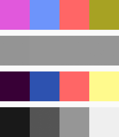
When you put together a colour palette, a good rule is that the colours should have noticeably different perceived brightnesses (I wrote about perceived brightness above).
Here are two colour palettes that use the same hues. I’ve included their perceived brightness values in grey. You can hopefully see that the second palette—with noticeably different perceived brightness values—looks better.
You can use the standard colour wheel to choose sets of colours that have useful relationships to each other. One common example is complementary colours, where two colours are chosen from opposite sides of the colour wheel. A quick search online will turn up lots of explanations of these approaches, so I will not repeat them here.