Stripe recently refreshed their website, so it's a good time to dive into some interesting details that jumped out at me. Stripe clearly puts a lot of care into its design - there's far more to admire than I've listed below.
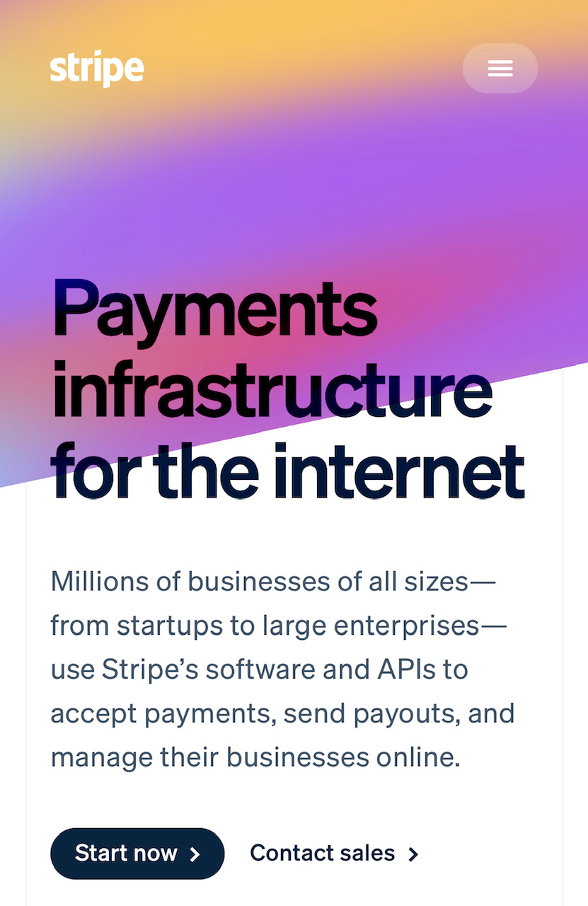
First up is the header. Kudos for putting a transparent background around the hamburger menu icon, to signify that it's tappable. Stripe have used a pulsing colour gradient to blend both the navigation bar and the hero section. It saves space and draws your eye to the headline as it should.
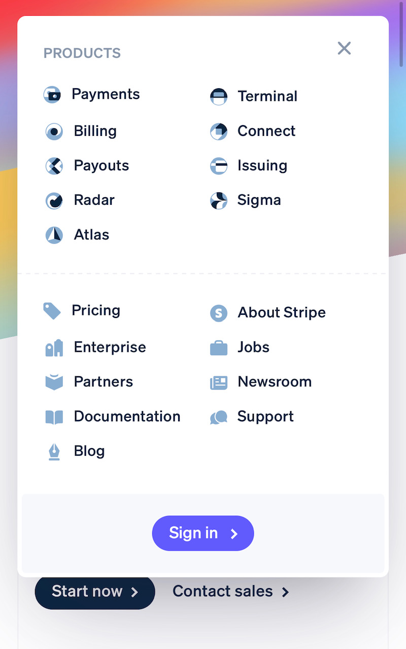
The hamburger menu on mobile is interesting. They've styled it as a overlaid modal, but it'll stay stuck to the top of the page if you scroll down. Most mobile hamburger menus overlay the entire page, so you need to close it if you want to keep reading. Not in this case.
A few things are happening to give a sense of hierarchy in this menu. First, "Products" has a title, whereas the next section does not. Second, a dotted line separates the two, but not completely. "These things are different but still connected". Finally, the Products icons use more colour/shades than the other icons.
I'm seeing more and more websites show social proof company icons in their original colours.

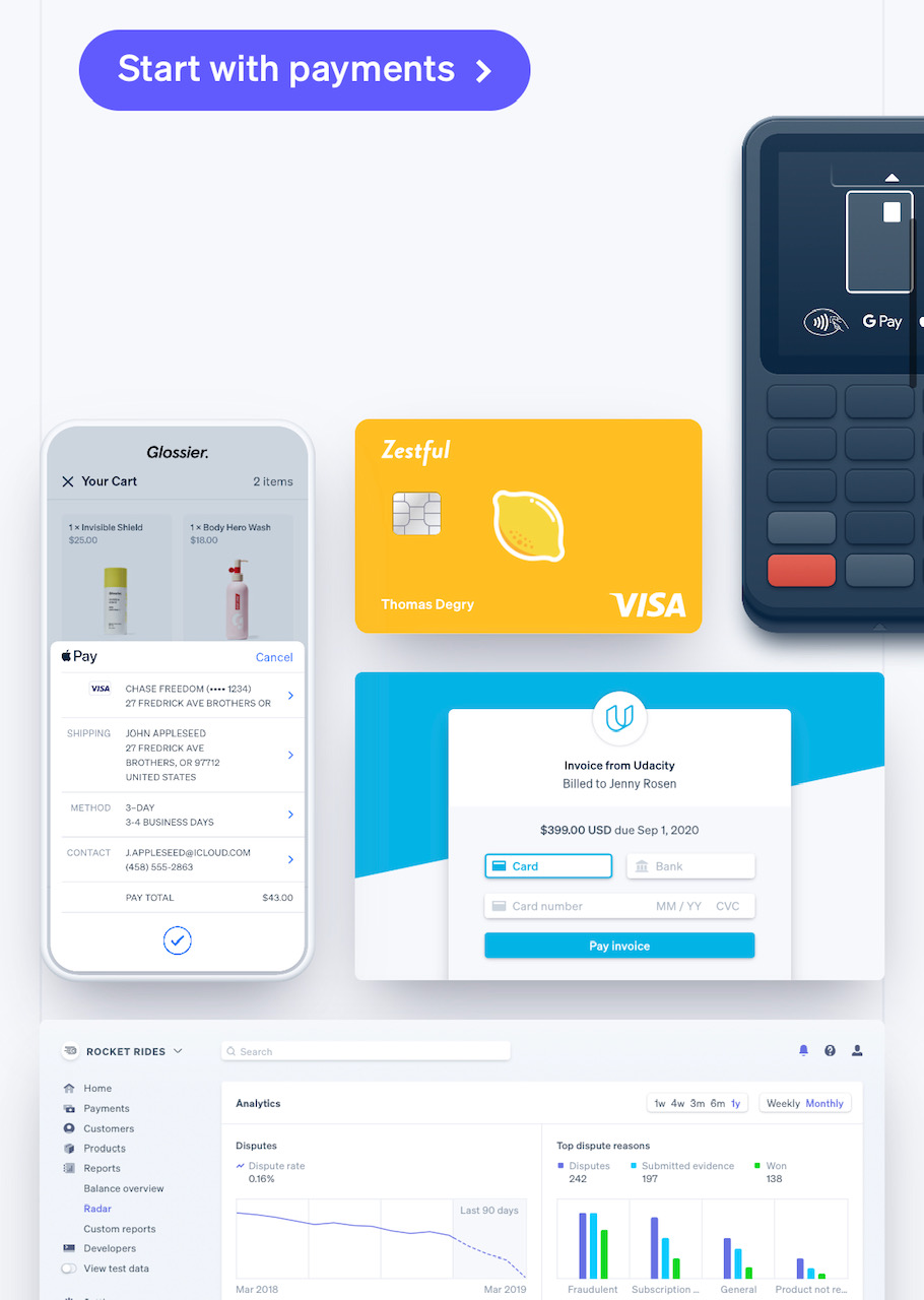
The collage of technology that Stripe enables is arranged differently on smaller screens vs. larger screens. Using a collage approach like this means you can re-arrange a large illustration or image "section" and still have it show things in the same quality/size. No simple resizing images for Stripe.
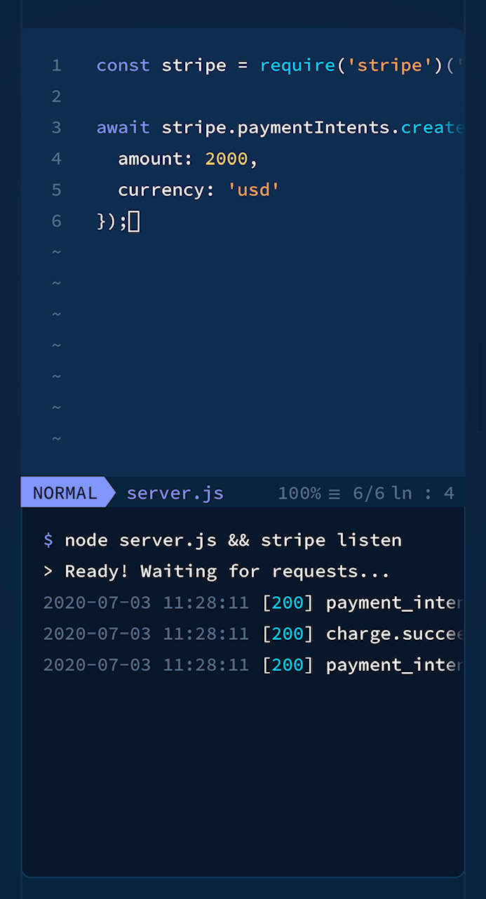
The animated code demonstration shows details from a code editor that aren't needed for the message at all. They're there to help you appreciate that yes, this is something your developer will actually be writing. It really is this simple to get Stripe working. Many companies recreate software interfaces in their marketing sites, but simplify the approach. You don't know whether the product is really that simple, in those cases.
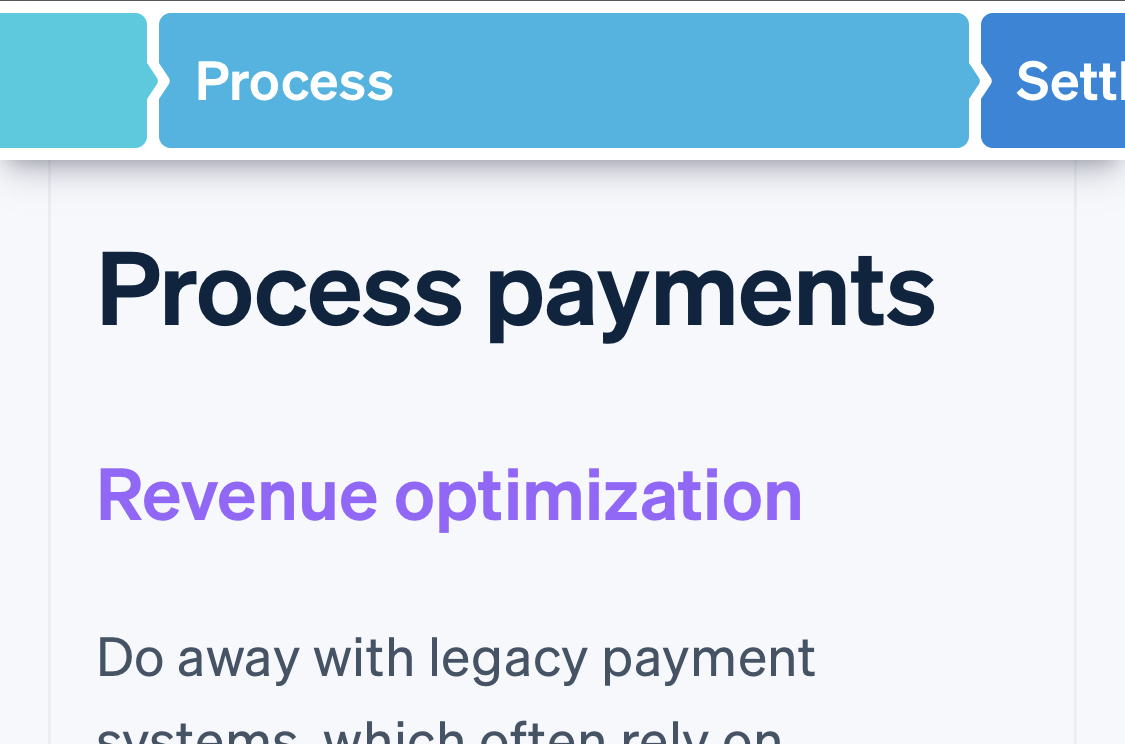
One thing I took a while to notice are the two faint lines on the left and right of the page. Stripe is using a four column layout on larger screens, and a one column layout on smaller screens. They make this subtly visible with these faint grey lines running down the length of the page. It helps everything feel more aligned.
The visible layout lines also help with other things. Here Stripe is colouring the line to act as a bullet point for product features. This doesn't take up any extra space, unlike an ordinary bullet point, but still gives you the benefit of one.
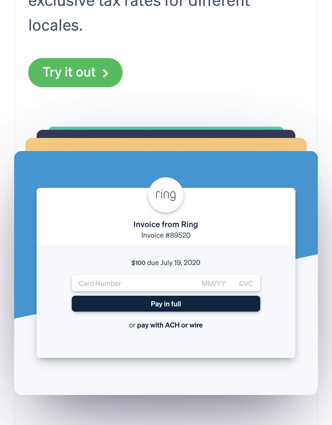
When you change the type of payment, this interactive image changes to show the relevant fields for that payment type. But only the fields move and change - the rest of the image stays still. Very engaging.
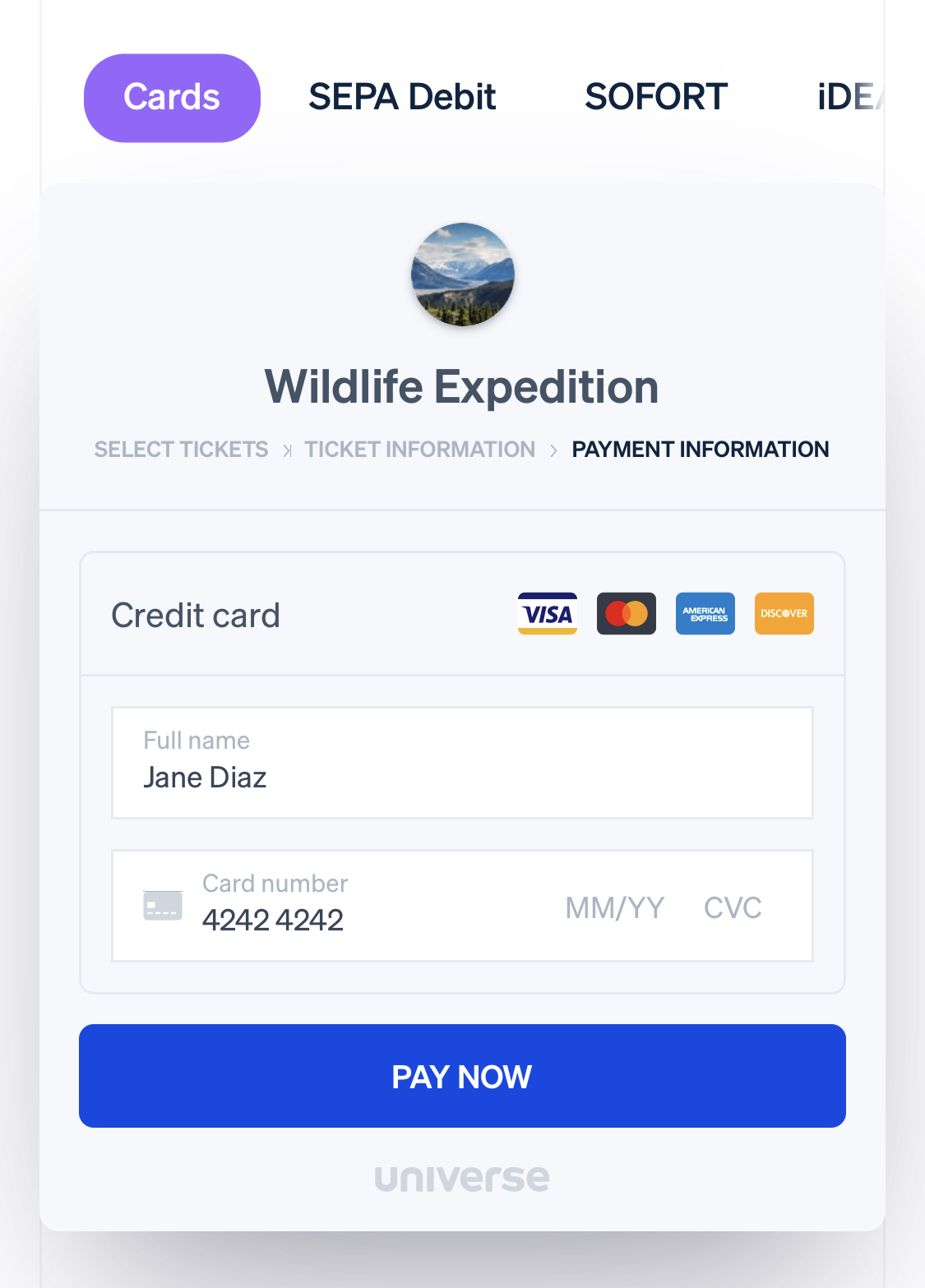
As you scroll down the page, you see a progress bar/breadcrumbs style graphic. These steps act as direct navigation - you can tap on them and be taken to that step directly. They also stay stuck to the top of the page as you scroll, and show you which section you're viewing. Stripe uses this "Sticky temporary navigation" approach on lots of pages.
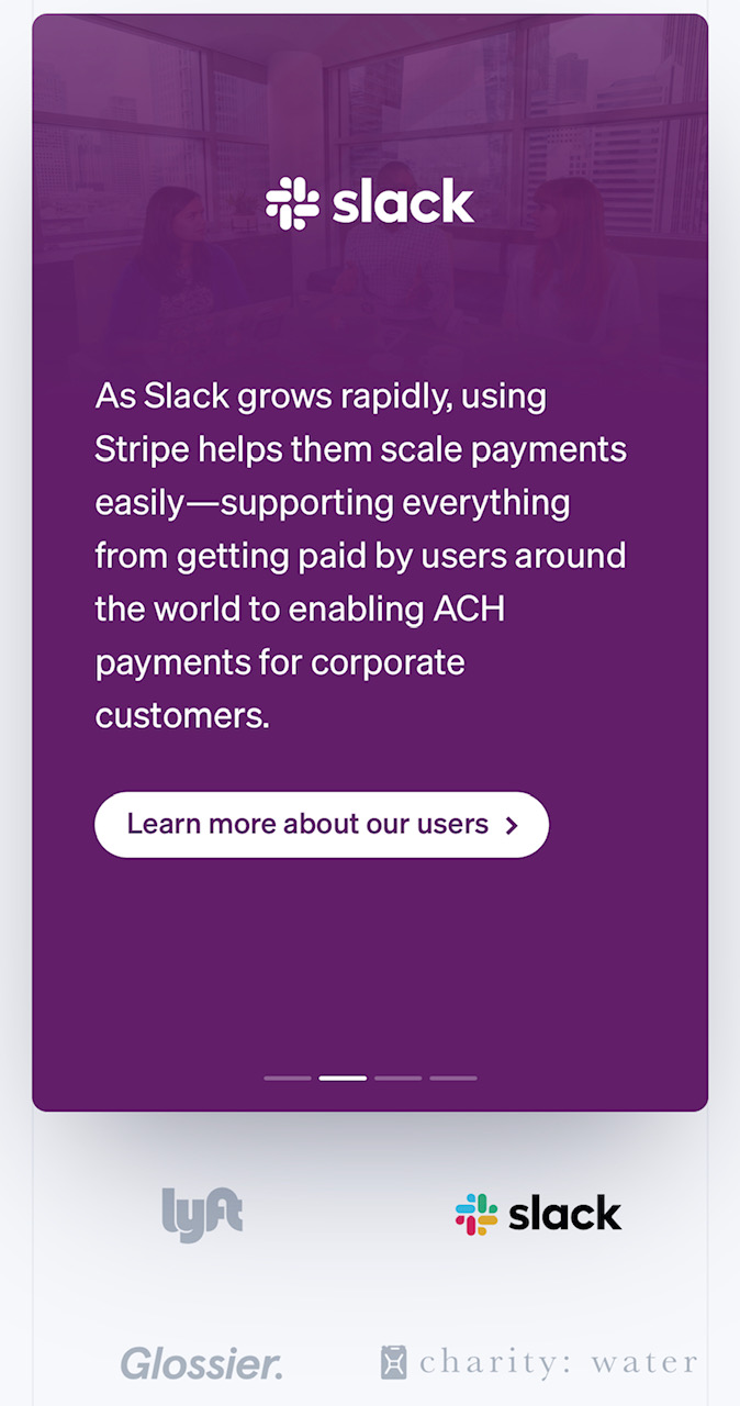
The social proof/Stripe in use carousels can be swiped left and right, but each slide is also tied to the company logos beneath. If you tap a company logo, you'll be taken directly to that company's slide. It's hard to tell without looking at the style guides for each of these companies, but it seems like they're also using brand colours for those companies as the slide backgrounds.
These examples of branded invoices are stacked like cards, and as each one drops away the next one slides forward. Engaging, and because they're all just examples, you don't need to be able to move forward through them manually.
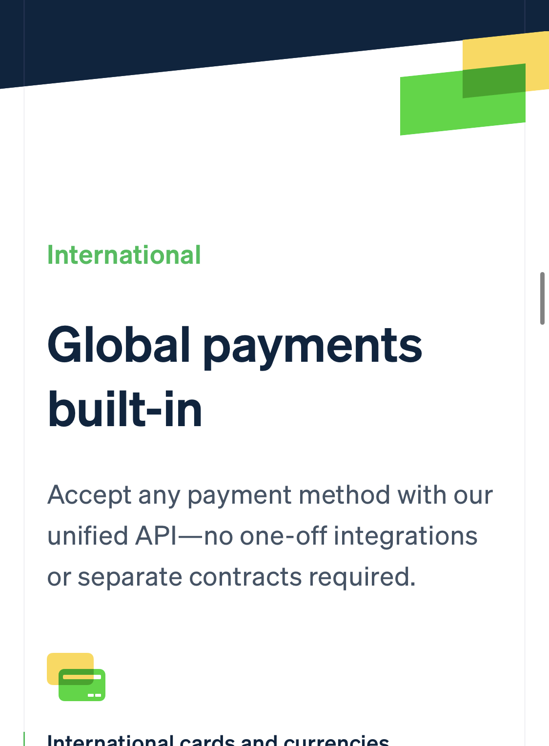
Stripe uses colour for theming features/parts of the website. Here the first feature is themed with a cyan and purple colour scheme, and the second feature is themed with green and yellow.

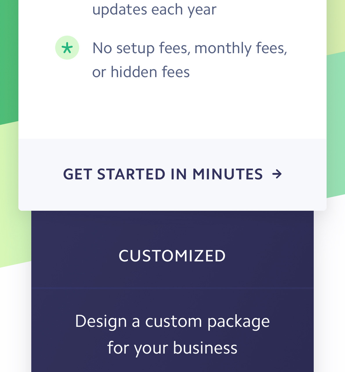
On a large screen, the standard pricing plan is highlighted in white, and overlays the darker "Customized" plan. For smaller screens, Stripe kept this overlay, even though the cards are now laid out vertically.