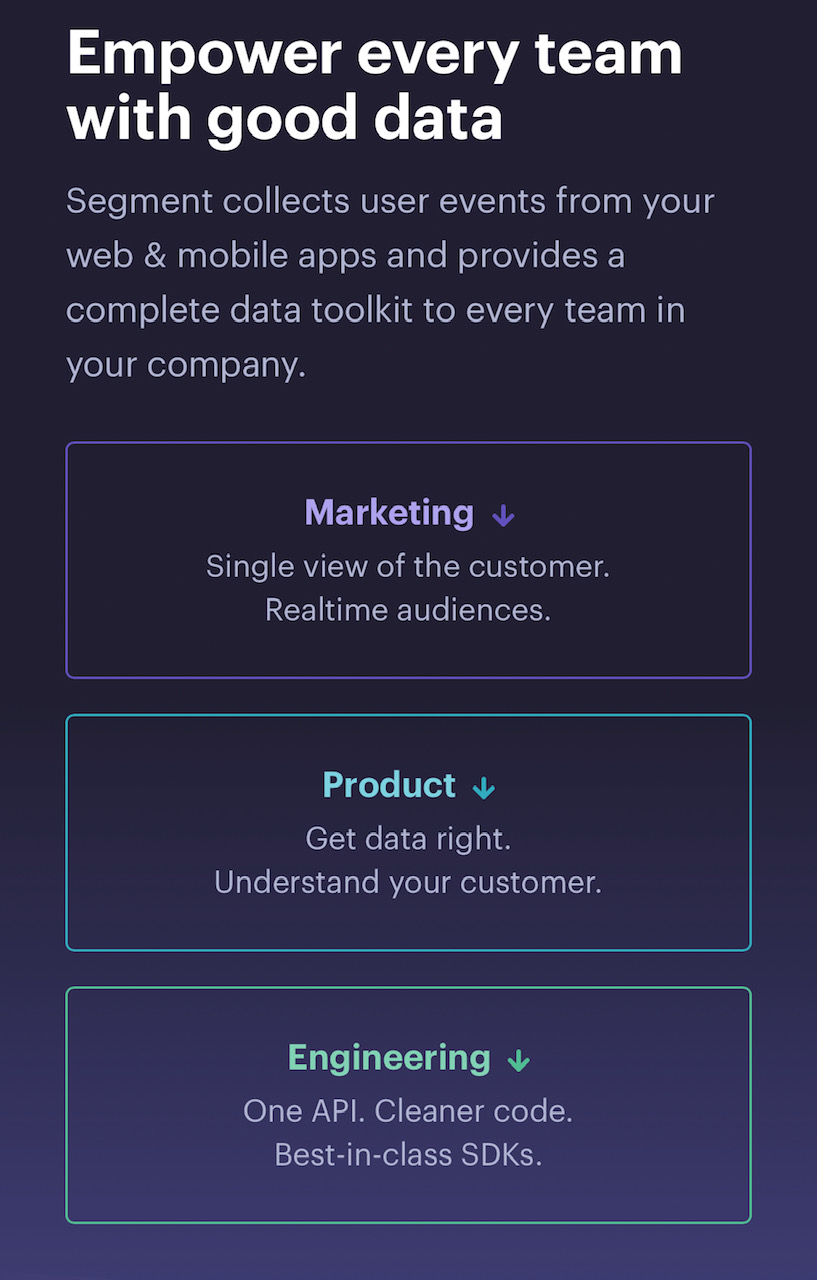
Segment's home page has navigation links that jump you to the relevant section of the page. They want to get you to the good stuff, whatever that might be for you, as quickly as possible.
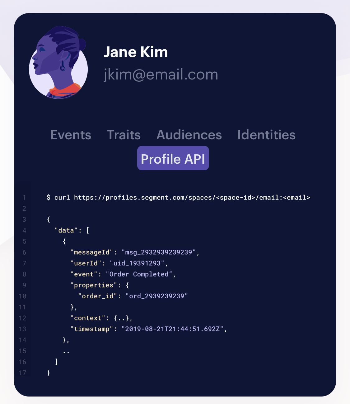
This card describes the sorts of data you can collect about a person using Segment. All of the types of data ("Events", "Traits", etc.) use a white background, but when you switch it to "Profile API" the background turns dark. I assume this is because for code display, a dark background matches what developers are used to more. Most code editors have dark backgrounds.
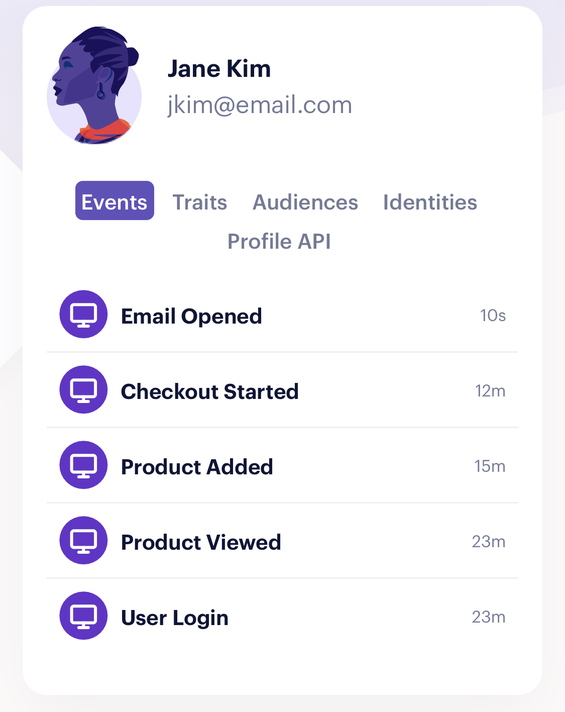
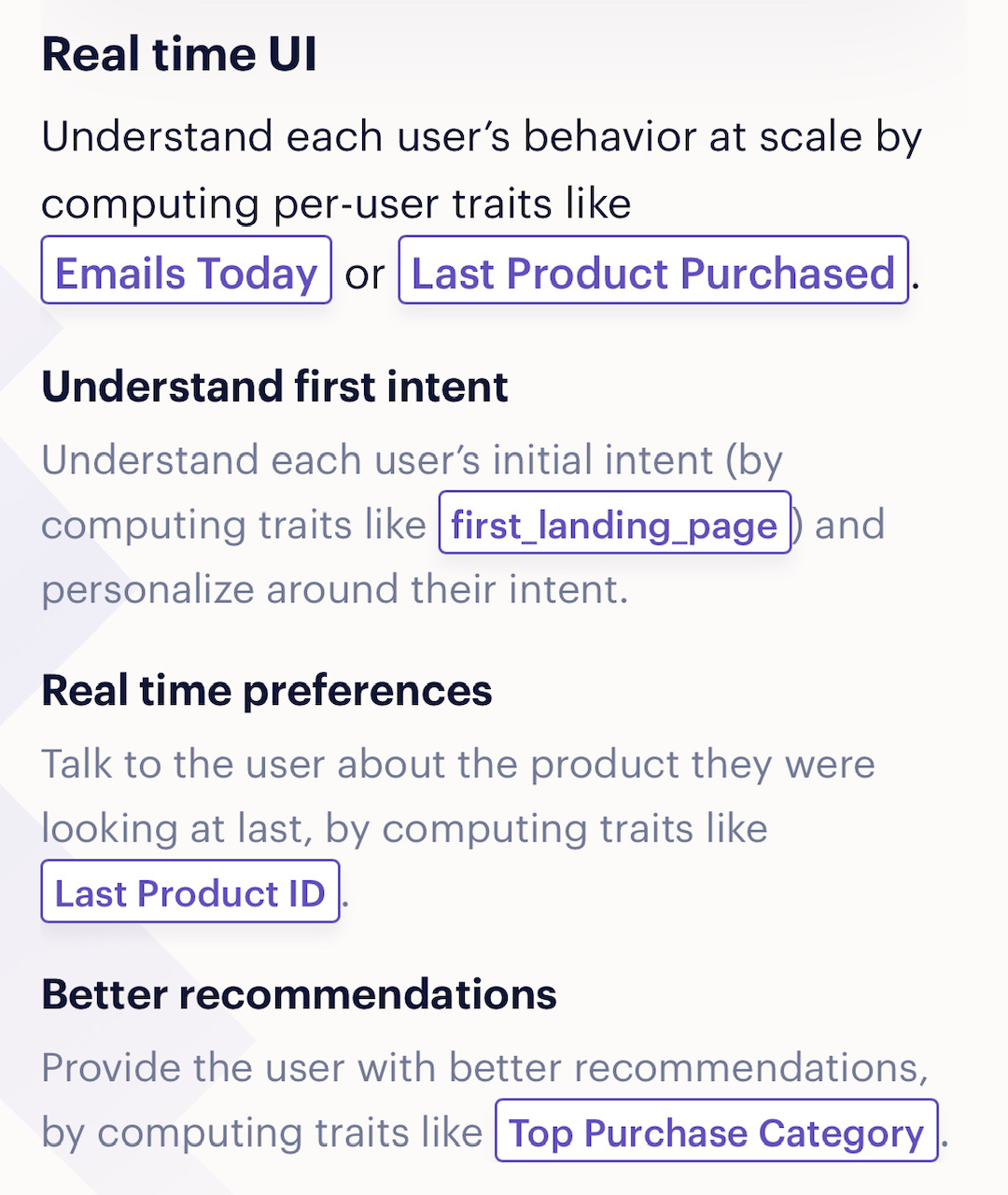
User traits that you can work with in Segment are highlighted in the copy to make them stand out, giving you a small taste of the platform before you start using it.
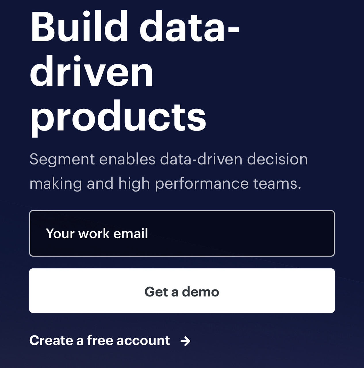
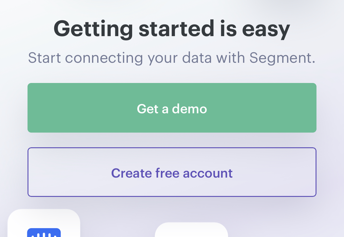
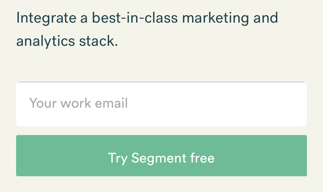
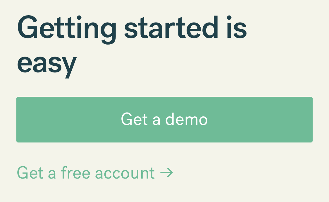
I don't think I've ever seen as many styles for calls to action as I have on Segment's site. Here's a collection of the ones I could find. They never let you get used to how the call to action looks, which I assume increases the chance of someone getting pulled in by one of them.

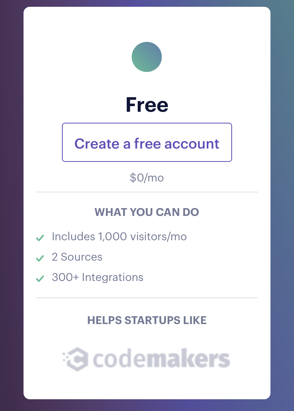
The pricing page cards show examples of companies that use that level of subscription.
Since I'm viewing the page on mobile, it's hard to show me how the features change when I switch plans. Segment pulls it off by highlighting the parts of the feature list that have changed.
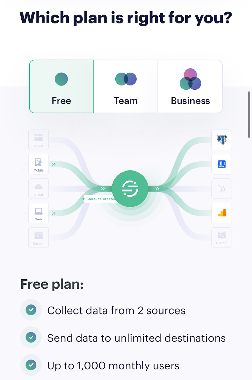
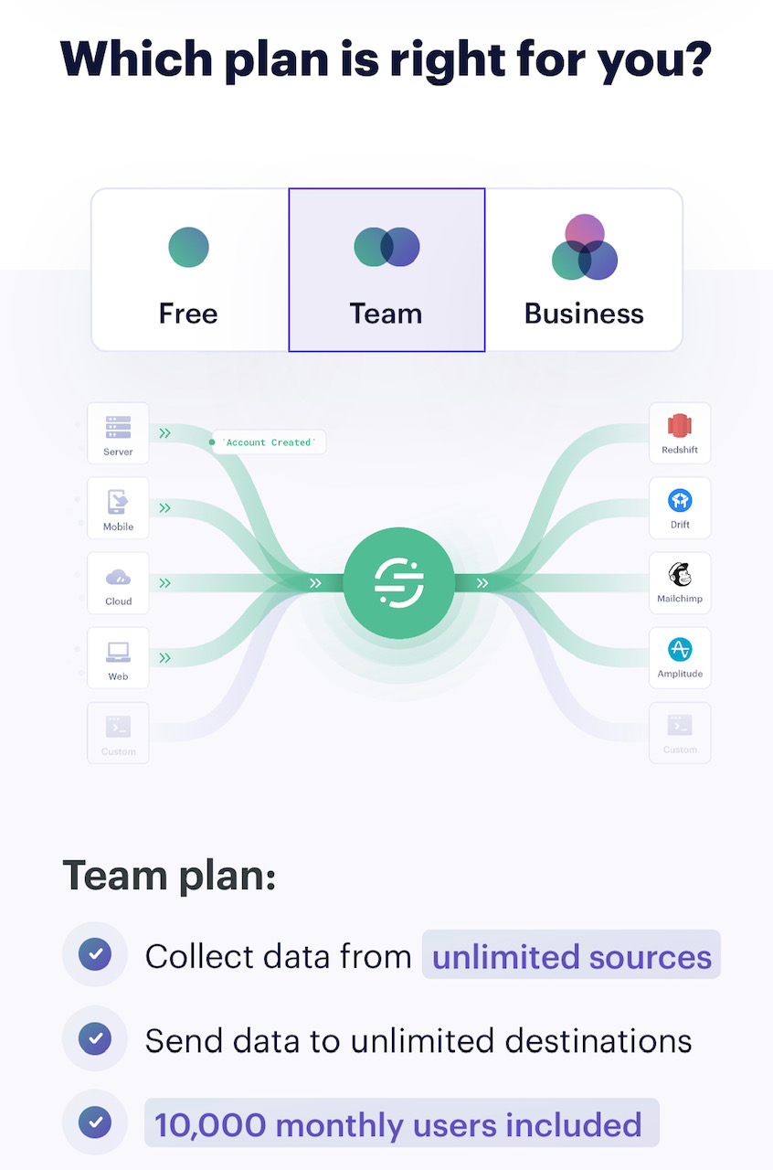
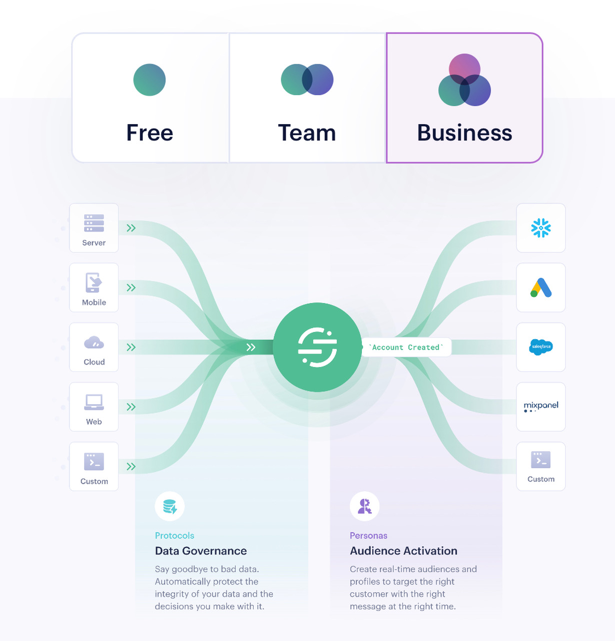
Notice also that as I move up the plans, from Free to Business, the illustration showing how the system works changes to show more features and integrations.
