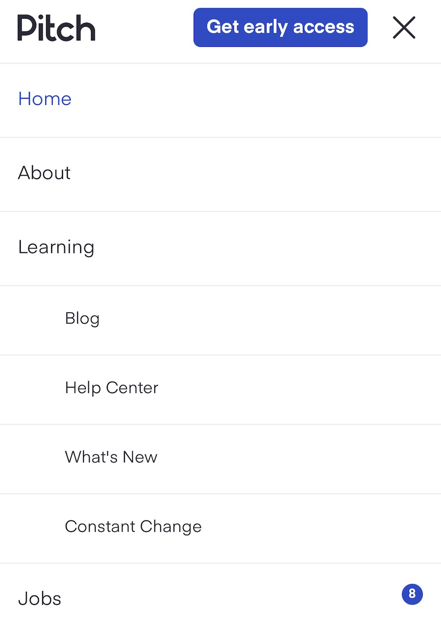
Pitch is a new presentation building tool. They've put some effort into their website, so let's take a look. First, they show the number of open positions next to the "Jobs" menu entry, so they don't waste your time if they've got no open roles.
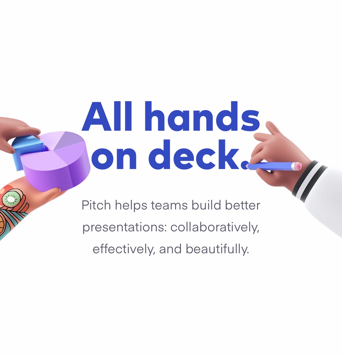
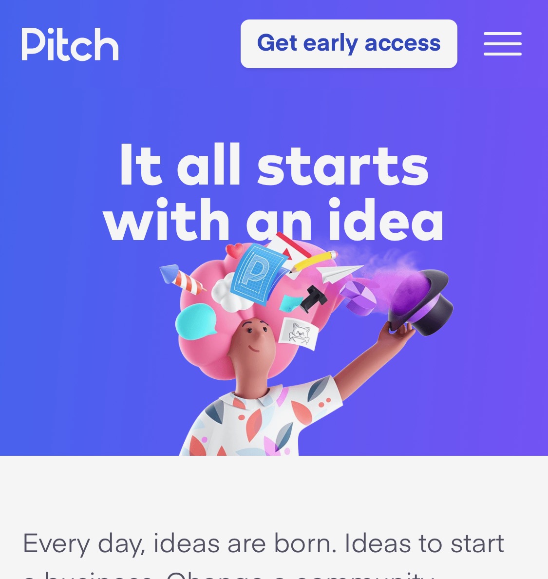
The hero image is pretty standard stuff.
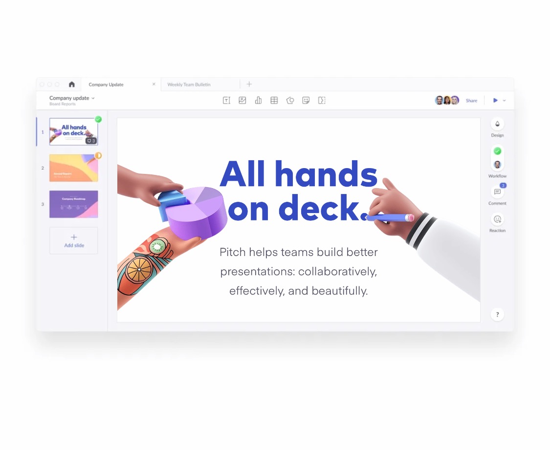
But as you scroll down, it pulls back and becomes part of the interface for Pitch. Clever, and introduces their product early.
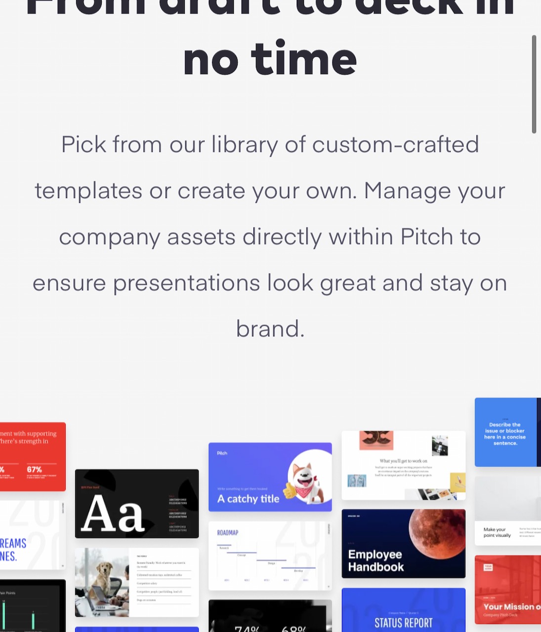
I'm not normally a fan of scrolling effects, because they are distracting, but Pitch has kept theirs subtle. As you scroll down the page to this section, the small images below the text rise at different speeds to give a pleasant sense of movement that doesn't overwhelm you.
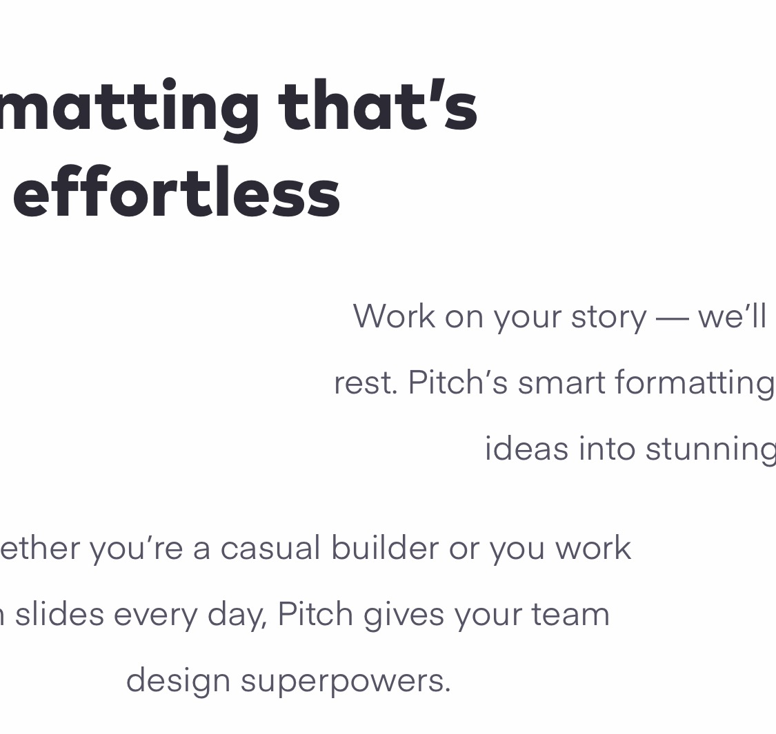
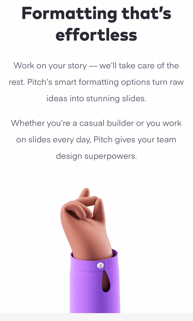
This next section has text blocks that are unaligned.
As you reach the hand below, it clicks its fingers with an animation, the the text blocks all slide into place. I like these types of effects because the content is already there. You don't have to wait for it to fade into view, which often happens too late on some websites.
The menu icon changes from three lines to a cross, which is standard fare these days. When you tap on a menu item though, the icon changes to a single flat line until the page has loaded. This acts as a nice "We've got your request, it's on its way" signifier.
The Product page colours the navigation bar the same colour as the hero section, which provides some simplicity.
But when you scroll down and hit the text it changes back to white so it doesn't distract you.
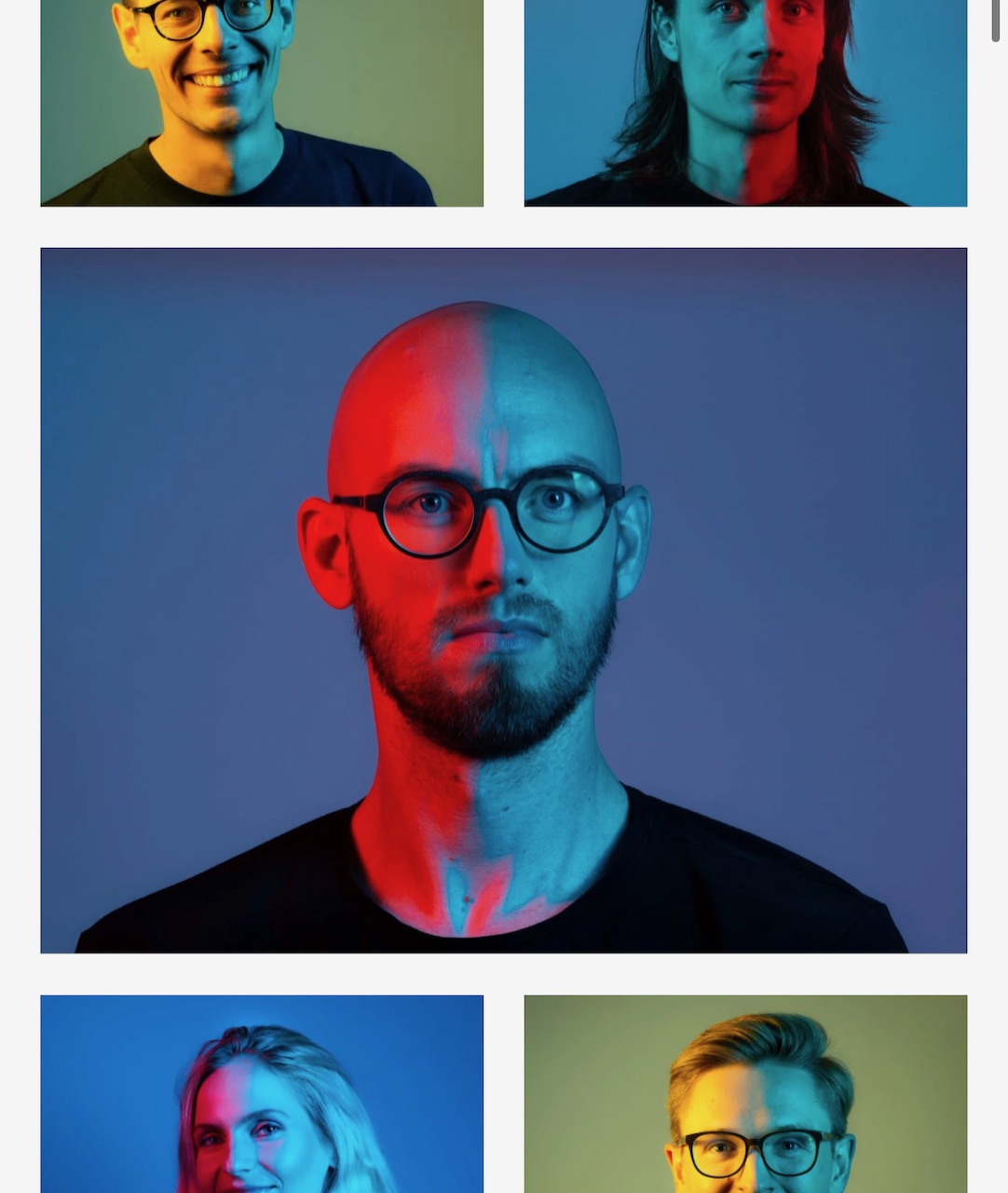
The photos of the team at Pitch all use this two-tone lighting effect. This is an interesting way to make sure that even photos of the people who work for you say, "This is Pitch".
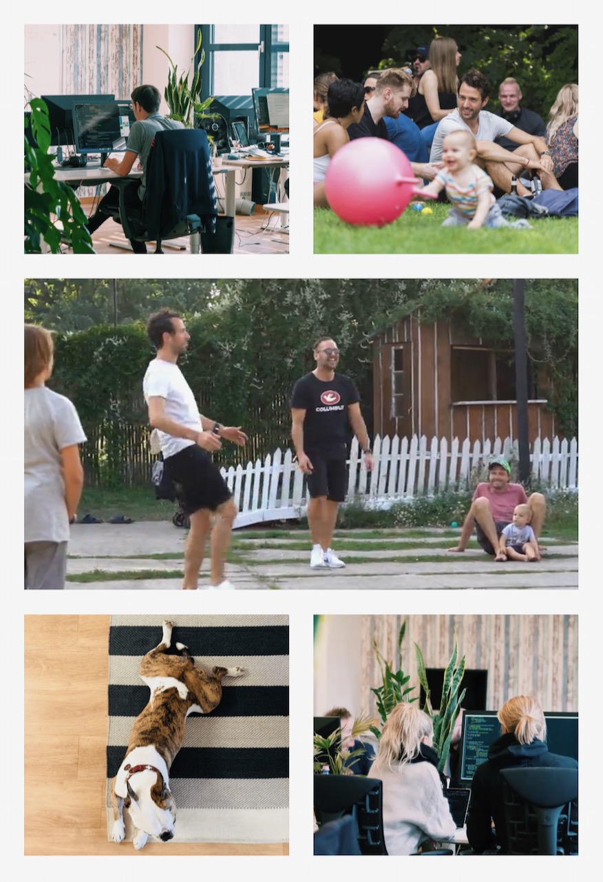
Further down the "About the company" page are these flavour photos which represent life at Pitch. This middle image is animated, which shows a nice touch and adds some variety to an otherwise still grid of photos.
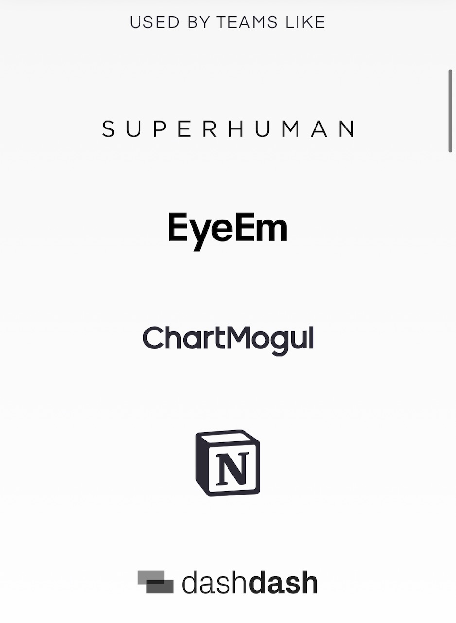
Logos of companies that use Pitch are monotone, as you might expect...
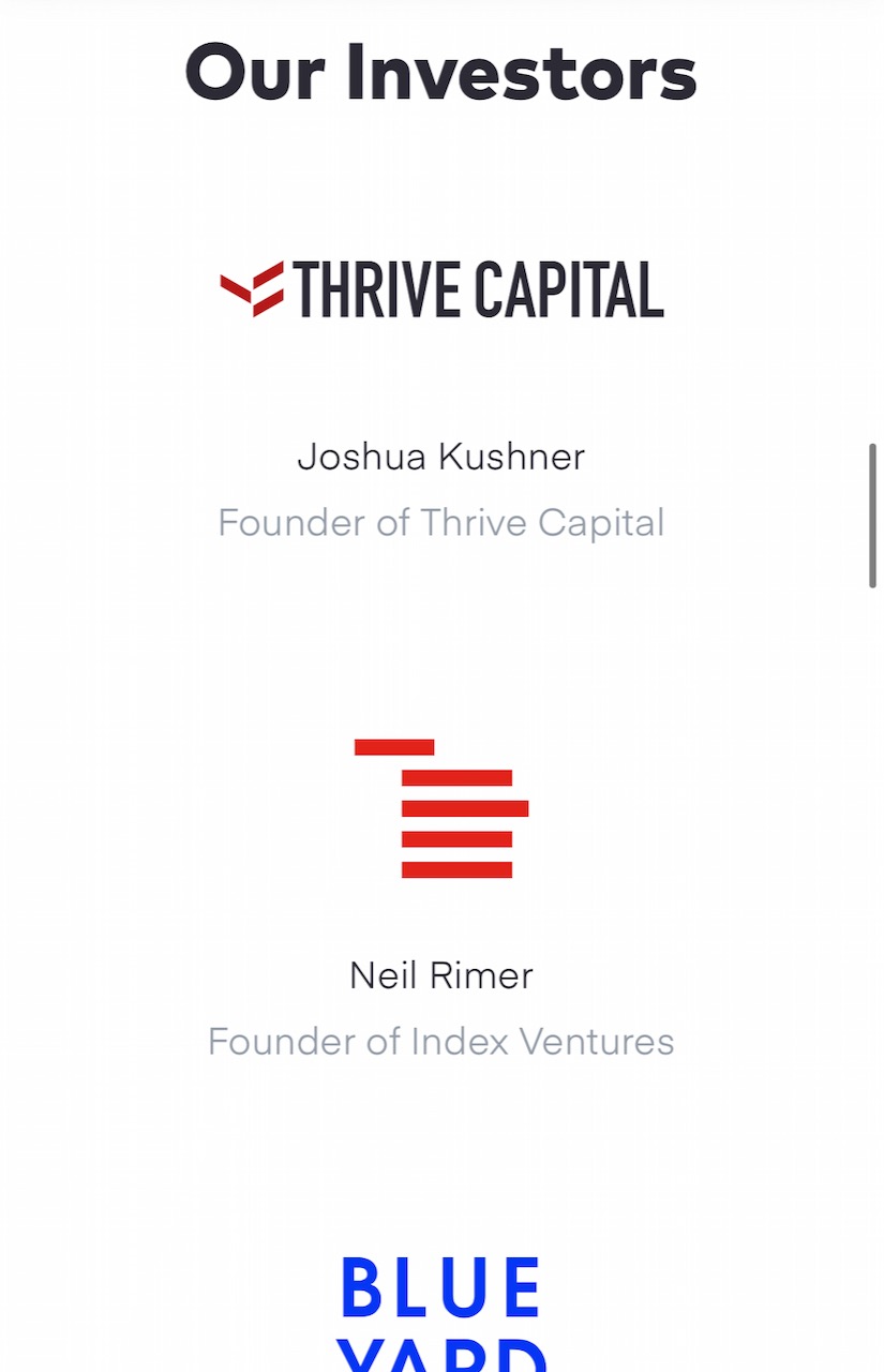
... But if you've given Pitch money? You get your logo in colour.
As you scroll down the "Constant Change" page, a secondary navigation appears to let you jump to a specific part of the page, since it's quite long.
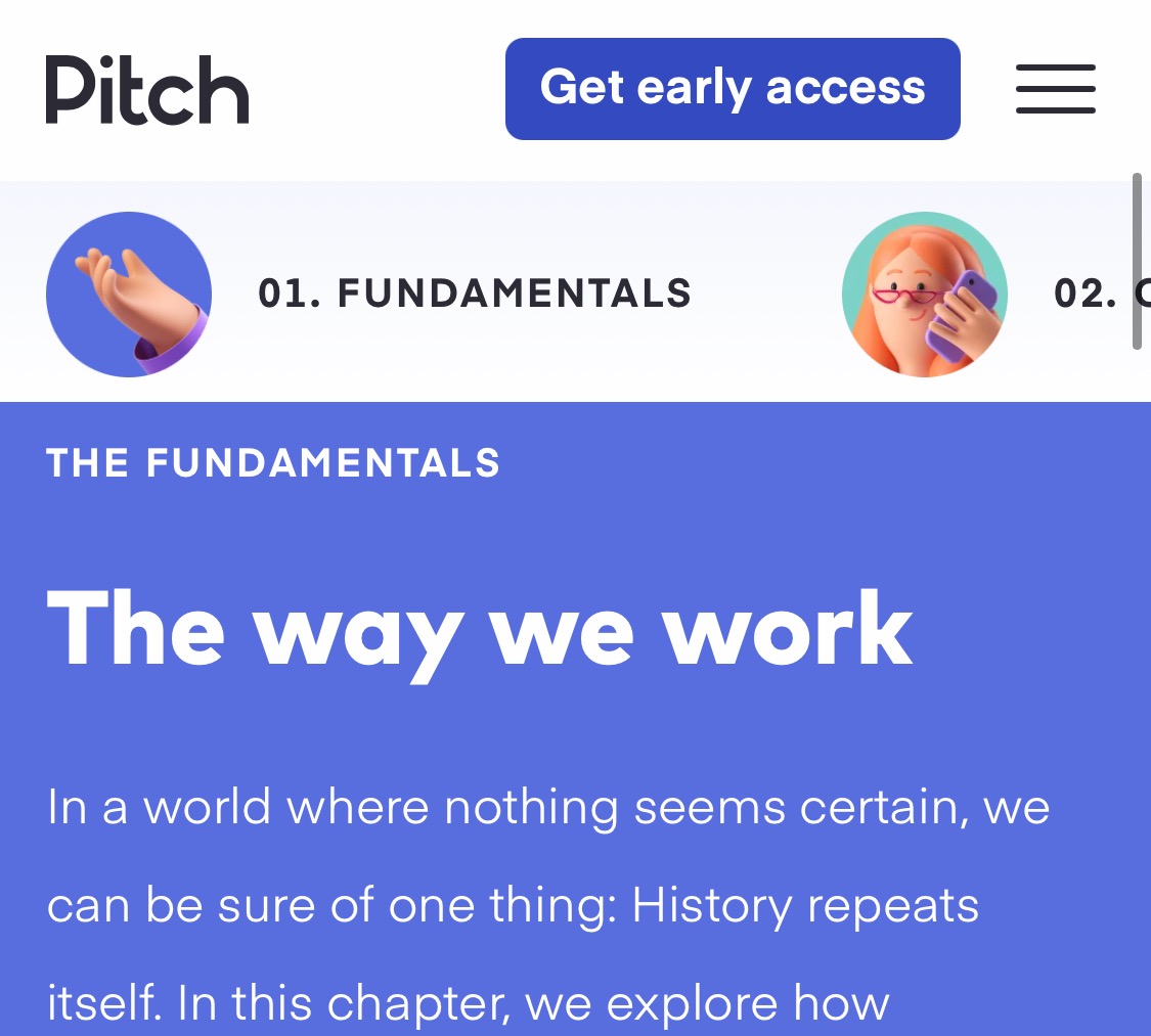
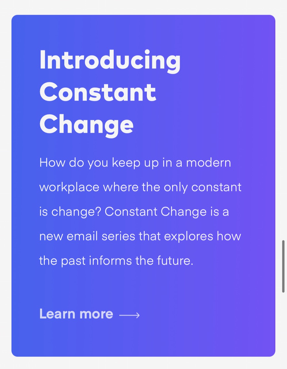
The section of the home page that introduces this new "Constant Change" section is given a blue background with a gradient. This makes it stand out from the rest of the page.
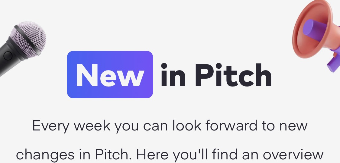
I noticed that the word "New" is also give the same treatment on the updates page. I assume this is a visual style that represents "Hey, notice me" in Pitch, and this is a nice way to introduce that concept.