Panic is known for pouring a lot of love into their software, so it's no surprise that their websites are the same. The website for their text editor Nova has some tasty treats for us.
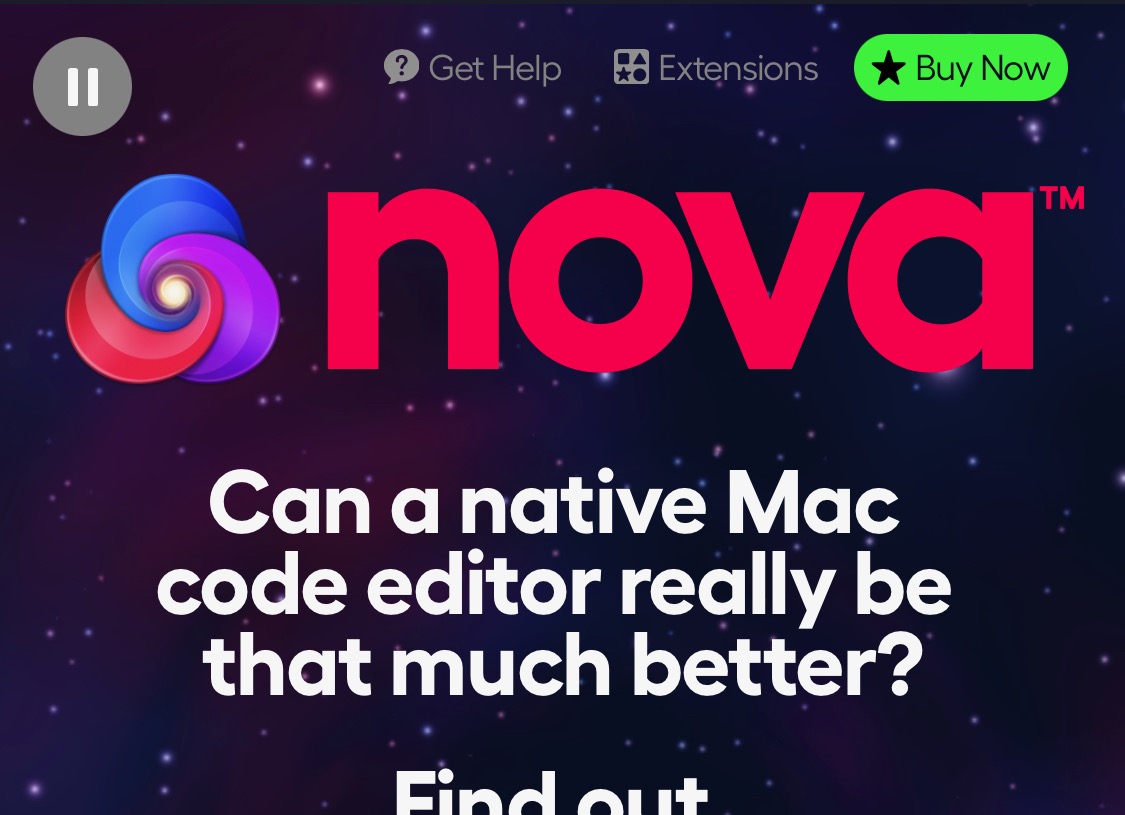
The background for the hero section of the website is a star field that slowly moves towards the user. Panic must have realised that this could be distracting for some people, so they added a pause button in the top left of the website to stop the animation.
As you scroll down the page, a Download button appears in the top left of the navigation to replace the call to action in the hero section.
The branding for Nova makes use of a spectrum of colours, from yellow to blue. Here they're used to represent the features of the software, but they're also repeated elsewhere through the site. They use the same spectrum for the dividers, for example.
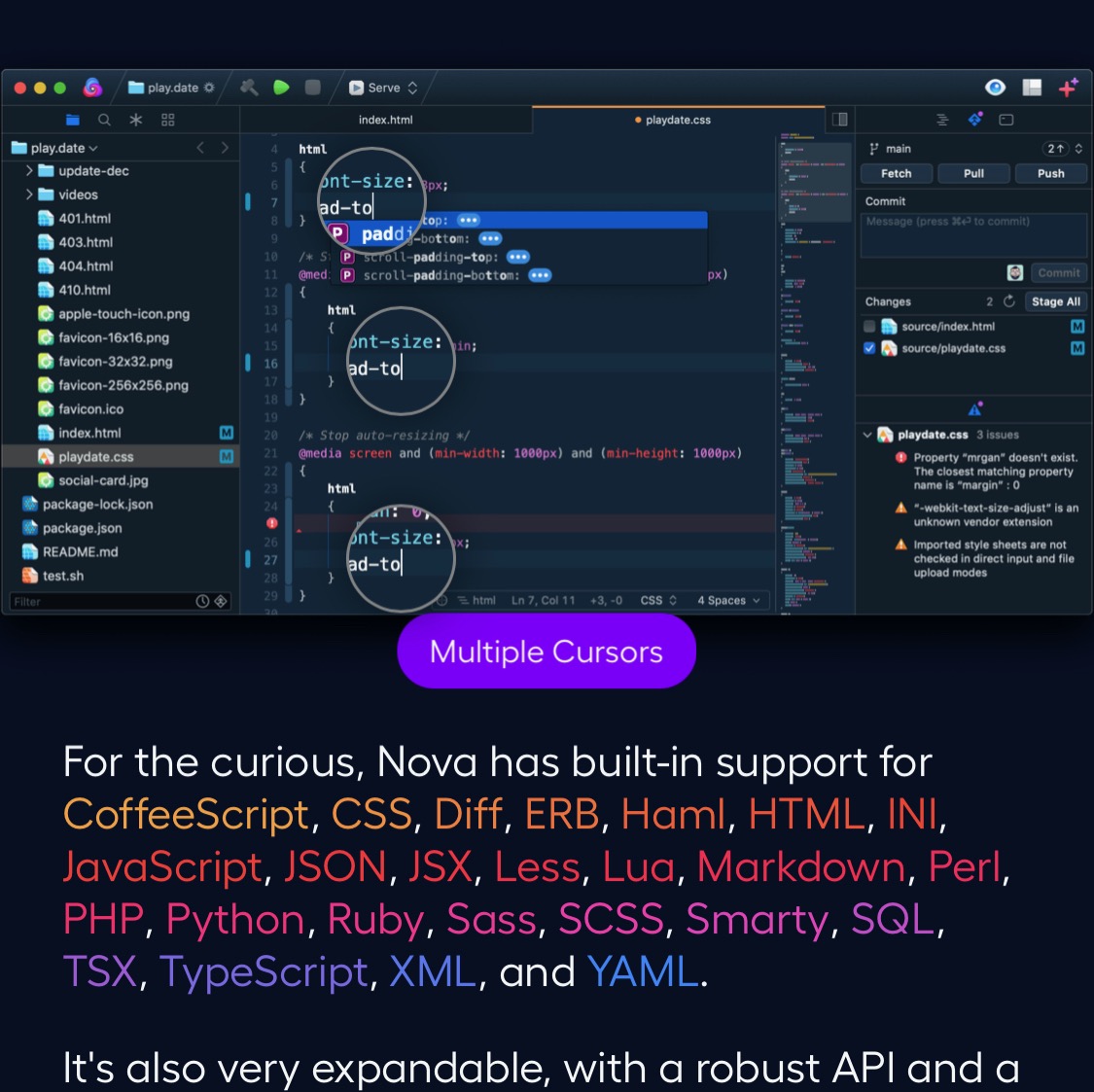
They also use it to colour the list of languages that Nova supports. The screenshot is probably too small to read on a mobile device, but magnifying circles and a label explaining the feature appear, which helps even on small screens.
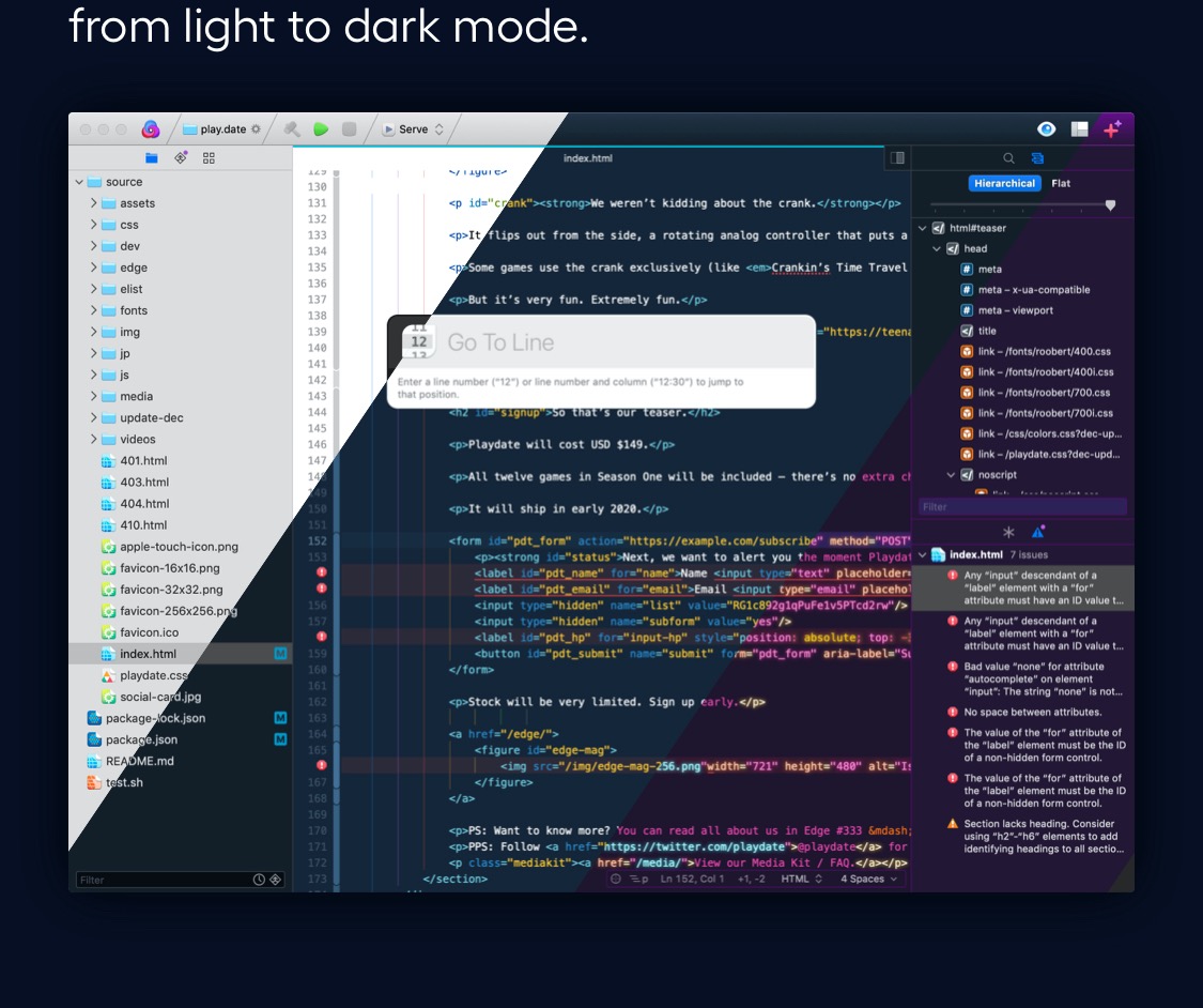
Instead of a rotating carousel or multiple screenshots, the software's many visual themes are shown off by this animated split screenshot, where the bands of colour slowly move from left to right, showing you all four colour schemes at once.
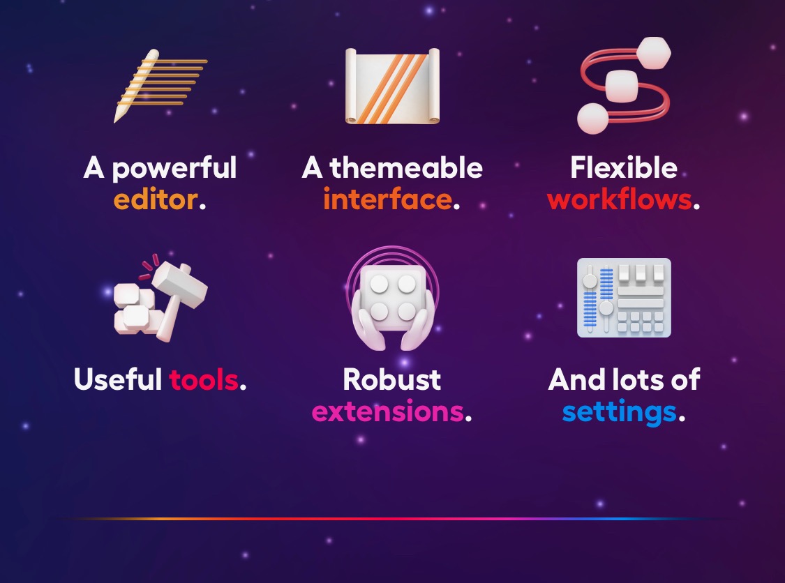
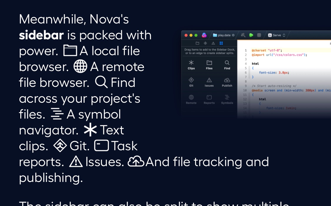
Panic introduces parts of the interface - the icons used in their sidebar - in the copy. They get you used to their iconography before you've even bought the software.
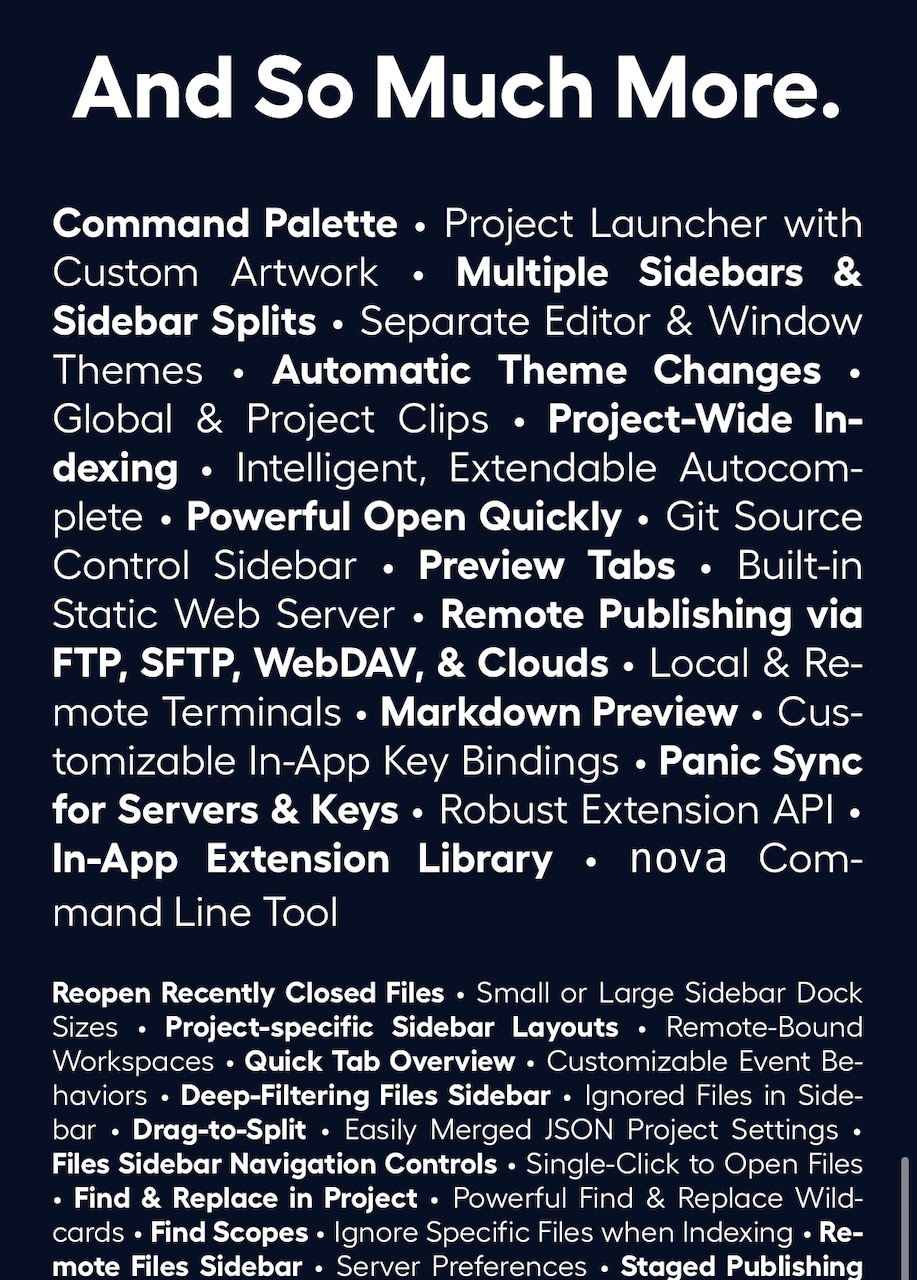
For anyone who cares enough, Panic doesn't keep the rest of the features of the app a secret. They list every single one, and drop to a smaller text size so they don't take up too much space. The alternating regular and bold font weight helps people scan through the list.
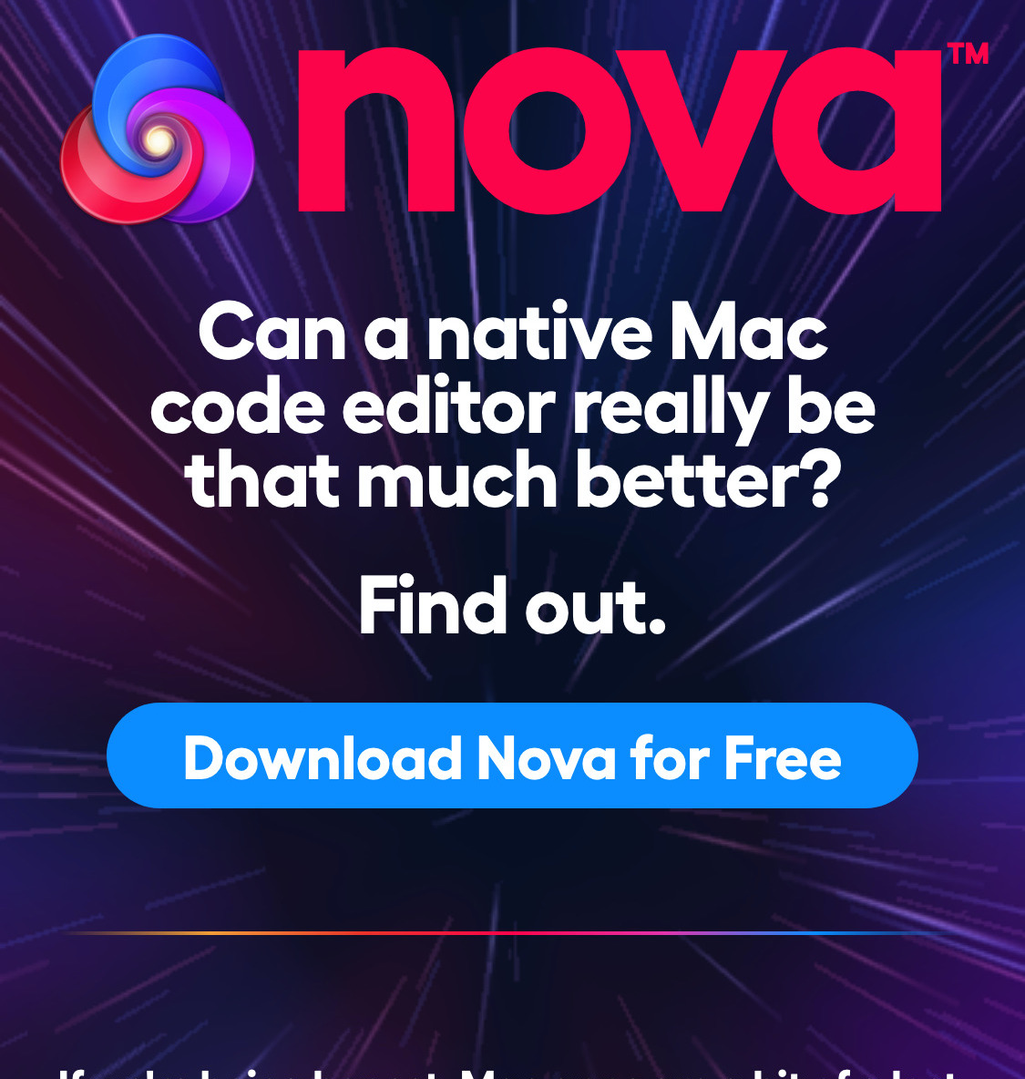
If you tap on the Download Nova for Free button on mobile, or hover over it with a mouse, the star field background suddenly flies towards you a lot faster, as if you've entered warp speed. This is a fantastic way to get you excited about the call to action, and represents Nova's power and speed.
Panic managed to keep the number of sections of the website small enough to fit all of the relevant links in the main navigation, no expandable menu needed. This is helped because whatever page you're on is removed so another can take its place.