Notion has captured everyone's hearts, and I imagine some of that is down to great attention to detail. Let's see.
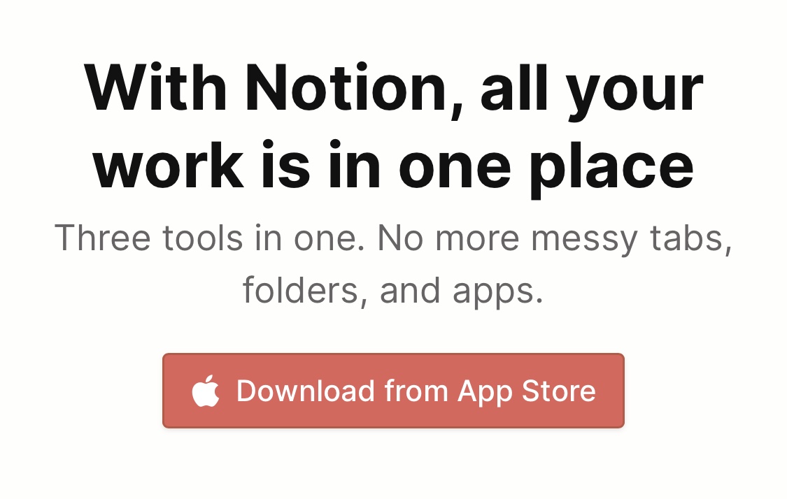
Viewing the website on my iPhone, all of the calls to action are showing an Apple logo, and taking me to the app store.
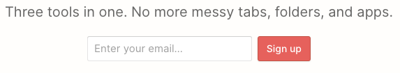
If I view it on my laptop, instead I see an email sign up form. They're getting me to the action as quickly as possible, and in the best way for my preferred platform. If I want to sign up with my email on my phone, instead, there's an option for that in the menu.
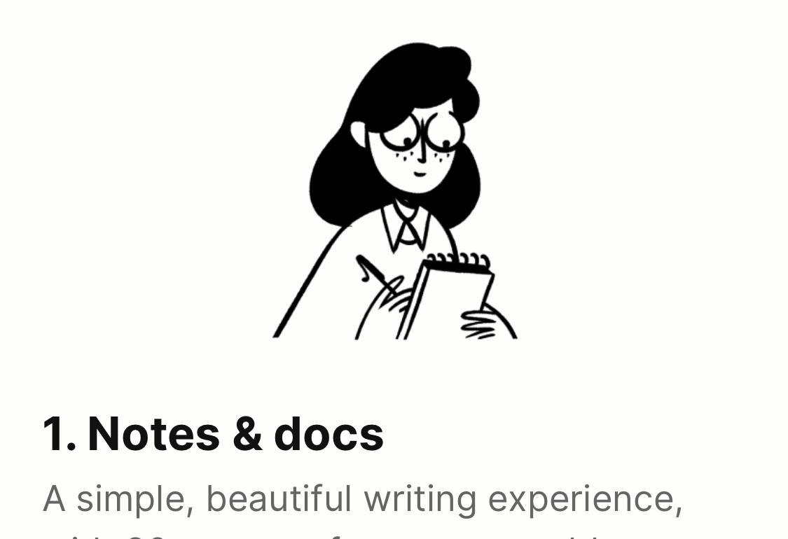
The tabs on the home page have illustrations above them. Each person is doing something related to the tab: Writing, learning, sorting.
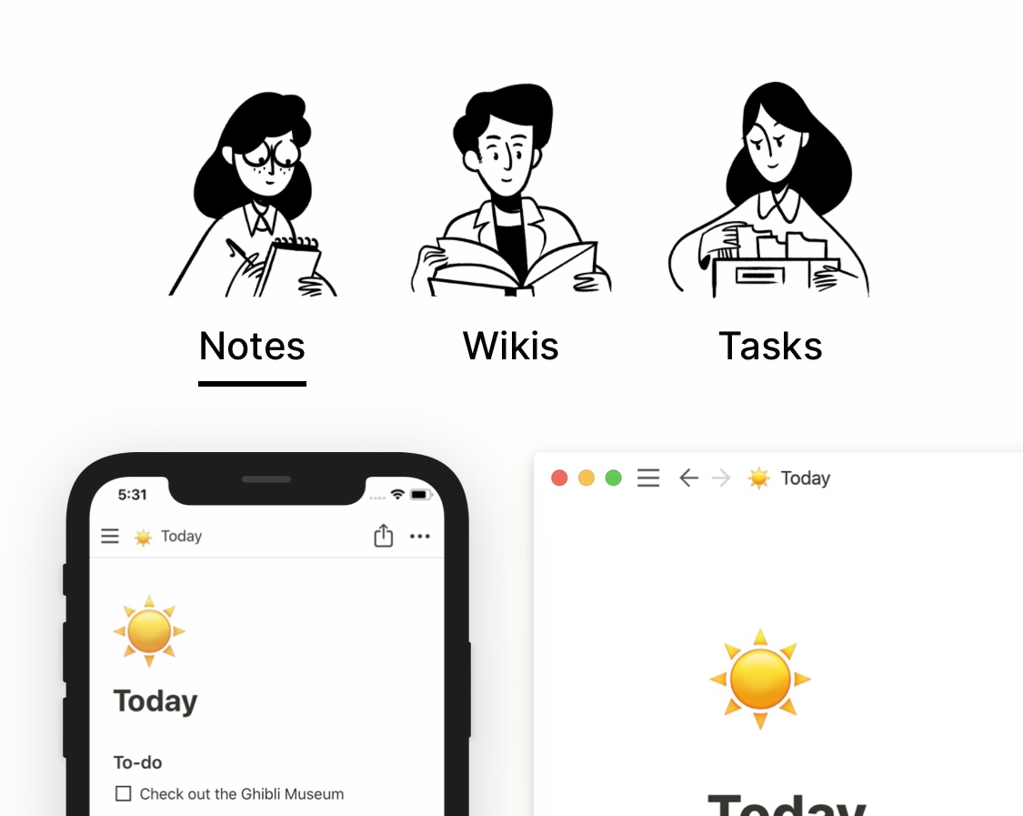
These images are repeated when you get to the relevant section later on in the page, even though the two sections aren't linked in any other way. Consistency of illustrations is nice for reinforcing a theme, even if most people won't pay attention to the illustrations in the first place.
On mobile, large images aren't crammed into the small screen. When they reach a certain size they continue off the edge of the screen. The user can swipe them to bring them into view, which is intuitive and, thanks to a bouncy animation, fun. This maximises visbility and engages the user.
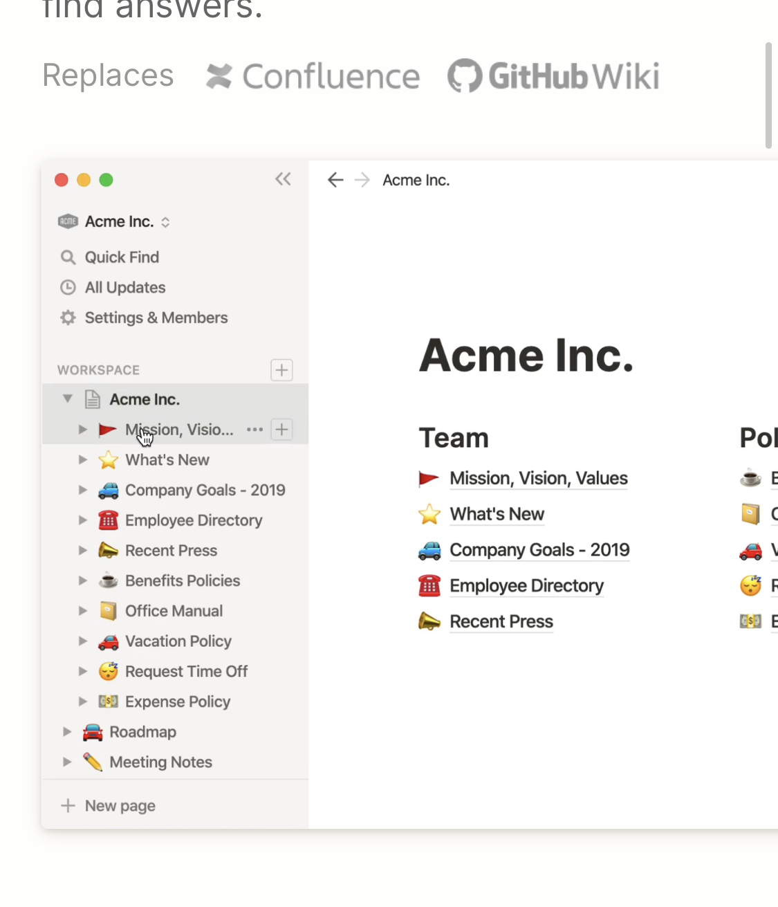
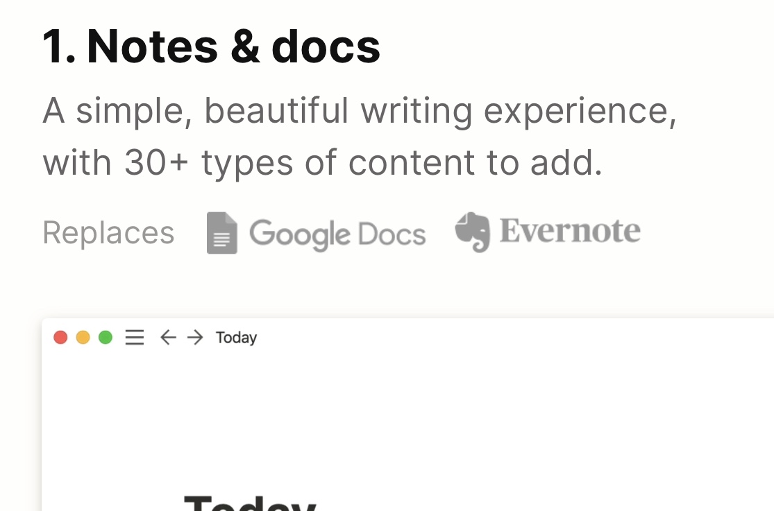
Each feature section mentions which of Notion's competitors that feature can replace. Notion aren't afraid to challenge their competition, which we'll see more of later.
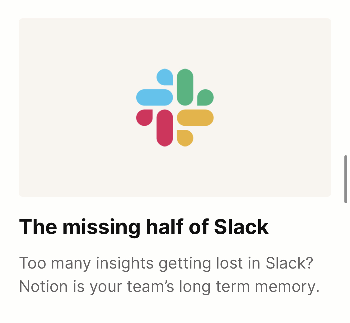
They're also not afraid to admit what they can't do. Notion doesn't offer real time chat, so they position themselves as Slack's other half. The message is clear: If you have Slack and Notion, you have everything you need. Notice also that Slack's logo is in colour. The competitors' logos are greyscale.
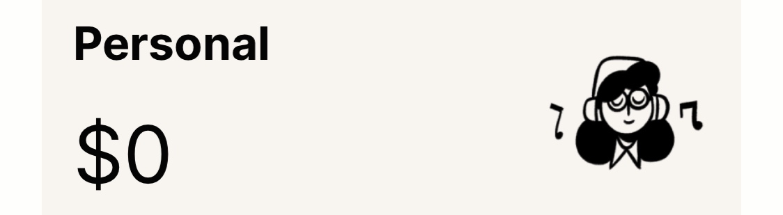
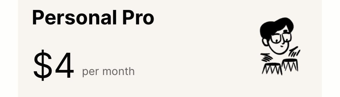
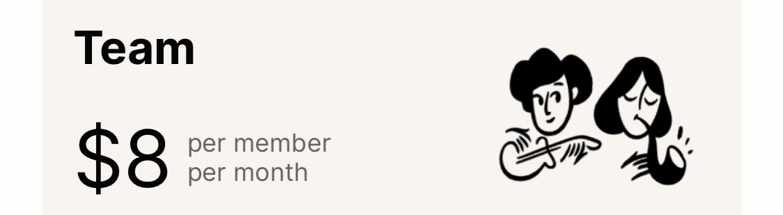
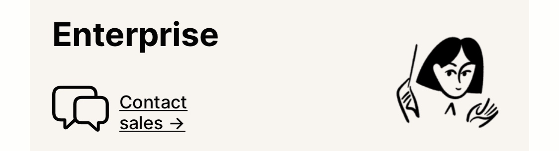
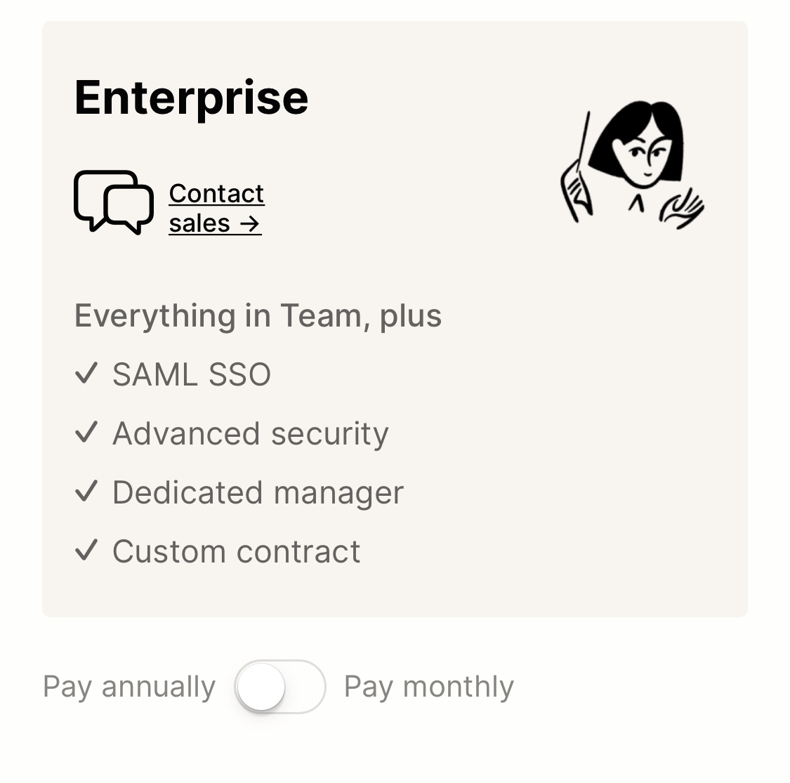
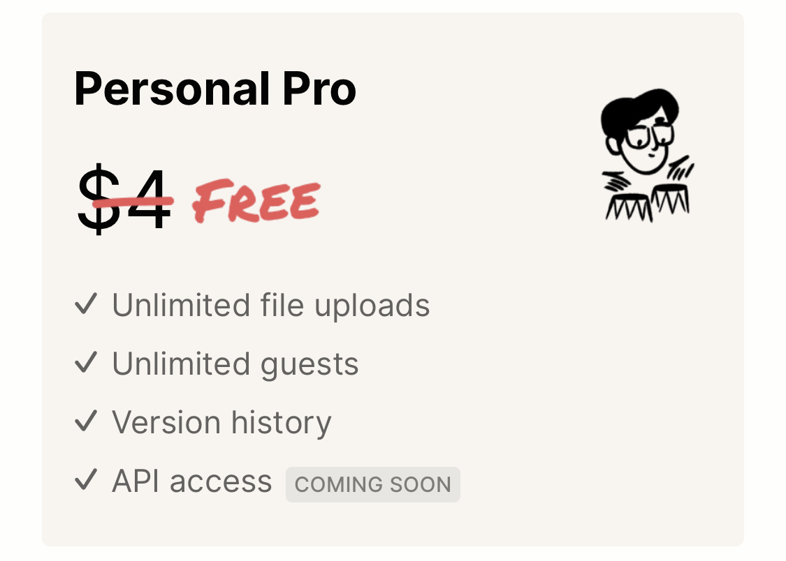
Clever illustrations continue on the Pricing page. Each tier of subscription is represented by people involved in music. The personal plan is someone listening to music on their own. They're consuming. Personal Pro is someone creating music with drums, but they're still alone. The team plan is two people making music together. They're jamming, so it's still casual. The Enterprise plan shows a conductor. It's one person, but you immediately know that they're leading an entire orchestra, which is serious business. These illustrations suit the purpose of each plan very well.
Attention to detail can always be turned to darker patterns. The annual/monthly toggle could be at the top of the pricing list, so people immediately know the prices are for an annual subscription. Instead, Notion put it at the bottom of the list, and made sure it doesn't stand out by avoiding colour or emphasised text. A bit sneaky.
Throughout the website, if there have been any recent changes to important details, these are shown as if someone has taken a red pen and corrected them. As well as being the colour we associate with corrects, red also stands out a lot, grabbing our attention.
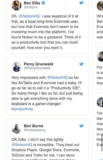
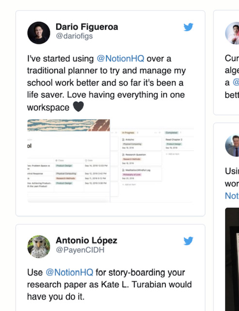
Notion is very good at social proof. Most pages have a grid of Twitter posts towards the bottom, but they're not random. These Twitter posts, on the "Students" page, are all from students talking about how they use Notion at school.
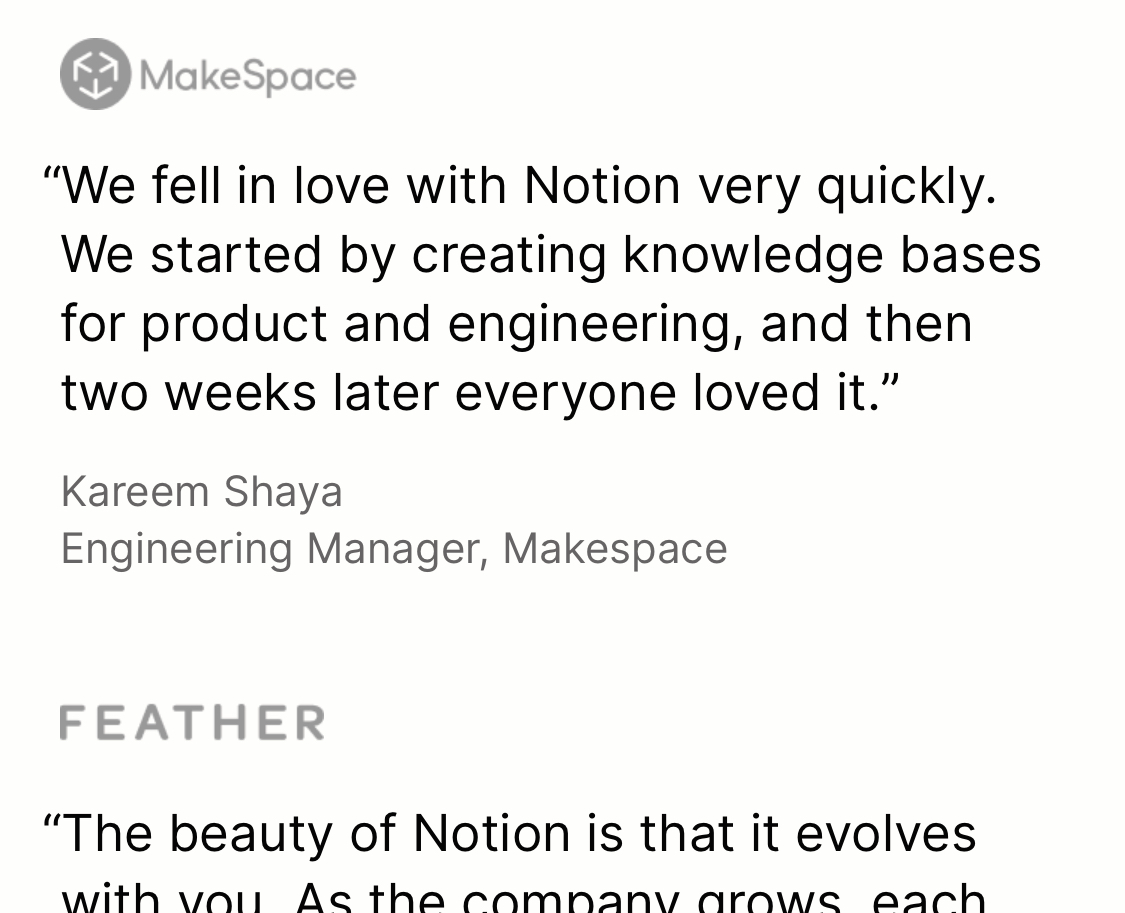
Most pages also have quotes from companies that use and love Notion. On almost all pages, the logos are greyscale so they don't grab the eye too much. Notion wants the focus on these pages to be Notion.
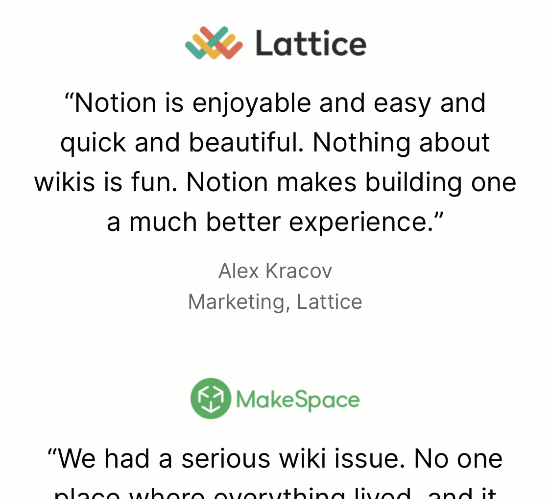
On the Customers page, however, the customers are the focus. Suddenly their logos are in colour.
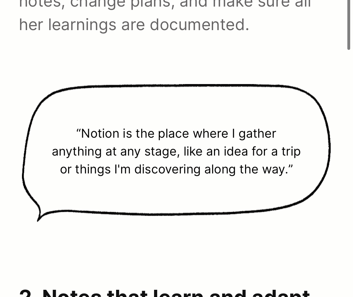
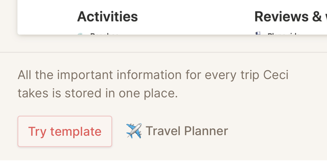
There are also full pages dedicated to stories from individual users. Unlike the quotes from companies, which are more structured, the quotes in these customer stories are wrapped in a speech bubble. Since you're in the context of a person's story, you don't need to see their name under every quote. It also gives the quote a more personal feel, which suits the purpose of the page.
These stories tell you how a person uses Notion to organise their life. Under each use case, Notion cleverly gives you a "Try template" button. This loads a demo of Notion where you can immediately be living your best life, like the person in the story. No sign-up needed.
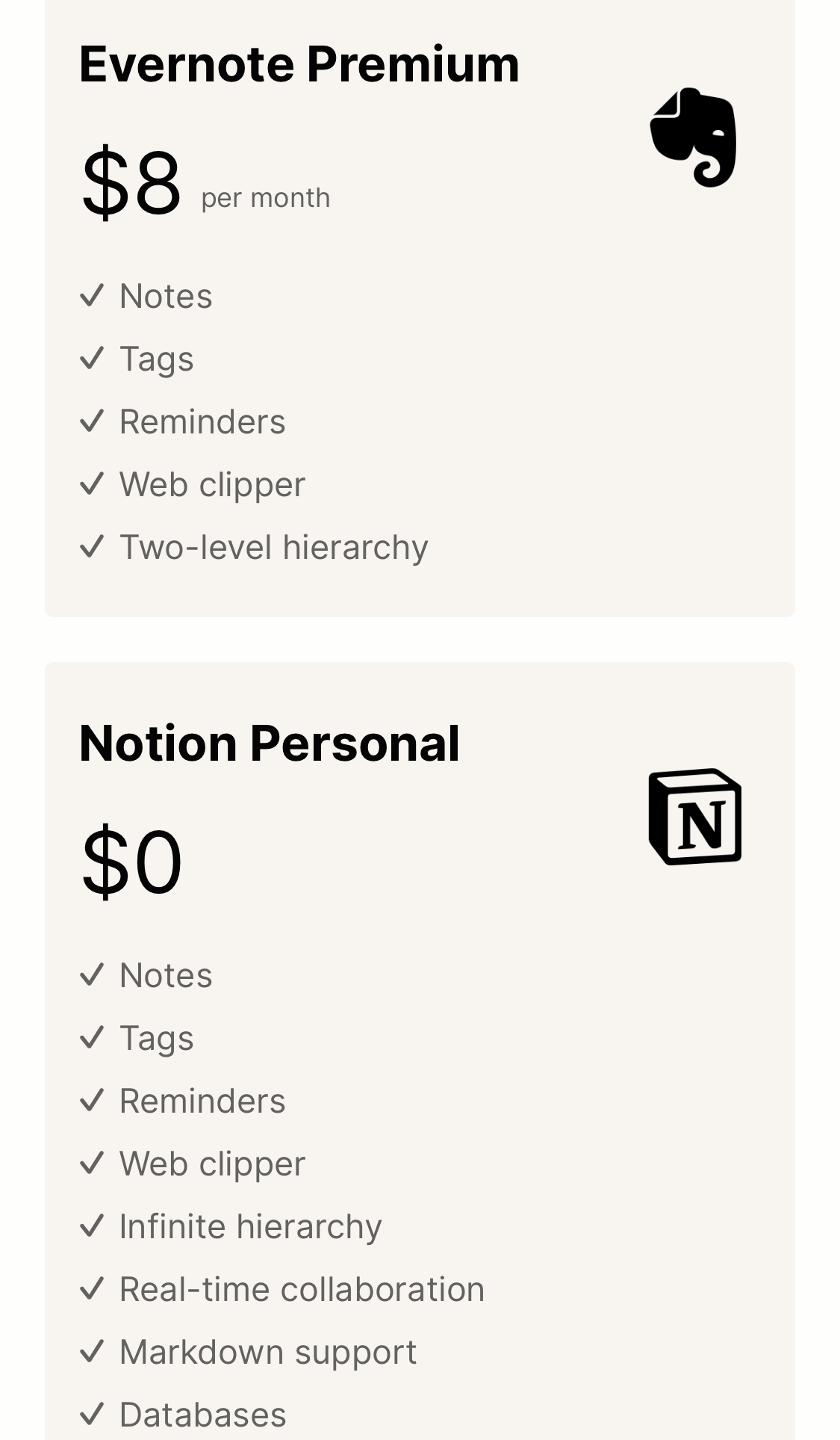
I mentioned above that Notion isn't afraid to challenge their competition. They've dedicated an entire page to Evernote. The pricing and features comparison is very direct.
Better yet, for the Social proof section they found Twitter posts from people who have switched from Evernote to Notion.