Hey is the new email service from Basecamp. I've already looked at Basecamp's website for Attention to Detail, and found lots of love. I'm not surprised the same minds brought us lots more.
Always have to give thanks for their using the word "Menu" for the menu. Hey's logo is a very nice hand-drawn hand, shown here in the header.
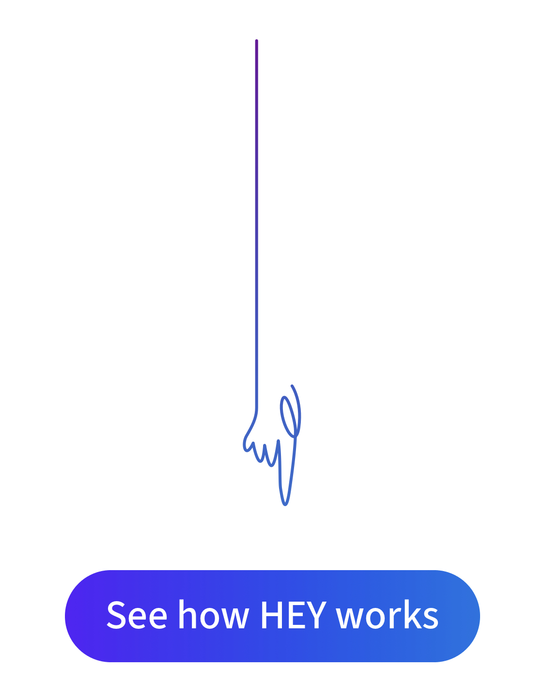
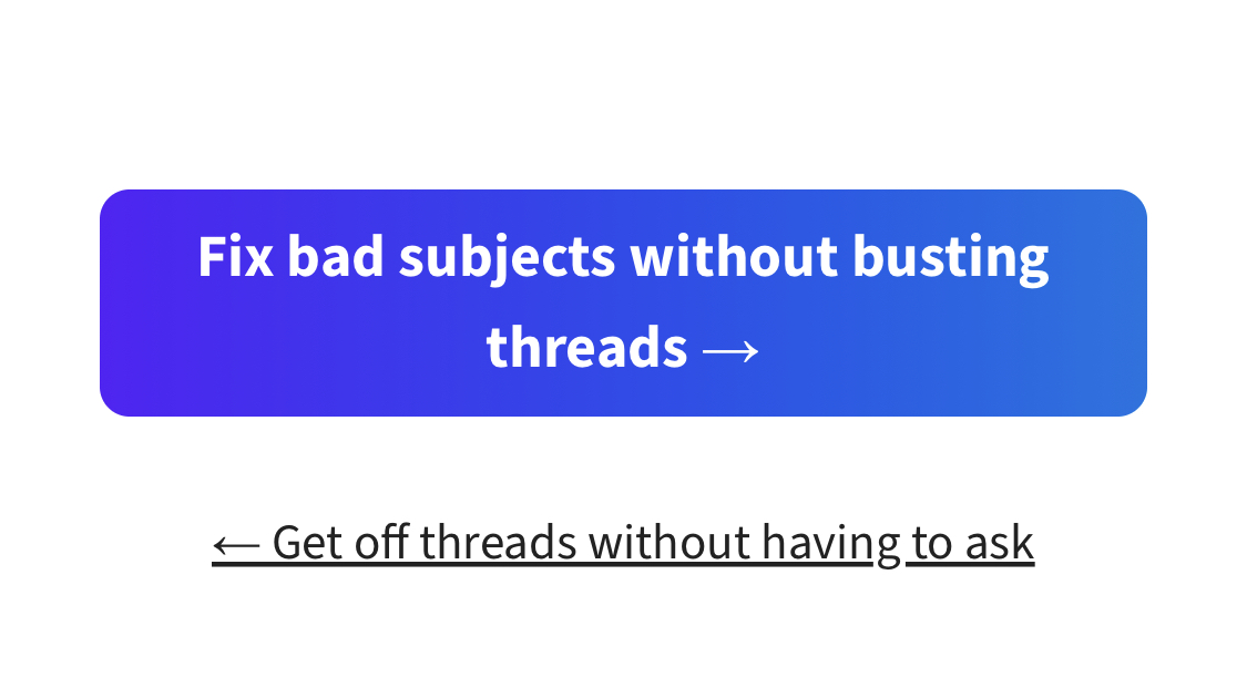
They use the hand as a motif, but they don't overdo it. Here it is used as an aid to guide your eye to the call to action. Very classy.
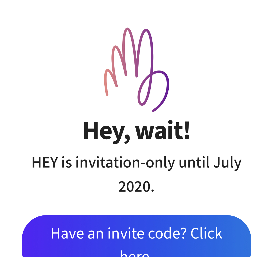
If you go to the Sign Up page, you're told that you can't sign up yet. They've got the hand drawn hand here, but it's not the same as the logo. They've redrawn it so that it's being held out flat - like someone telling you to stop. This suits the message on the page.
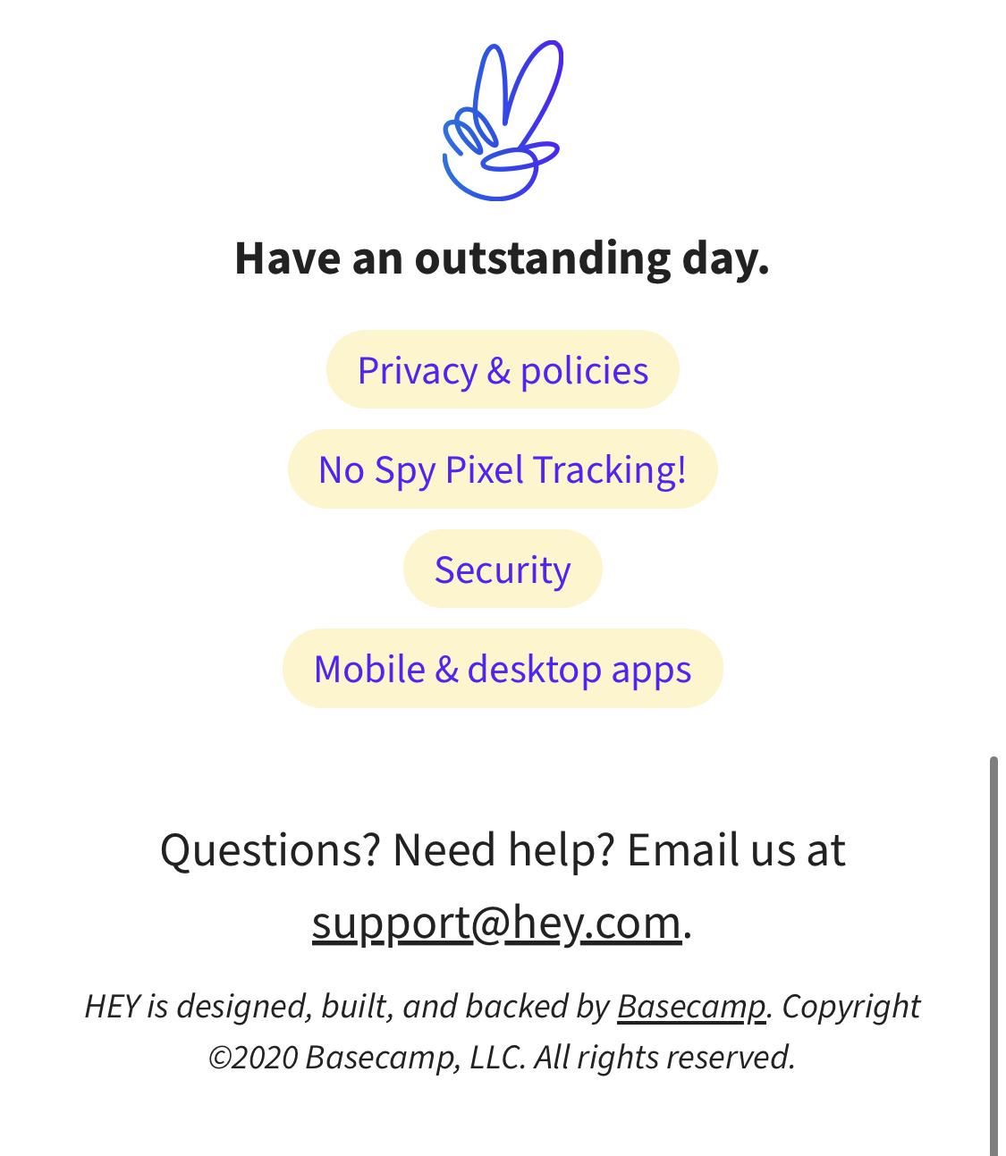
Finally, they've used it to make the "peace" sign in the footer. Speaking of the footer, it's refreshingly light, and works very well on mobile.
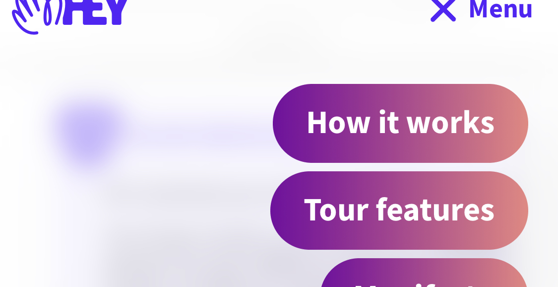
If you open the menu, you see that the buttons have a purple-to-coral gradient applied.
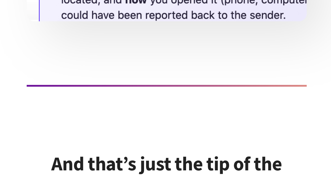
The same gradient is applied to the dividers on the site. This is an easy but very snazzy way of setting up some brand colours/styles and applying them throughout the site. Everything feels like it fits together, but as the user you don't necessarily notice it.
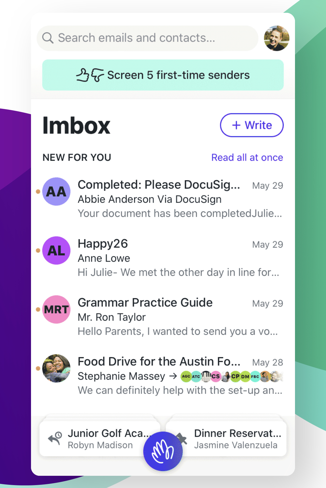
The first page of the product tour shows you a mobile-friendly screenshot if you're on mobile. This is quite impressive - most website shrink the desktop screenshot down so it's too hard to see, or they keep it medium size and let you scroll it back and forth. Hey realised they could show the same product features on a smaller screen.
The feature tour section of the site lets you click from one feature page to the next using these buttons. One interesting thing is that on a larger screen, these "Next" buttons have fully rounded corners. On a smaller screen they're seen as below, with less-rounded corners. I assume this is to fit text on two lines more comfortably.
Speaking of clicking through, you can read the Hey website almost like a book. There's lots of text on each page, and when you reach the end of a page you're given a link to the next page in the site ("Discover The HEY Way philosophy"). You don't have to scroll up to use the menu if you want to keep reading.
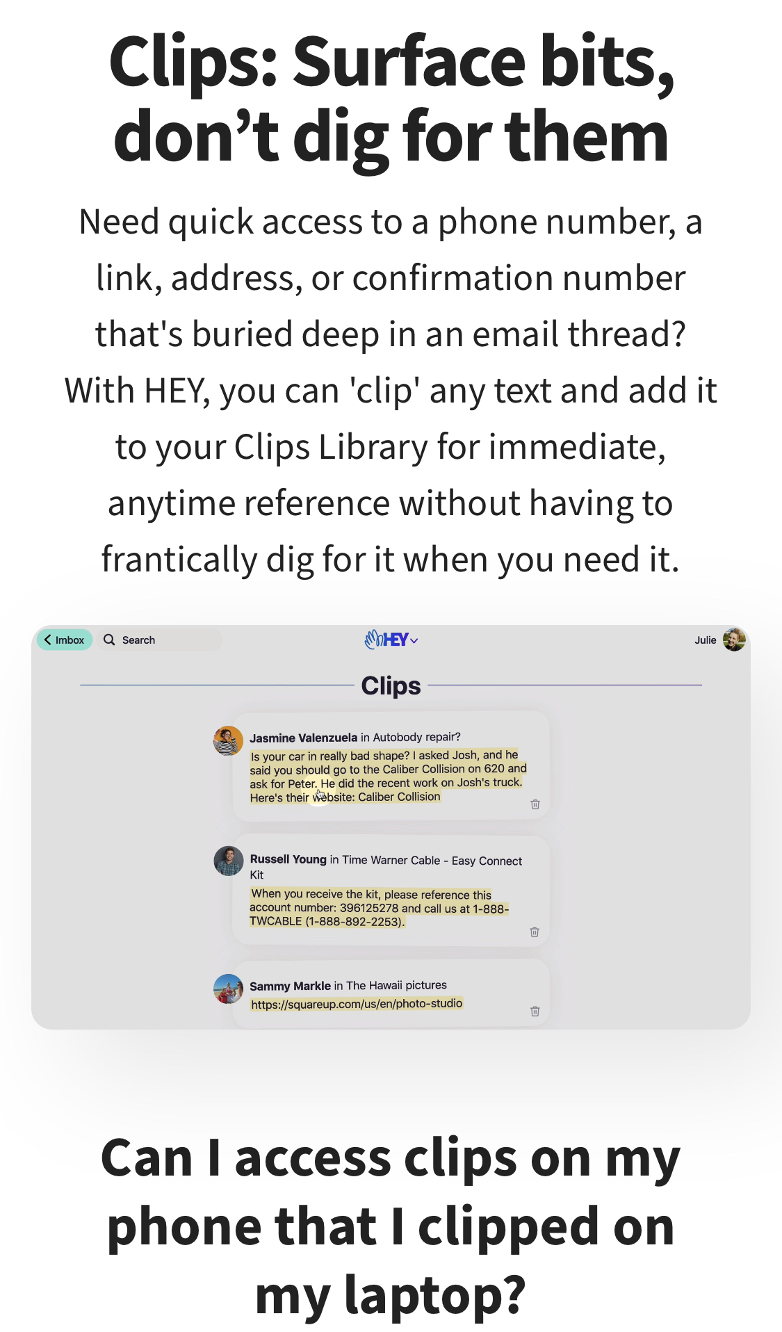
Instead of cramming feature information into one page, Hey gives each major feature its own page, with a video walkthrough and frequently asked questions. Switching email to another provider is a big decision for some (Especially if they're using a free provider currently), so there's lots of detail to put people's minds at rest.
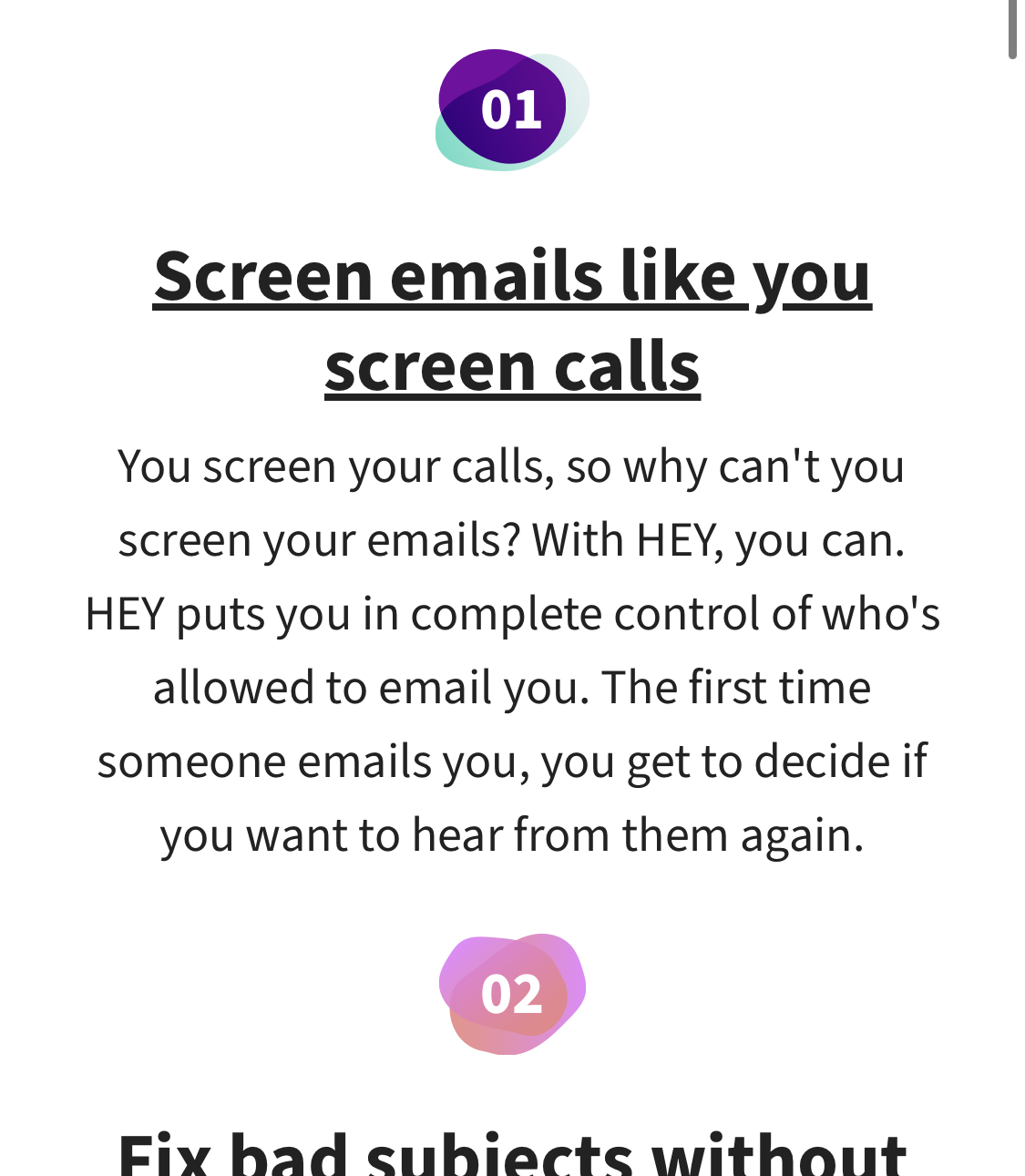
On the starting page for the feature tour, Hey keeps the list fresh by using these simple and colourful shapes for each number. Another opportunity to include brand colours.
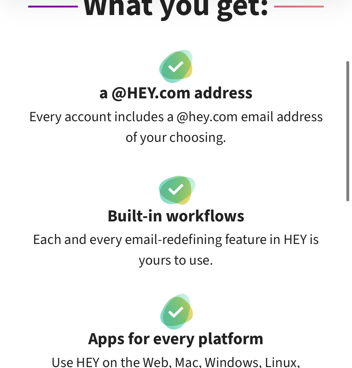
When you get to the pricing page, the same approach is used. Since these are all ticks, each "blob" is green, to back up the positive nature of the content. And you'll notice that each blob is still a different shape. Attention to detail indeed.
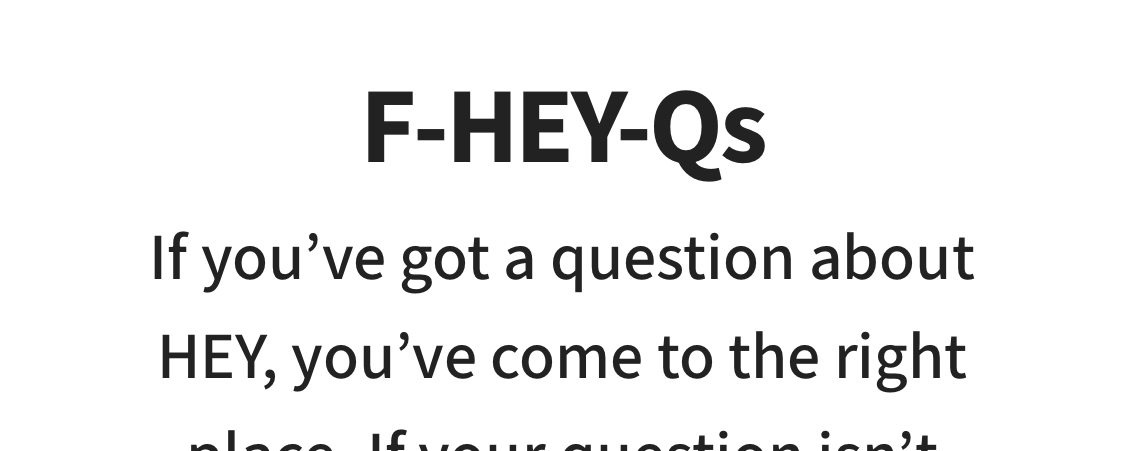
I liked these cheeky language tweaks to keep things on brand even without visuals. Something as simple as replacing the "A" in "FAQ" with your product name can go a long way to giving people a certain impression of your company.
I don't know if I've ever seen this before: The question for each question-and-answer is highlighted with brand colours. This separates the question from the answer enough that you don't need to put any space between them. This saves vertical space and makes the page flow better.
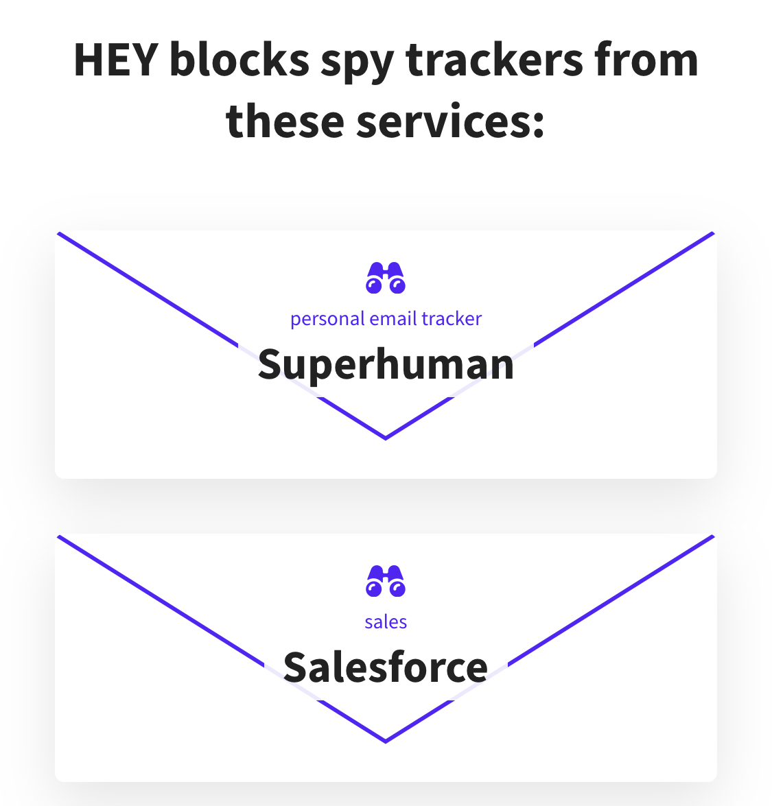
Finally, for each of the services that Hey blocks spy tracking pixels from, they've put the name of the company in front of a simple envelope. This could have a simple bulleted list, but using a graphic like this makes this page that much more interesting, and takes almost no effort to put together.