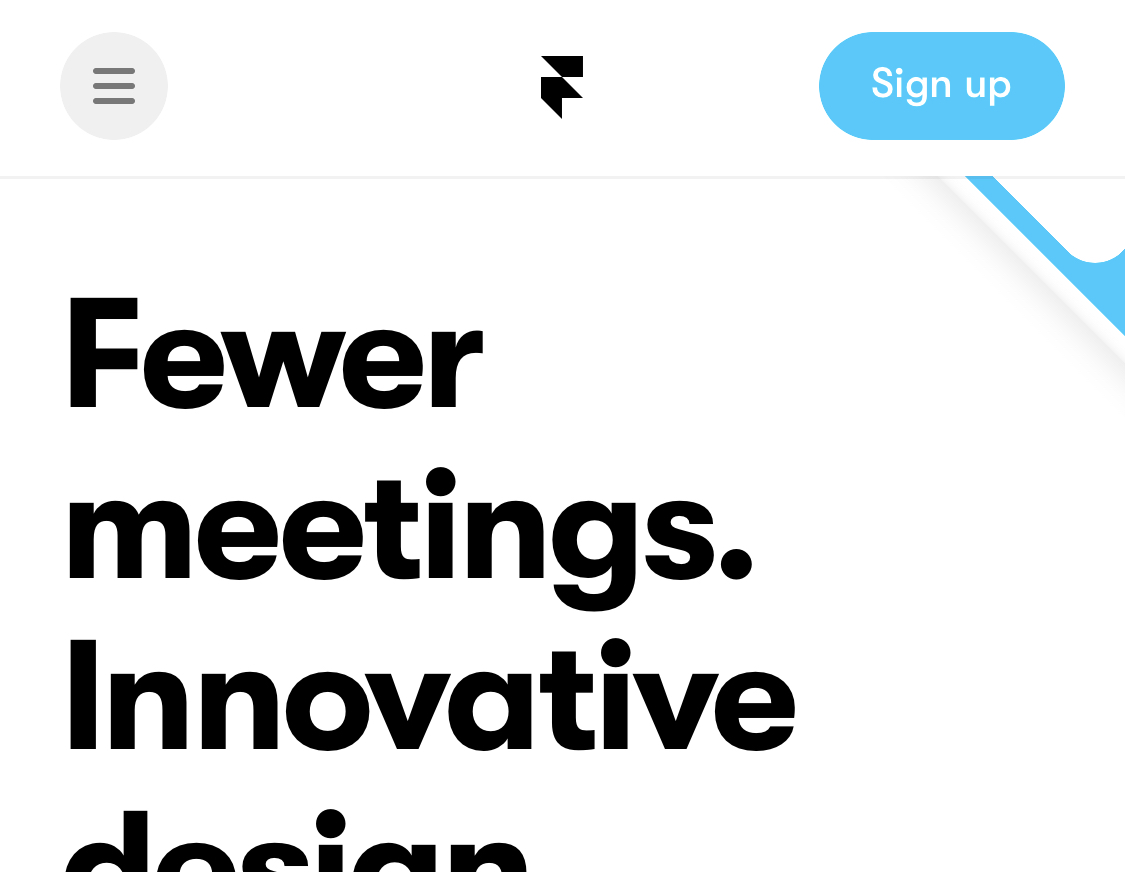
Framer's web design is big and bold. Look a little closer, though, and you start to notice all sorts of details.
The first thing I love is that framer puts a background shape behind its hamburger menu icon. They at least took the time to make it look like something you can tap.
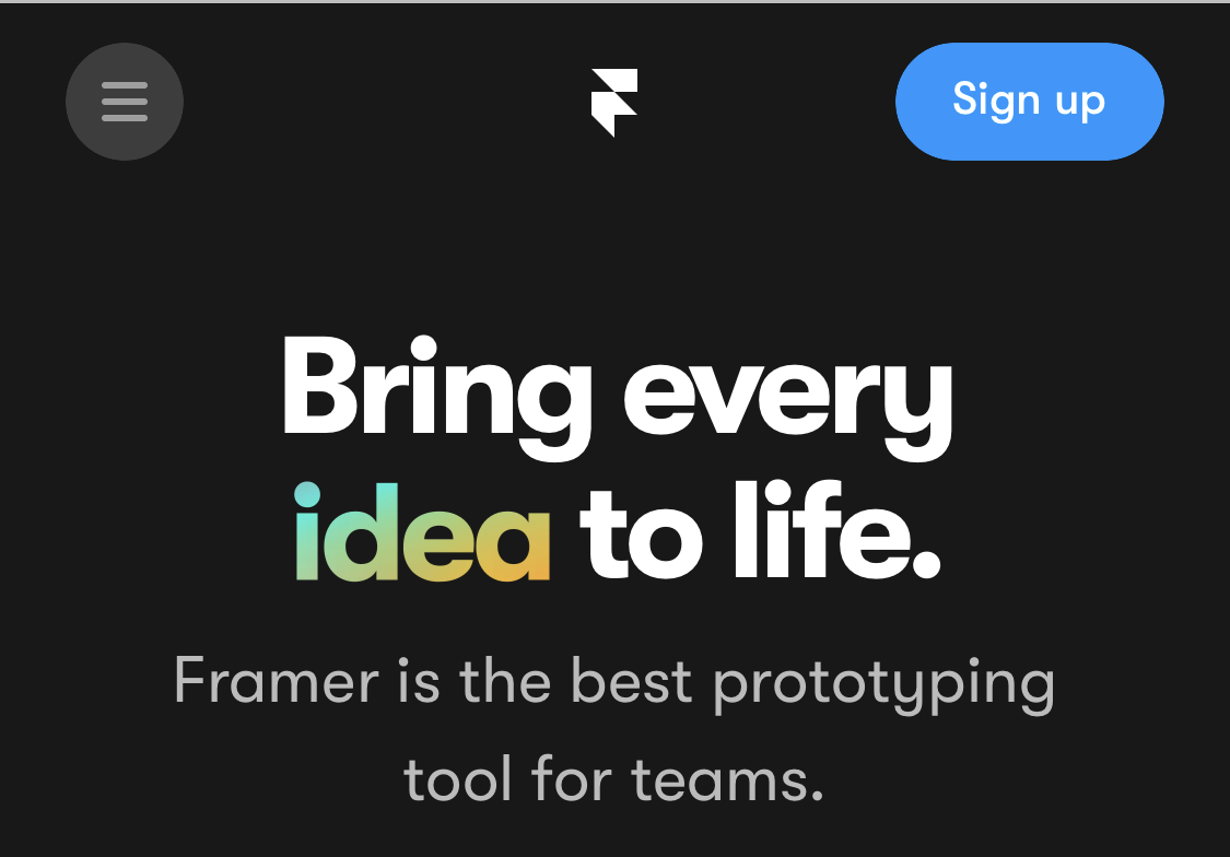
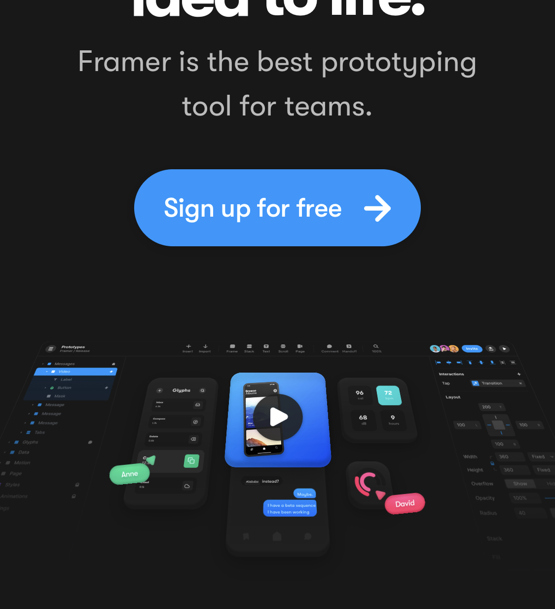
The word idea in the hero copy starts out white, but every few seconds it ignites into colour. This represents bringing the "idea" to life.
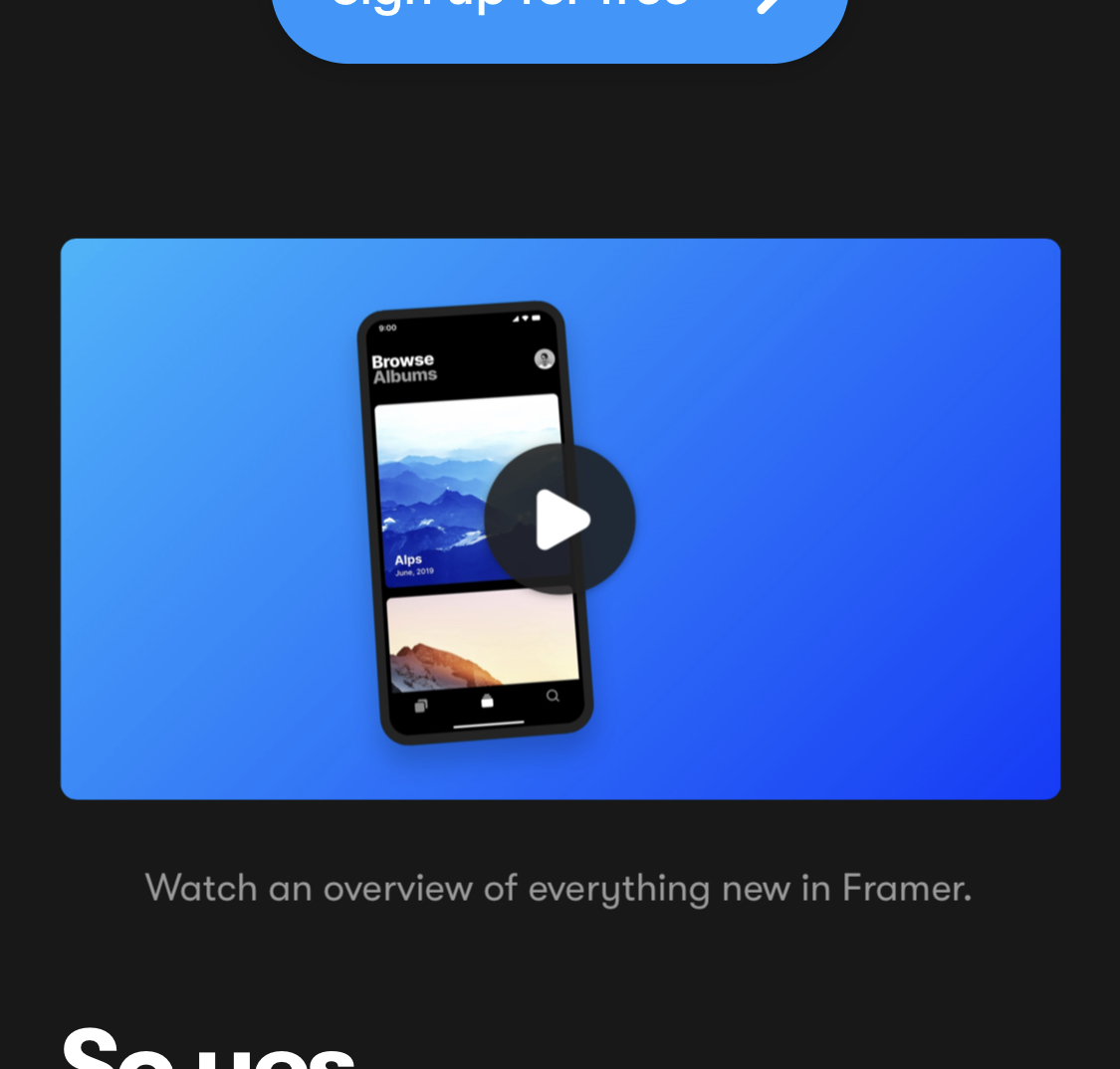
As you scroll down the page, you see this collection of objects leaning back as if they're looking at/underneath the hero copy. As you carry on scrolling, the blue square jumps forward and becomes a more traditional-feeling video player. This helps anyone who wasn't sure what that collection of objects was to know what to do with it. Thoughtful scrolling effects will come up again later.
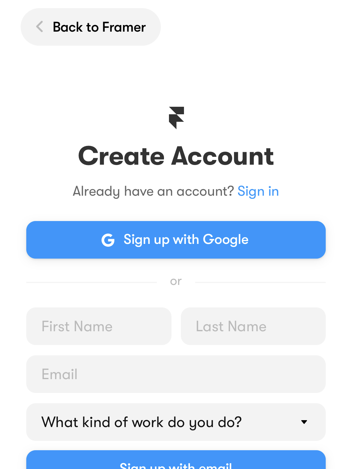
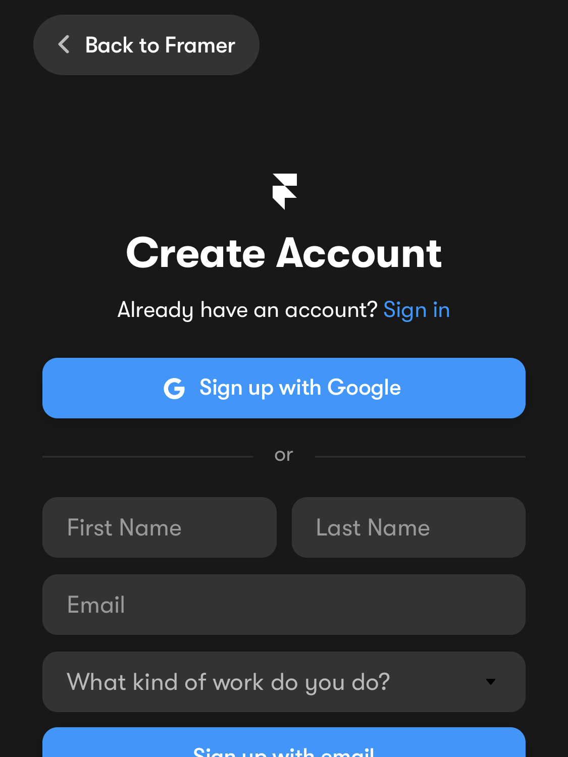
If you tap the "Sign up" button, you get taken to a sign-up form. The page changed from light to dark depending on whether I had dark mode turned on in my iOS settings.
Framer's design makes fantastic use of colour. It's not so much for "theming" features, as seen in other case studies, but more for impact as far as I can tell. This pairing of icon accent colour with text accent colour is a simple example that makes the list seem that much more "together".
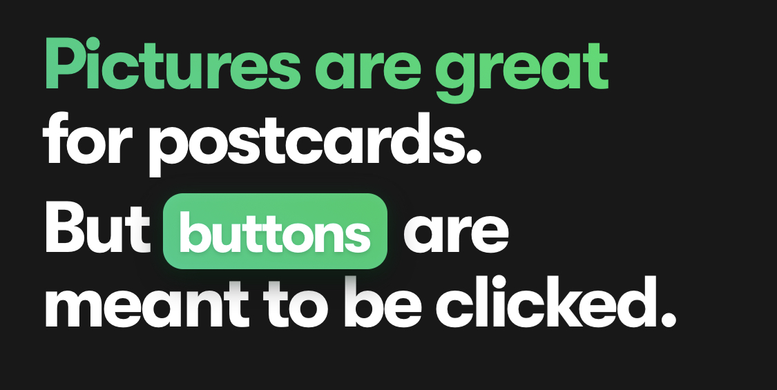
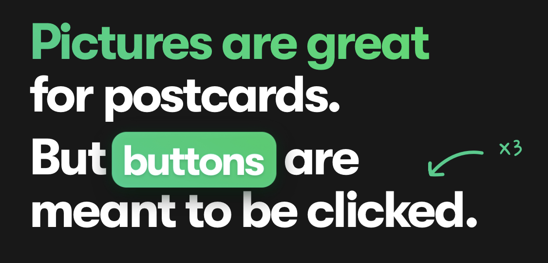
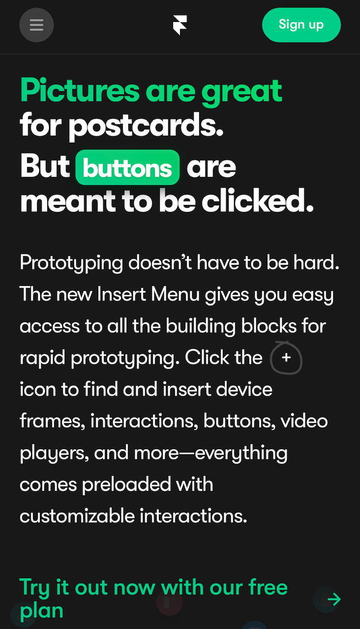
The hamburger menu background shape proves that Framer is being careful to show when things are tappable. I was a bit disappointed when I saw this fake button in a title. Then I thought I should check to be sure, and tapped it. Even this fake button is a real button. It adds a fun detail to the word "clicked" every time you tap it.
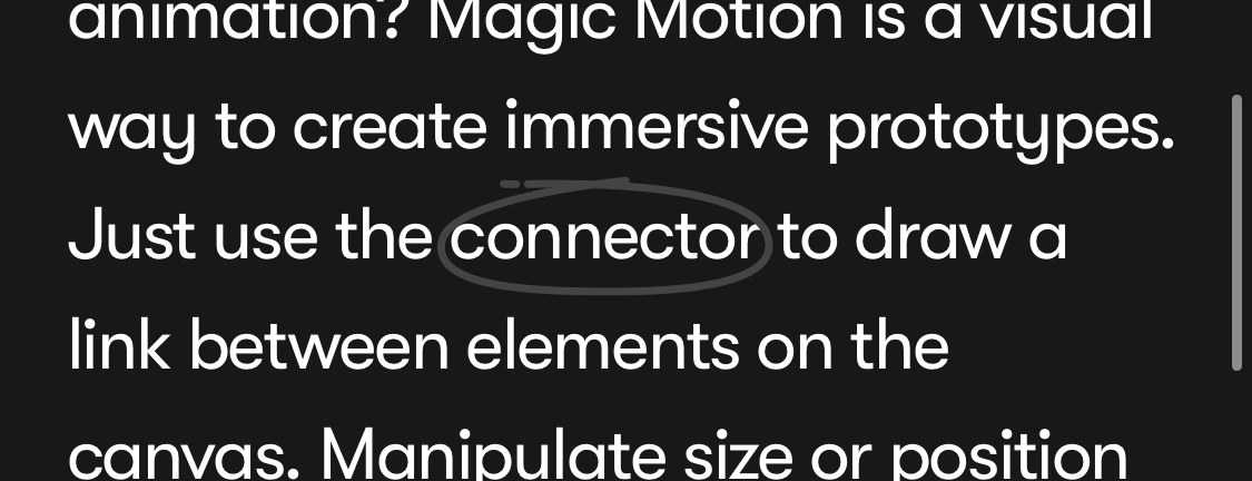
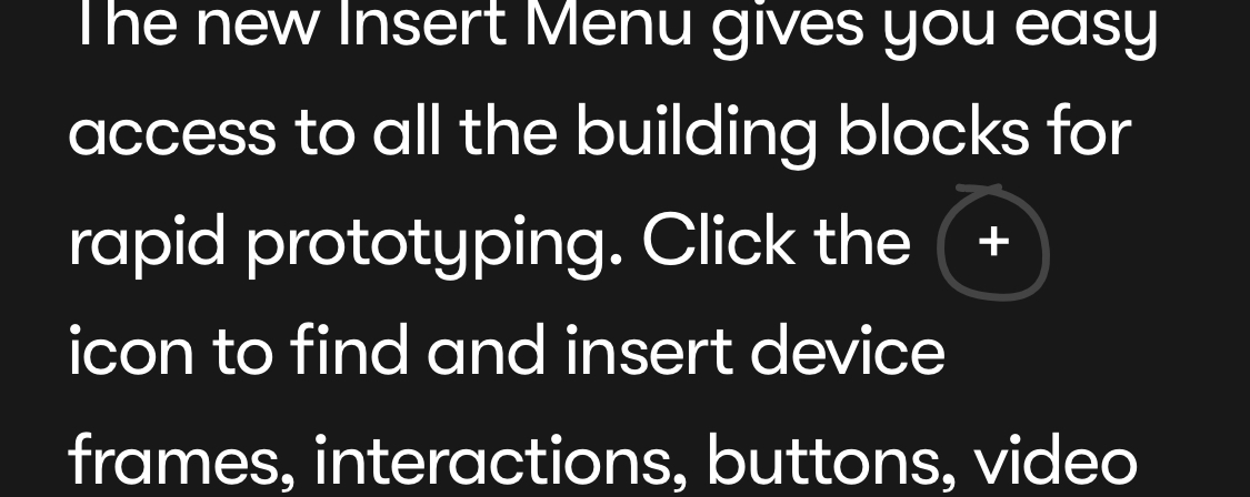
If any copy makes a reference to a feature or concept in the Framer software, it's circled like this. A preview for any potential users, which gets them used to the concepts early.
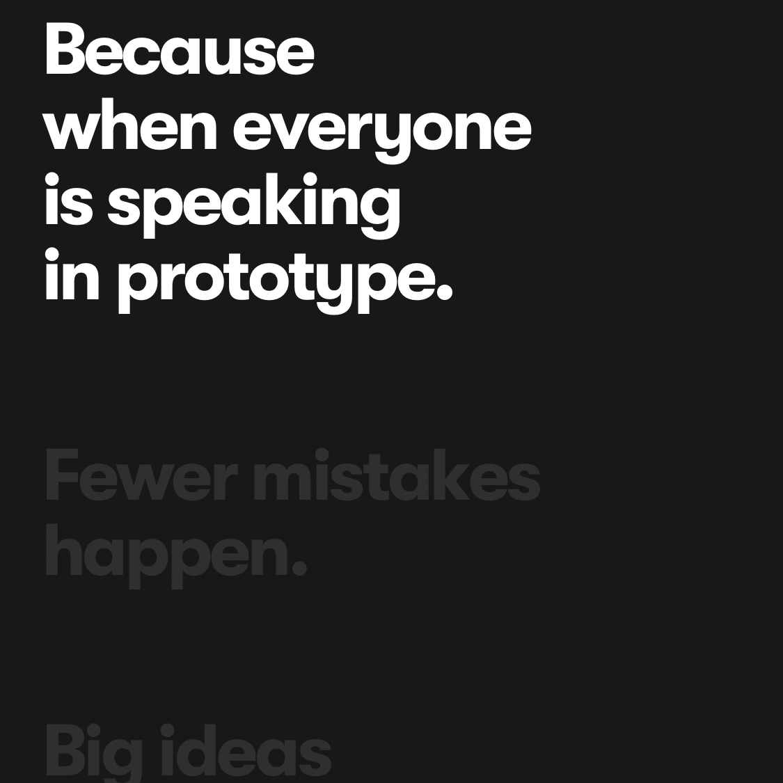
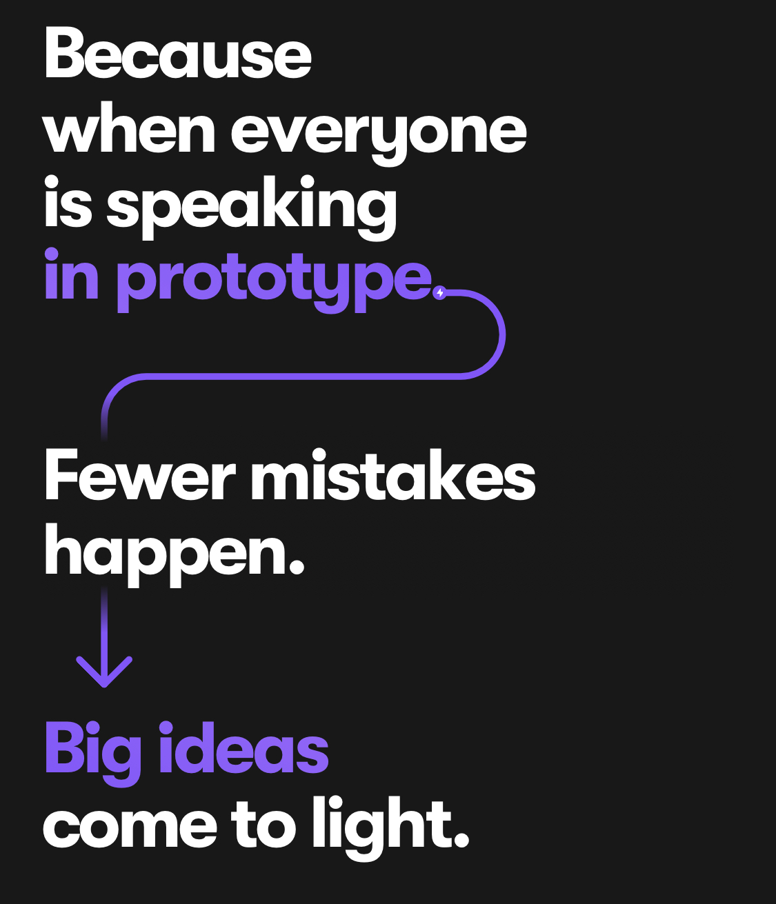
Here's another example of thoughtful scrolling effects. Many sites hide things until you scroll down to them, which creates a big gap in the design until you get far enough. Framer de-emphasises elements instead, and then emphasises them when you scroll to them. This means you know what's coming, and still get the fun, engaging effect. In this case the arrows snake from one line to the next, and highlight them as it reaches them.
I mentioned Framer's handling of colour earlier. I realised eventually that the "Sign Up" button was being re-coloured every time the primary colour on the screen changes. Here it's changed to green.
The home page's background is all black, but here on another page the background starts off white, so the header navigation does too. Once you reach a part of the page with a black background, however, the header navigation turns black.
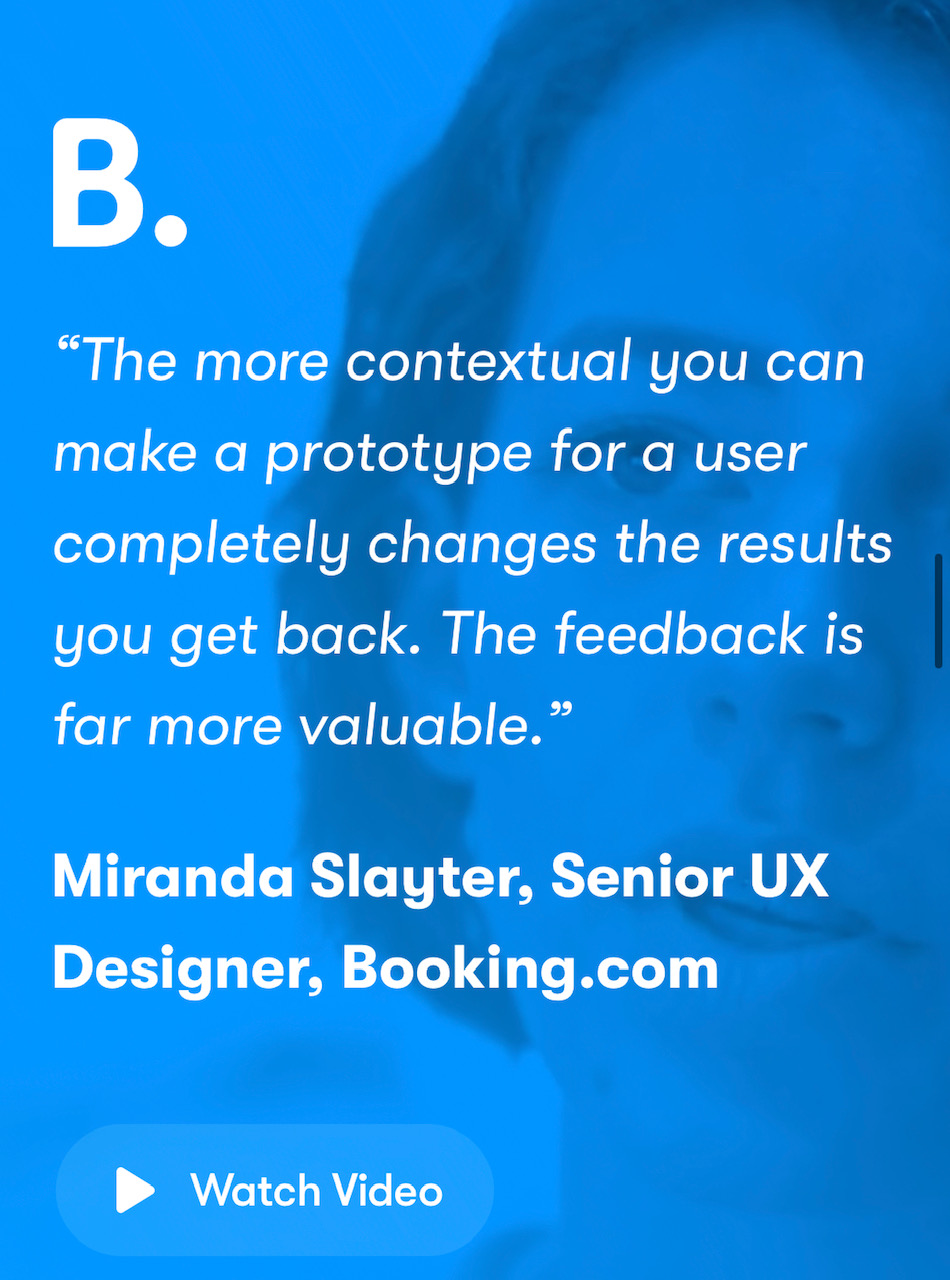
Customer testimonials are taken from videos, and Framer plays clips from the video behind the testionial. The movement catches the attention, without being too distracting while reading the text thanks to the heavy colour saturation.
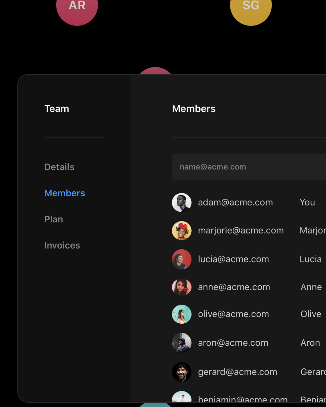
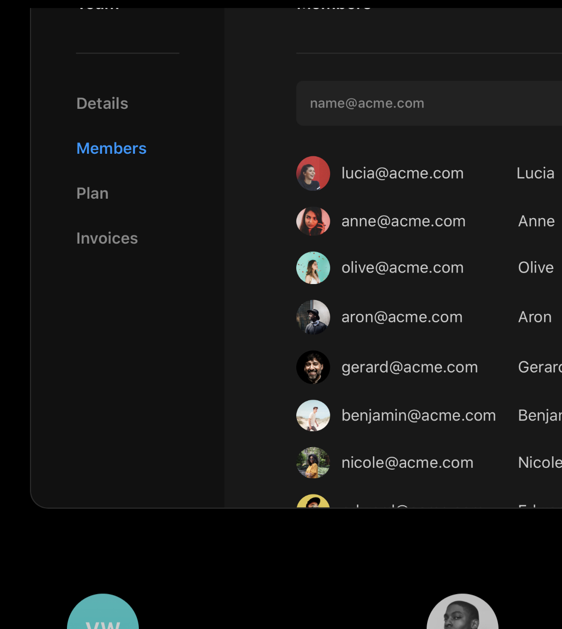
Another thoughtful scrolling effect that's easy to miss. This list starts off with "adam" at the top when you first see it. As you carry on scrolling past, so does the list in the image. In the next image you can see it's scrolled to the point that "lucia" is at the top instead.
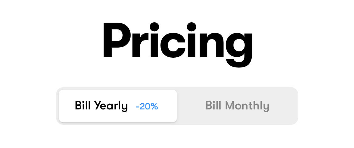
A clear way of showing the benefit of being billed yearly is on the pricing page.
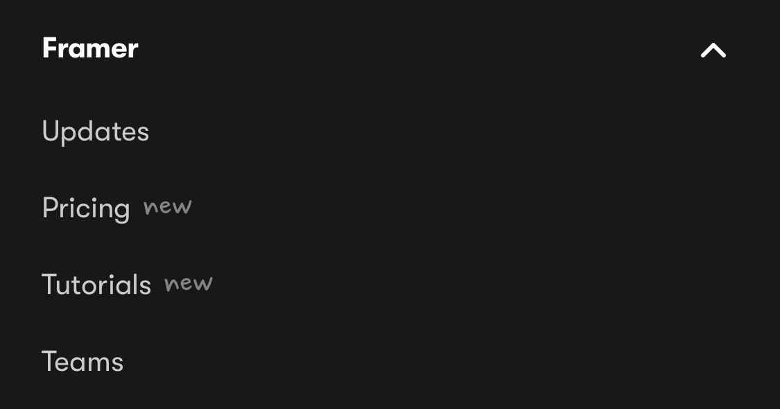
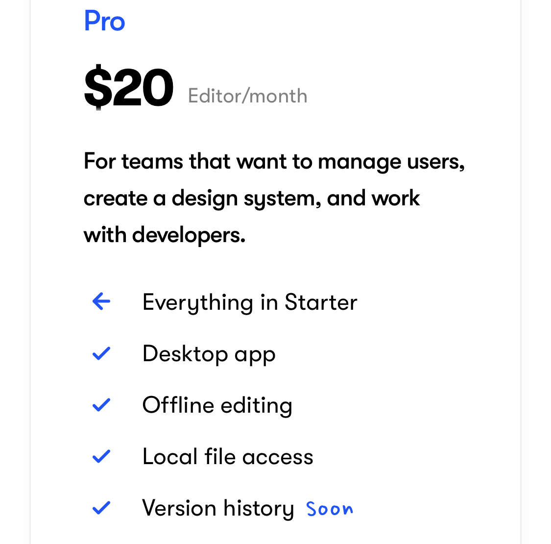
Framer likes to use a handwriting font to show temporary changes or notes throughout the site. Here a feature is marked as coming soon on the pricing page, which might sway a potentially buyer.
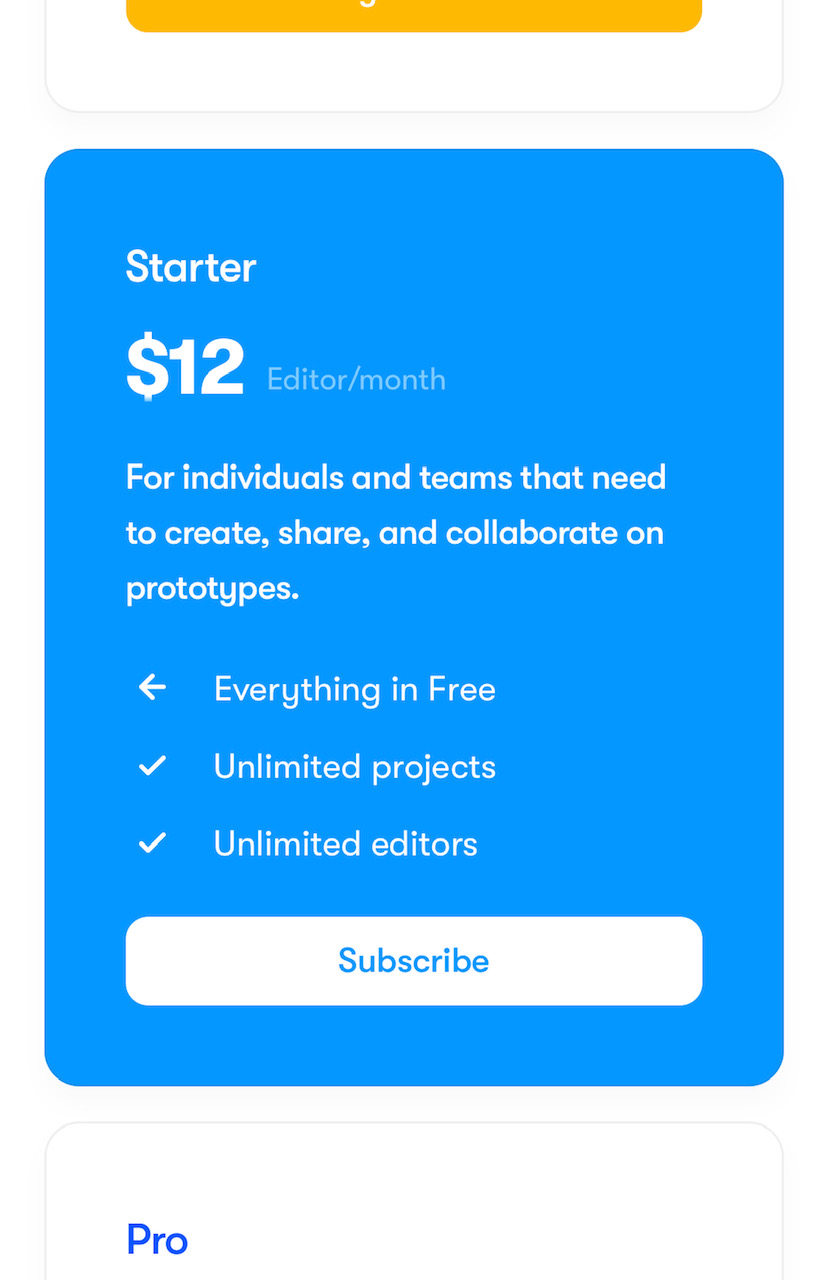
The "Starter" pricing plan is given a solid blue background, unlike the white given to all other plans. This is not spelled out anywhere, but I assume this is because the starter plan is the most popular. This mimics other pricing websites when they highlight their most popular plan, but more tastefully.
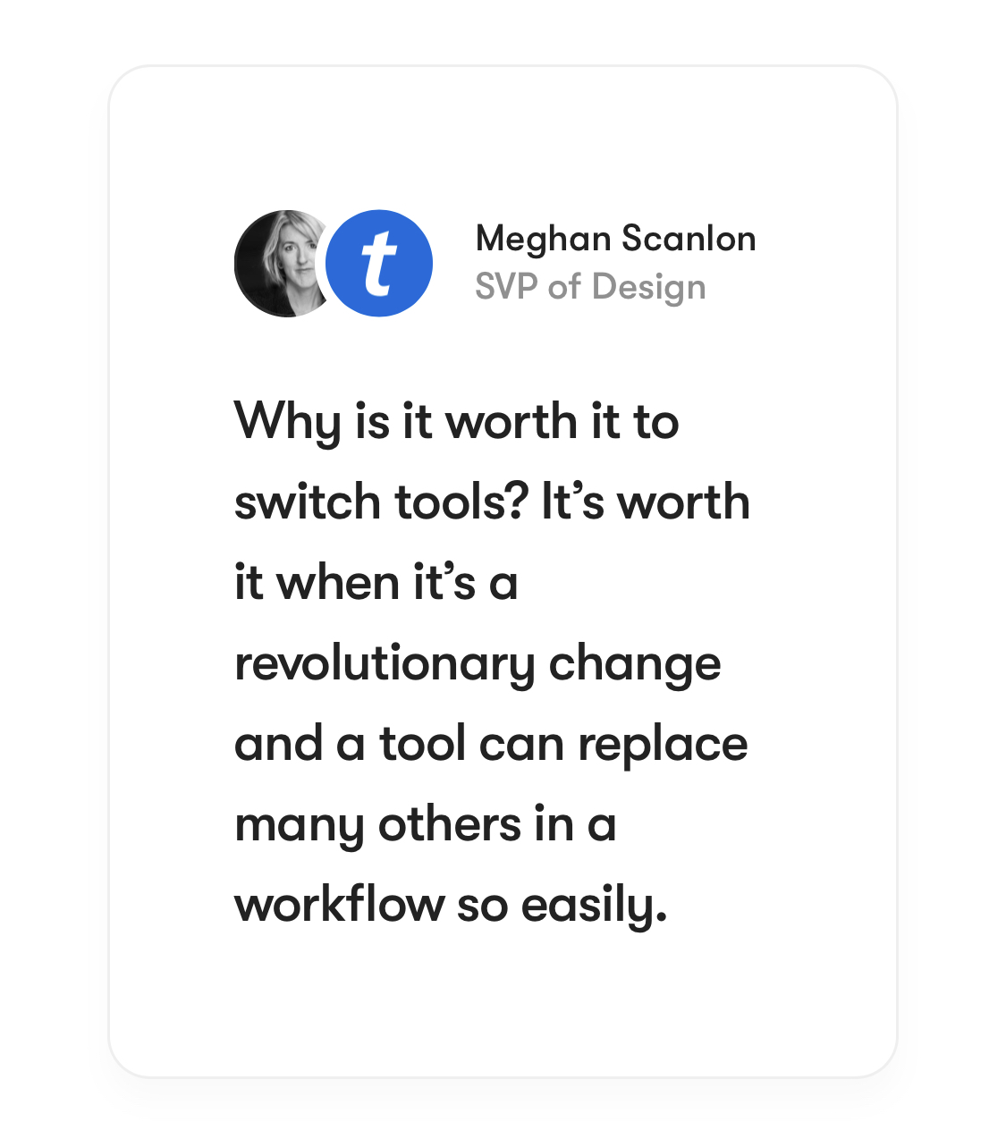
The pricing page features a much simpler testimonial design than the full screen video background used earlier. I imagine this is to avoid distractions.
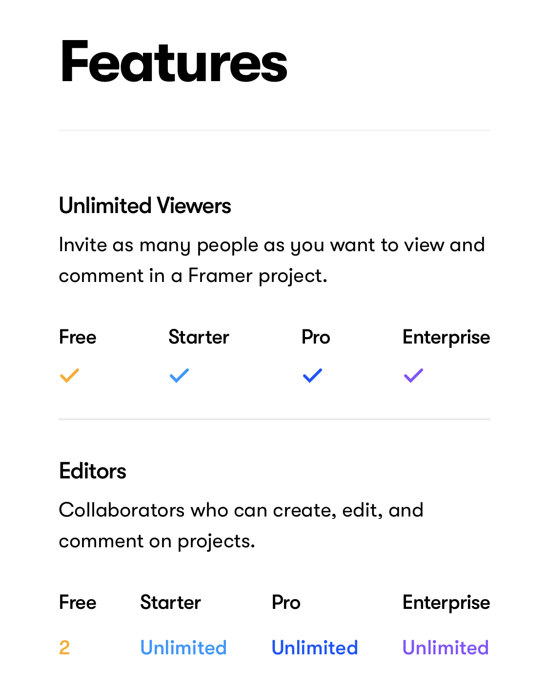
Towards the bottom of the pricing page you can also compare plans feature-first, which is a nice touch if you care about a particular feature or allowance.
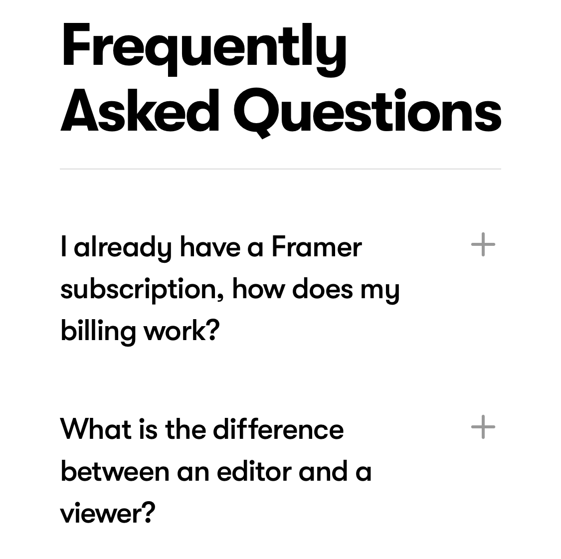
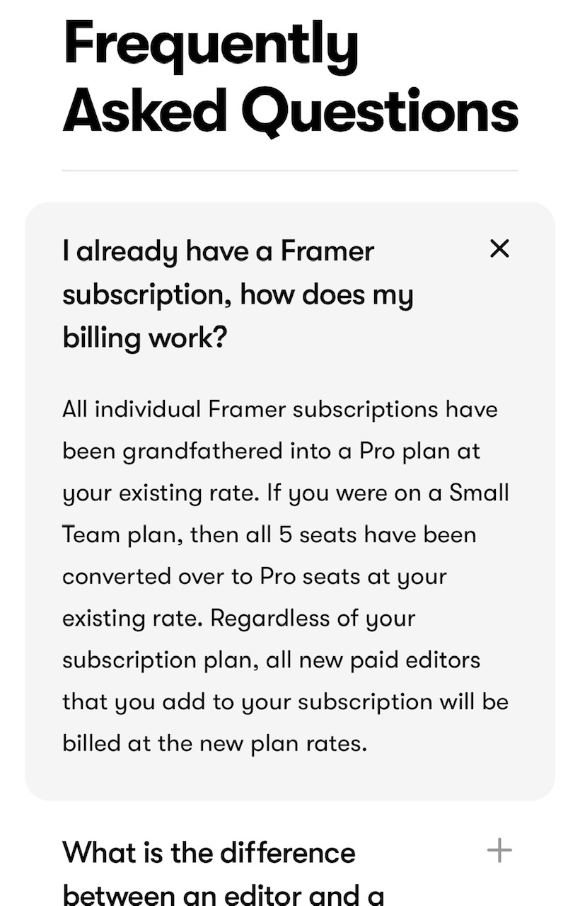
The FAQs on the pricing page start out as very simple text blocks. Once you expand one, the question and answer are given a subtle grey background to make the grouping clear.
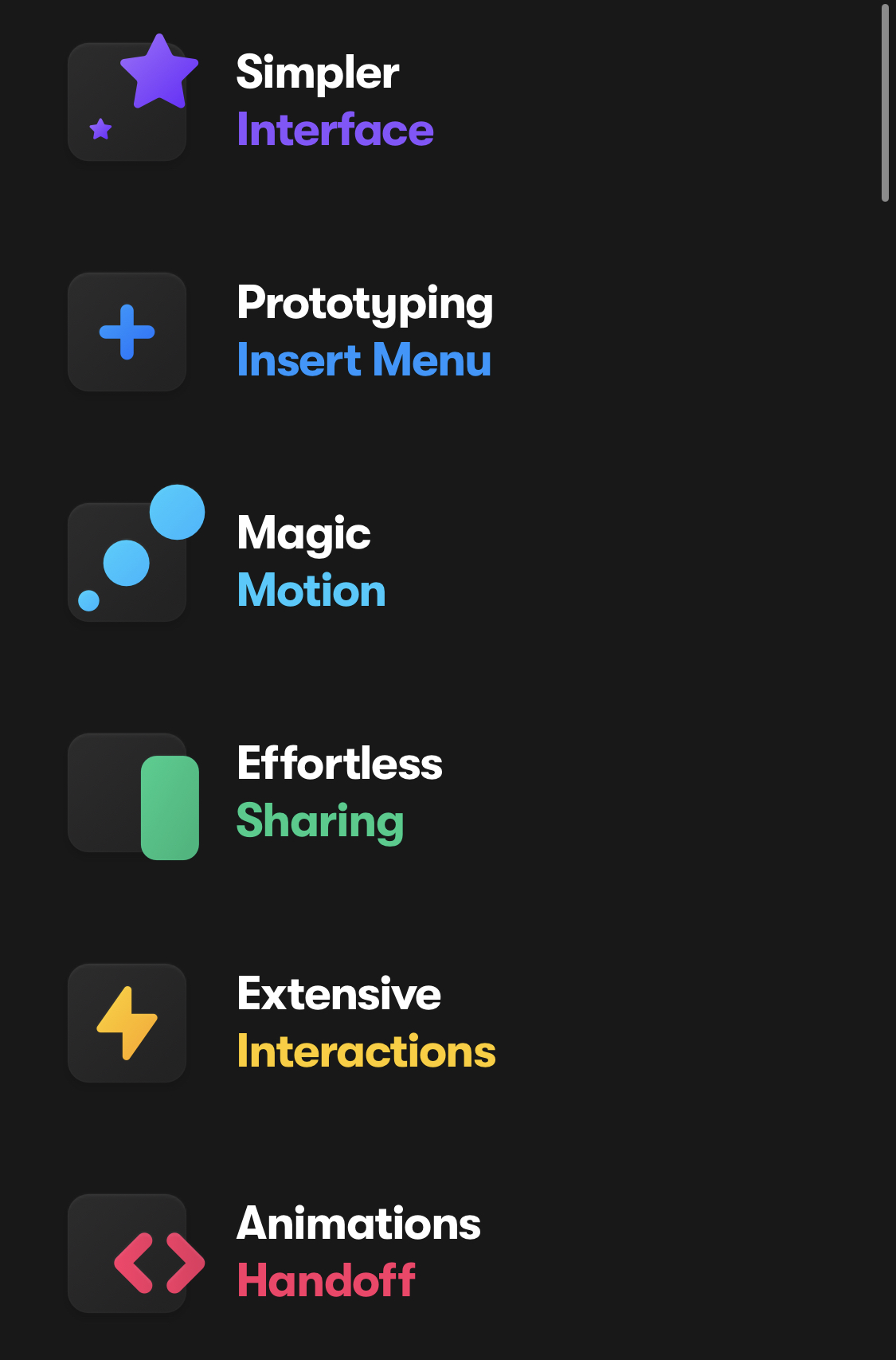
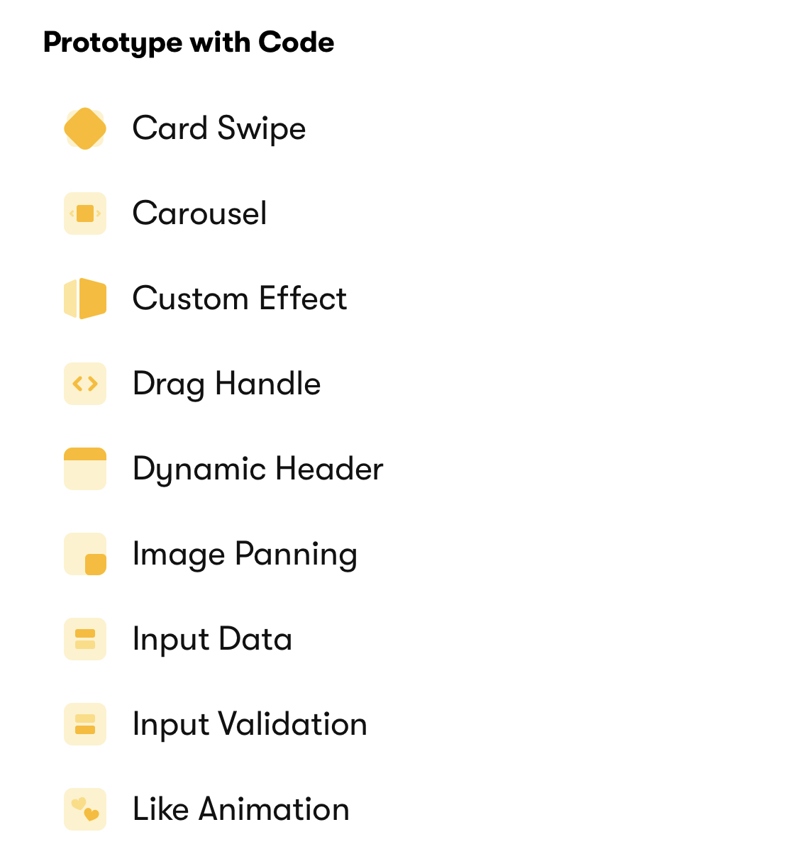
Framer created icons for all of the components/effects you can create in their software. That must have been fun/frustrating.
The footer shows another example of a handwriting font used to highlight new features/areas.