The first thing that jumps out at me is that Dovetail has chosen to use the word "Menu" to open their menu, instead of showing the hamburger menu icon. I love them for it.
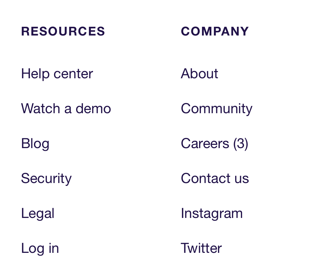
The Careers link in the footer shows the number of open positions in brackets. Dovetail doesn't want to waste your time if they've got no open positions.
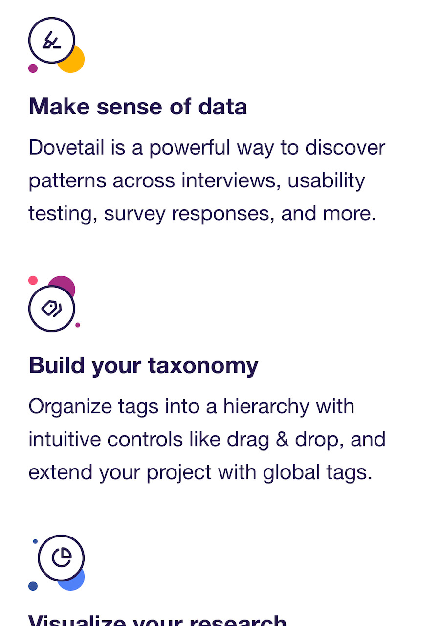
There's a heavy illustration/doodling theme running through the website. The bold colours in the hero illustration are repeated in the icons below, making it all feel like it belongs together with very little extra effort. This is a way to bring in generic icons and make them speak your brand language.

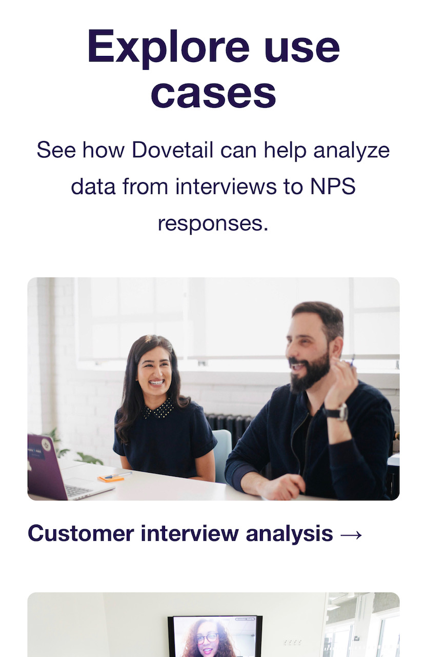
As soon as Dovetail wants to talk to you about real life use cases, though, they switch over to using photographs of people working, rather than illustrations and doodles.
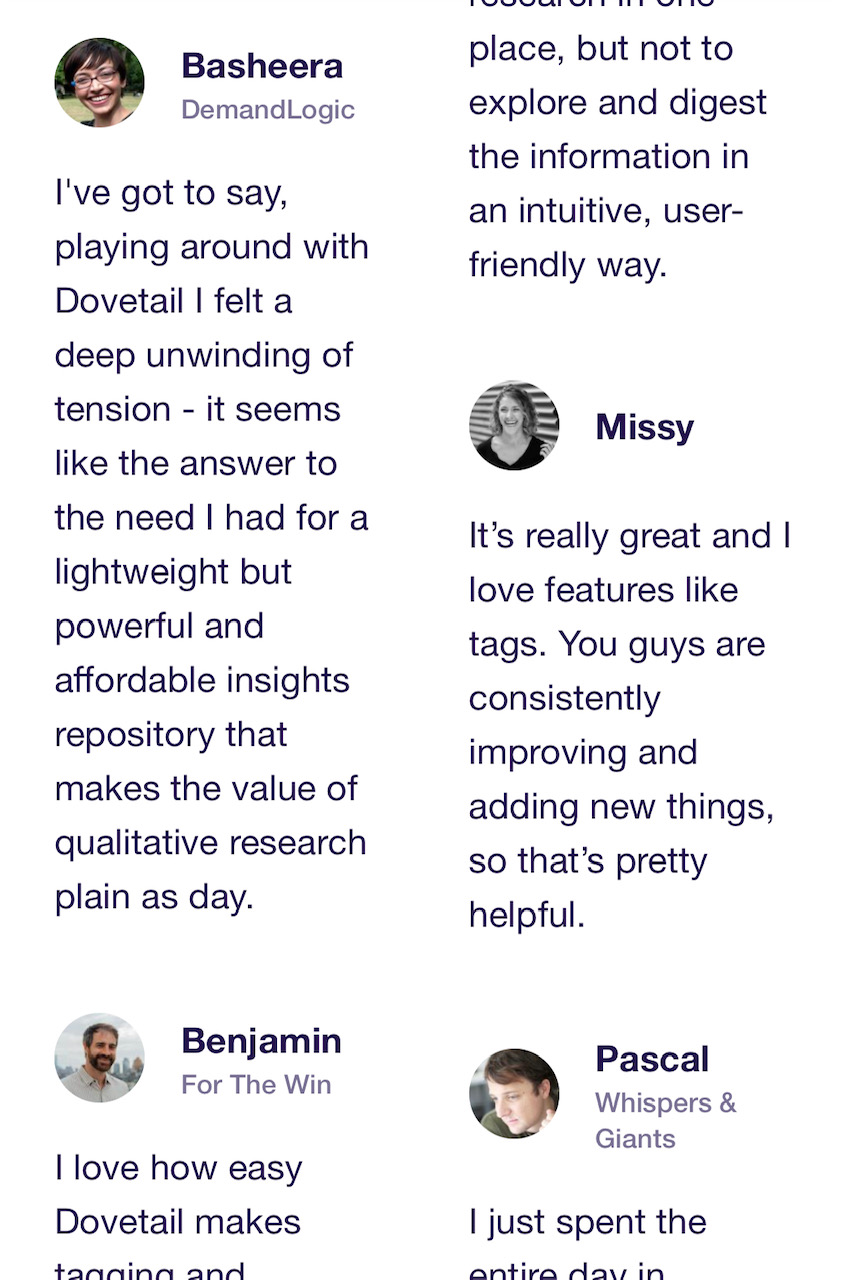
This could be a result of the responsive page template they're using, but the testimonials are in this staggered two column layout. Most websites show them full width, one after the other. Having them presented differently like this grabs your attention.
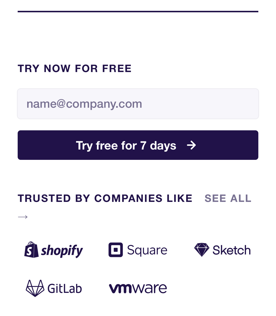
Putting a call to action at the bottom of every page is nothing new, but Dovetail makes sure ot include some social proof with it, every time. Twice the convincin', hardly any bigger.
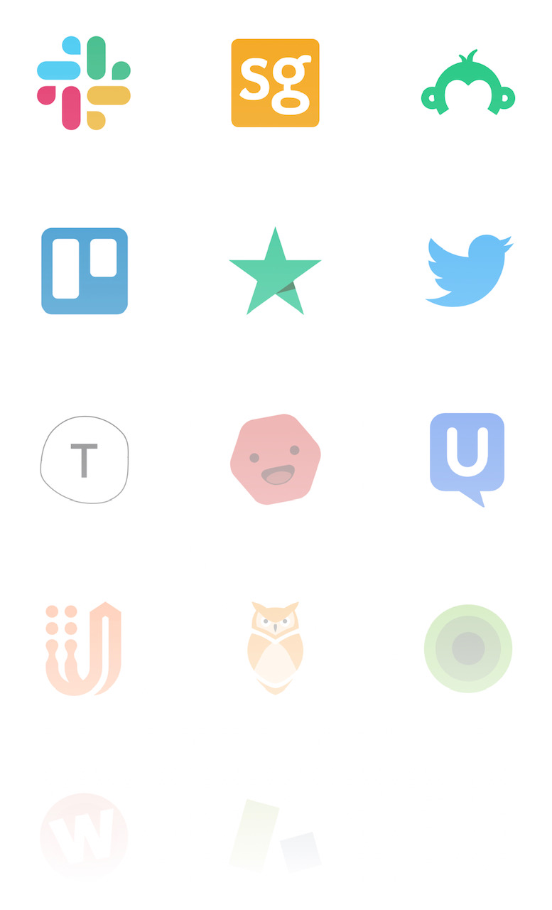
The list of integrations is so long that they fade away into white. Even if the list of integrations is actually no longer than this, it still gives a good impression.
This section of the home page talks about a new feature - Transcriptions and video highlights. It's got a purple background to make it stand out even more against the otherwise white page.
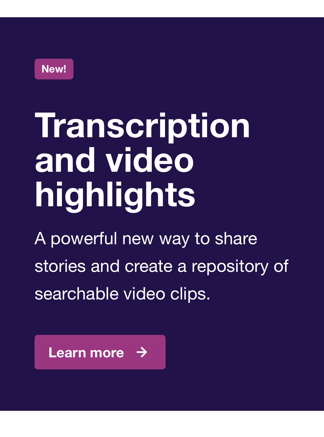
When you click through to the "Transcriptions and video highlights" page from the section above, the whole page has a purple background. This is different from the rest of the site, which has a white background. They're hammering home that this new feature is new, and different. The purple theme makes it feel like the feature has been given its own sub-branding, with very little effort.
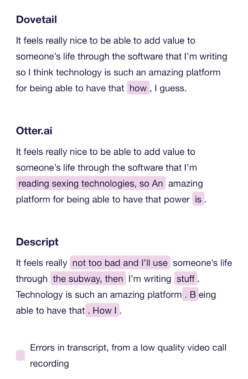
This section shows the difference between Dovetail and their competitors. The same audio clip was run through each service, and the words were wrongly transcribed are highlighted. This is a clever way to show the obvious difference between three audio services.
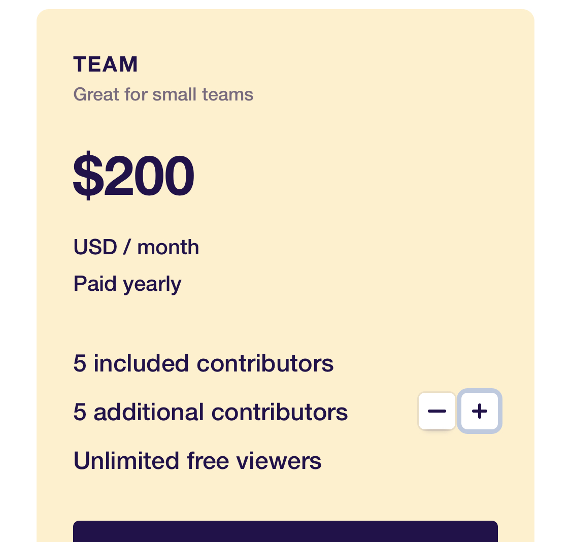
Often companies tried to de-emphasise whether the prices are monthly or annual. Dovetail have put it front and centre, which I appreciate.
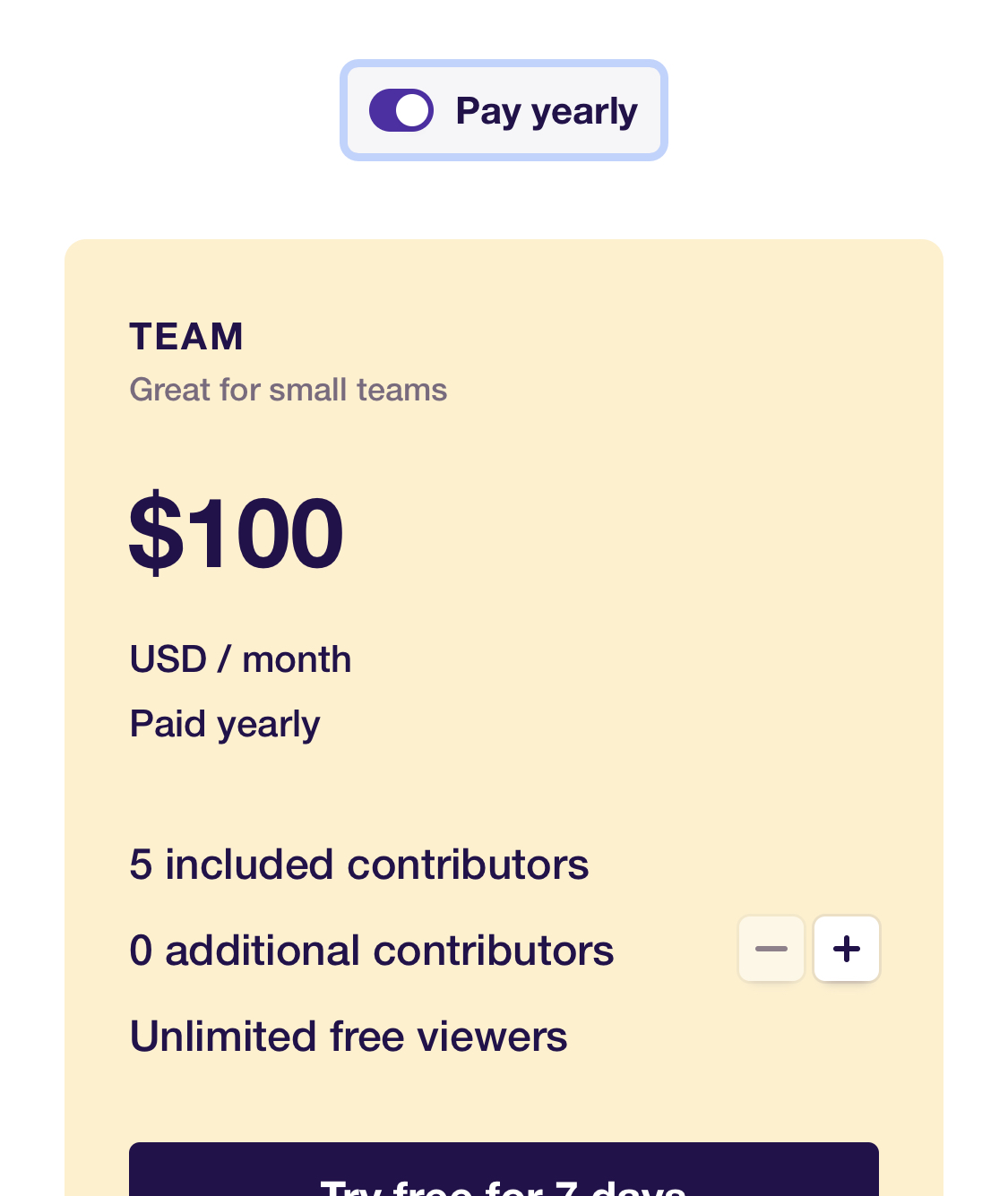
Each plan offers a custom number of contributors. The site handles this by putting plus/minus buttons right on the pricing comparison cards, so the user can immediately see how the prices change when they add more contributors.
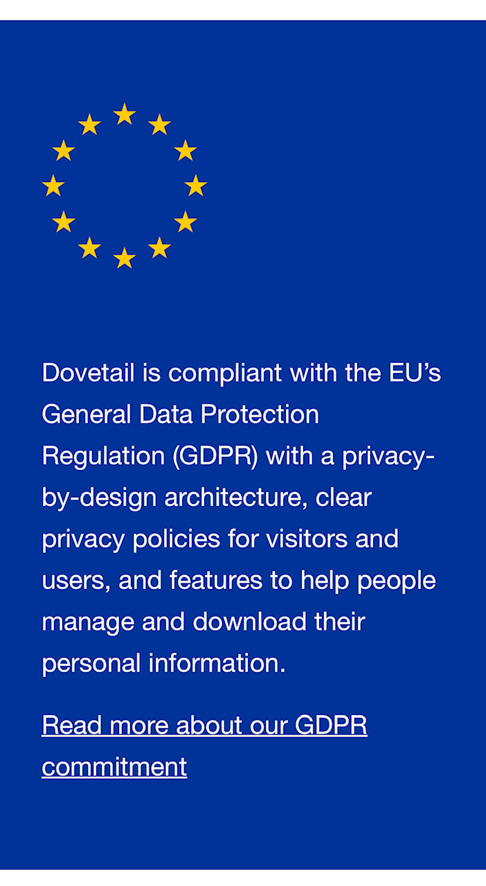
This section uses the background colour of the European Union flag as its background. Putting the text inside that colour gives you the impression that Dovetail really does care about GDPR laws - they're literally inside the EU flag.