This is in a different format to my other Attention to Detail posts. It was moved from my blog, but I think it fits.
BuzzFeed might be one of the most impressive sites on the internet, and partly it's down to their "See what sticks" attitude. Nowhere is this more evident than their home page, which is full to bursting with content, and formatted to encourage curious browsing.
I'll show you what I mean. Here's the BuzzFeed home page:
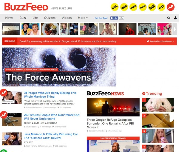
It's quite busy, and it's hard to know where BuzzFeed wants you to look (Aside from the largest image, which I suspect is reserved for their latest "big" story). But that's the point! They don't want you to look anywhere, specifically. They want you to get overwhelmed by juicy content and start randomly clicking on it.
The more BuzzFeed directs you to one part or another of its website, the more you ignore any other part, and the less they can experiment with finding out what people will curiously click on.
What amazes me most of all is the various formats BuzzFeed will present you content in, on the home page. First, navigation:

"News", "Buzz", and "Life" are links to categories of posts.

Each of these buttons is also a link to a category of posts. Notice that neither these "buttons" nor the text links in the previous screenshot make any real effort to explain to the visitor WHAT will be found when they click on them. If I designed navigation like this, people would frown at me! But BuzzFeed is relying on curiosity and exploration, and so they make everything a little bit confusing.
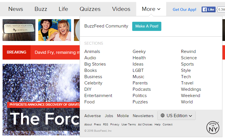
The main menu offers more options than you can shake a stick at, and might be the most normal thing about the site:
After the main navigation, we get this carousel:

None of these photos have any accompanying text. Once you hover over them, you get a blue overlay with a description/caption, but the photos are here purely to grab your attention. More interestingly, when you click the arrow button on the far right, the carousel doesn't move along one photo. Instead, it moves the whole carousel one section over - you only see one photo from the last set to orient yourself.
This is undoubtedly intentional - every time you click you see not one but eight more photos that might take your fancy.
Next are the "Breaking" banner and the "big story" banner - no doubt reserved for stories that Buzzfeed are not the only news sites to publish, and therefore that they want to drive more attention to. If everyone starts going to BuzzFeed for their regular news, after all, they've pretty much got the internet sewn up.
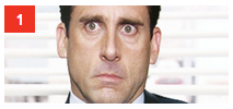
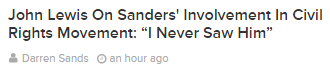
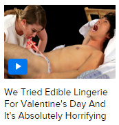
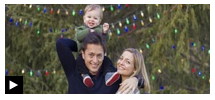
After this point, we get the "regular content", and I just want to demonstrate the various ways the site presents this content:
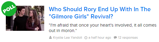
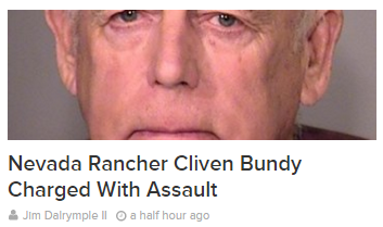
Buzzfeed are all over the shop (Though, intentionally). Compare this with the BBC or BBC News websites, where almost every link to more content follows the same format: An optional photo, a title, the time it was posted, and the section it was posted in.
Finally, the long "main" list of content on the left side of the BuzzFeed home page is an infinite list, meaning visitors will never run out of content.
As I've said, all of this contributes to one thing: Curious exploration. I don't read BuzzFeed more than once a month, nor do I intentionally seek it out of particularly value their content, but EVERY TIME I visit their site, I find something that grabs my attention and pulls me in. If they haven't perfected attention-grabbing, they're certainly best-in-class.