Basecamp's website is lovingly simple, but a close look reveals a mountain of attention to detail.
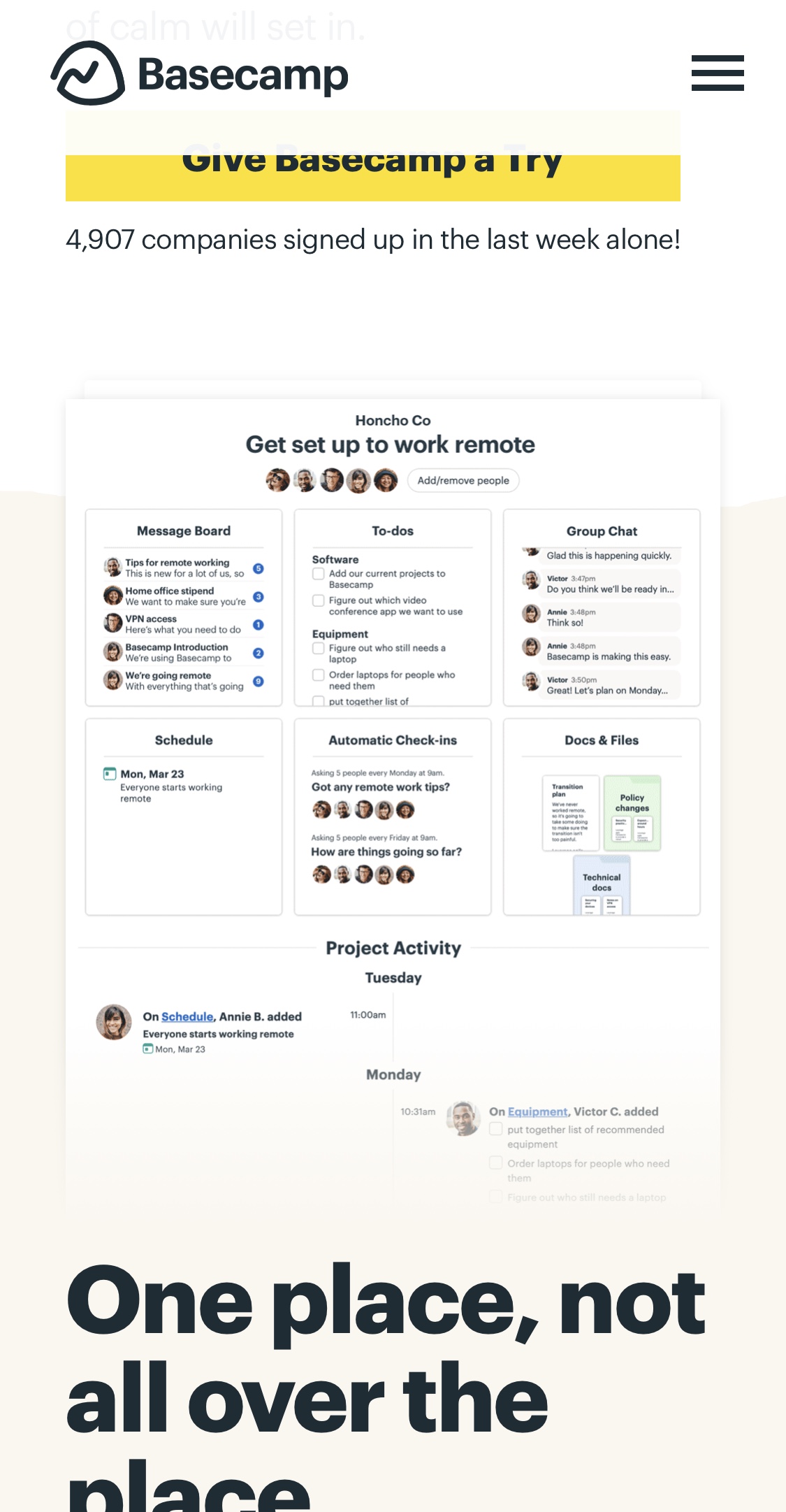
Let's start with the home page. Unlike some other pages on the site, it's almost all text - there's only one image. It's the first page people land on, and it's full of calls to action, convincing copy, and social proof. Even when you're looking at the only image on the page, you can see social proof above it, and a big benefit below it. No matter where you look, you're seeing reasons to sign up.
The background colour transitions are rough, not straight. They look like mountain ranges, which are on-brand.
Even the more visible dividers keep the motif going, though more subtly. These also add some fun to the page, which is on-brand for Basecamp.
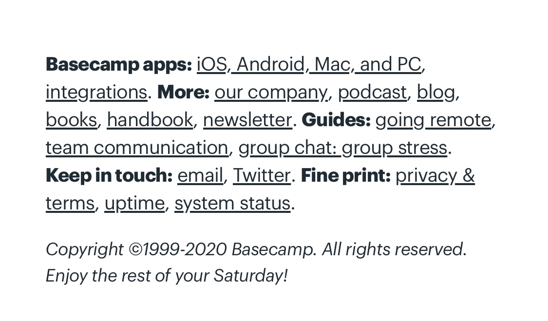
The footer is compact, but still full of useful links. The main reason I'm showing this, though, is the small touch at the bottom: They've made the copyright message more fun by asking you to enjoy the rest of whichever day of the week it is at that moment.
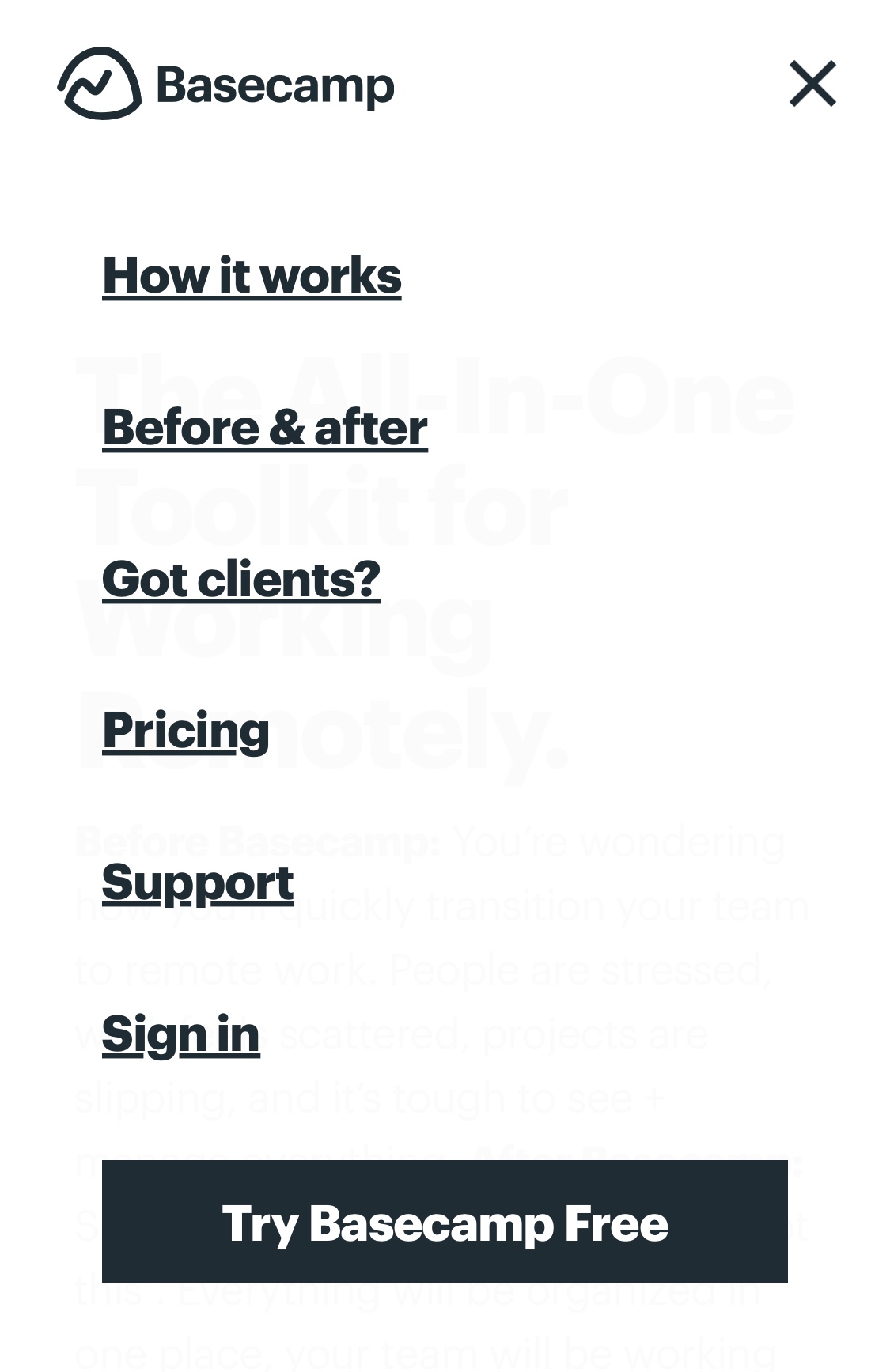
The menu slides over the page, but the background is subtly transparent to keep it grounded in the page you were on.
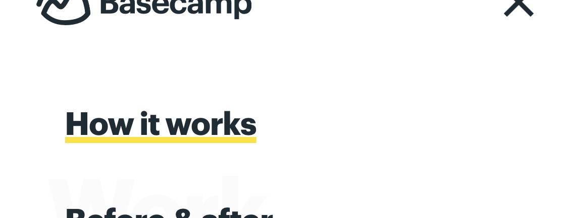
When you tap a link, the underline turns yellow. This lets you know that the website has heard your request, even if the next page takes a while to load. Immediate visual feedback.
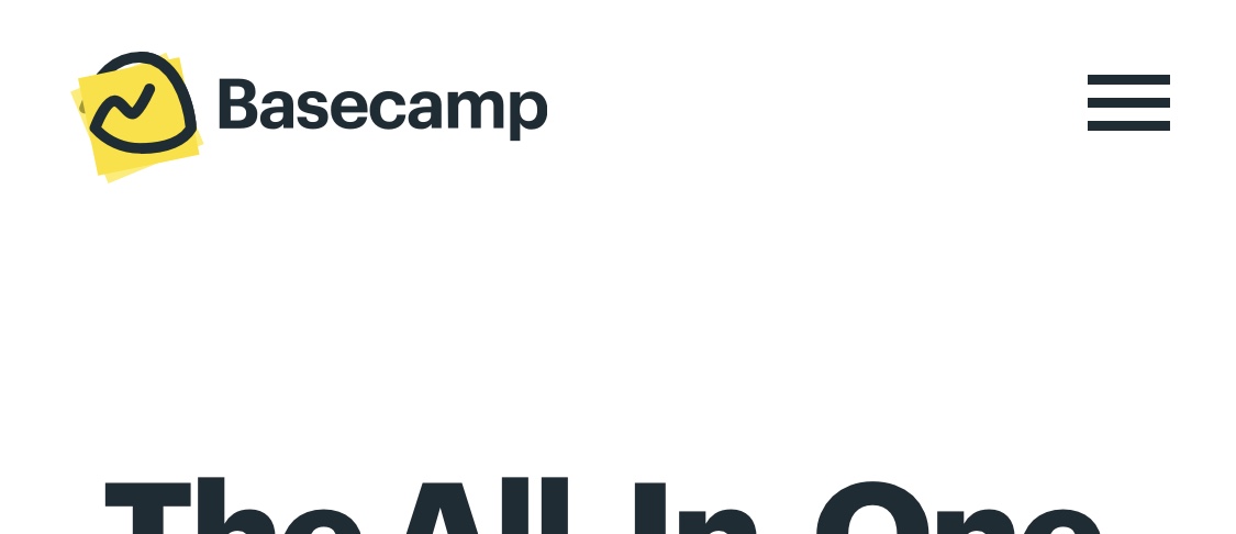
This pattern also happens when you tap the logo in the top left, but there's no underline to colour. Instead, yellow sticky notes appear in the logo, with the logo acting as a paper clip. If you're on a fast connection, this doesn't appear for long. Impressive attention to detail, especially since they couldn't assume people would even notice it.
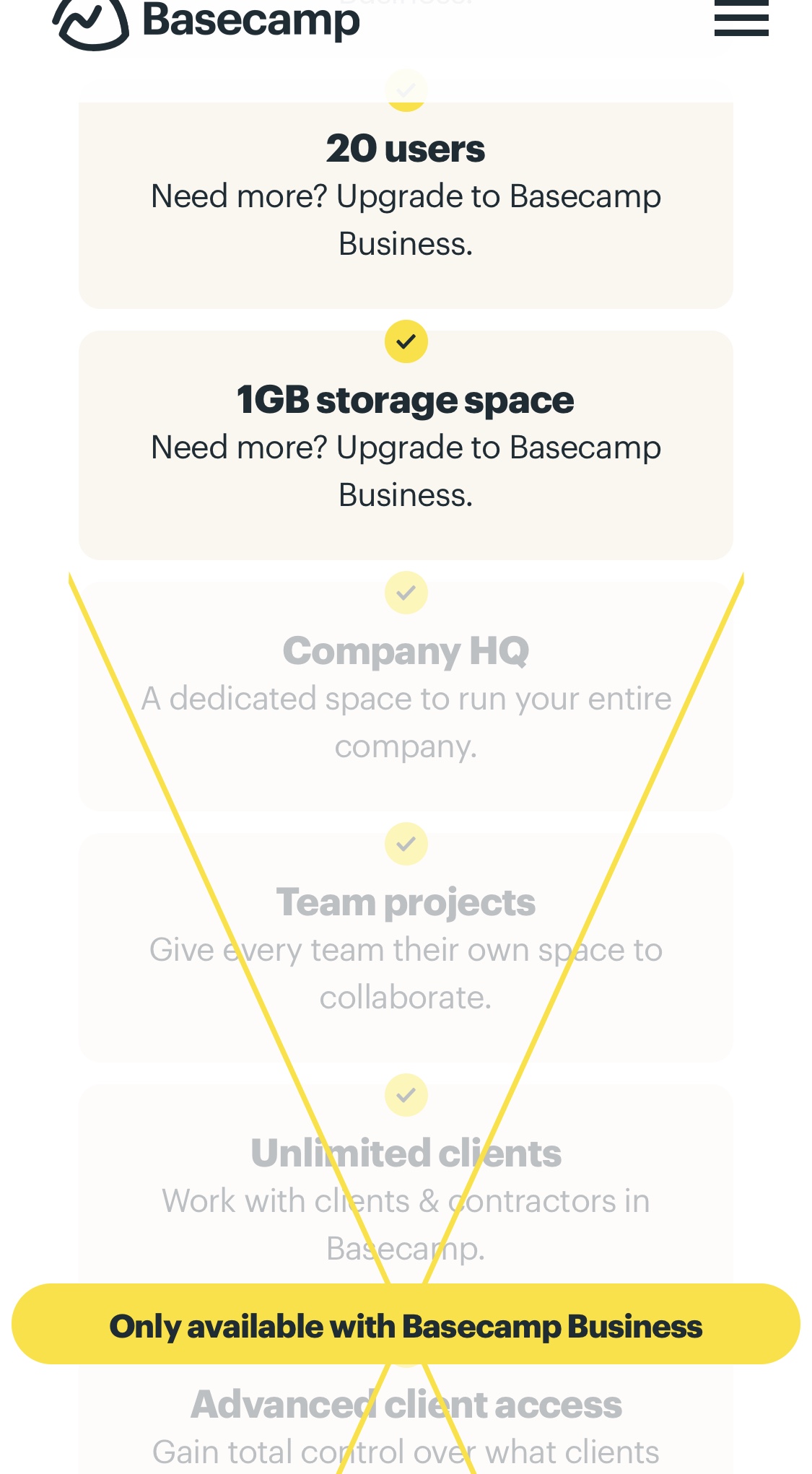
The pricing page shows you which features are available for the Business and Personal plans. The unavailable features are crossed out in yellow, with a label. This pattern works well on mobile - even if the label is off the screen, the yellow cross lines draw your attention downwards. It also scales no matter what length the list of features is, so it's future-proof.
The "Before & After" page has a night and day theme, made clear by the page title. The "Before switching" section has a black background, representing night, and the horrible time in your life before you signed up for Basecamp.
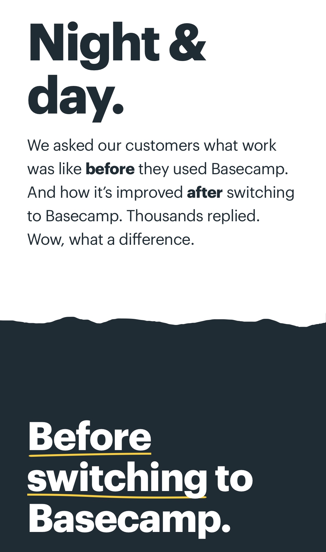
The "After switching" section has a white background, representing day.
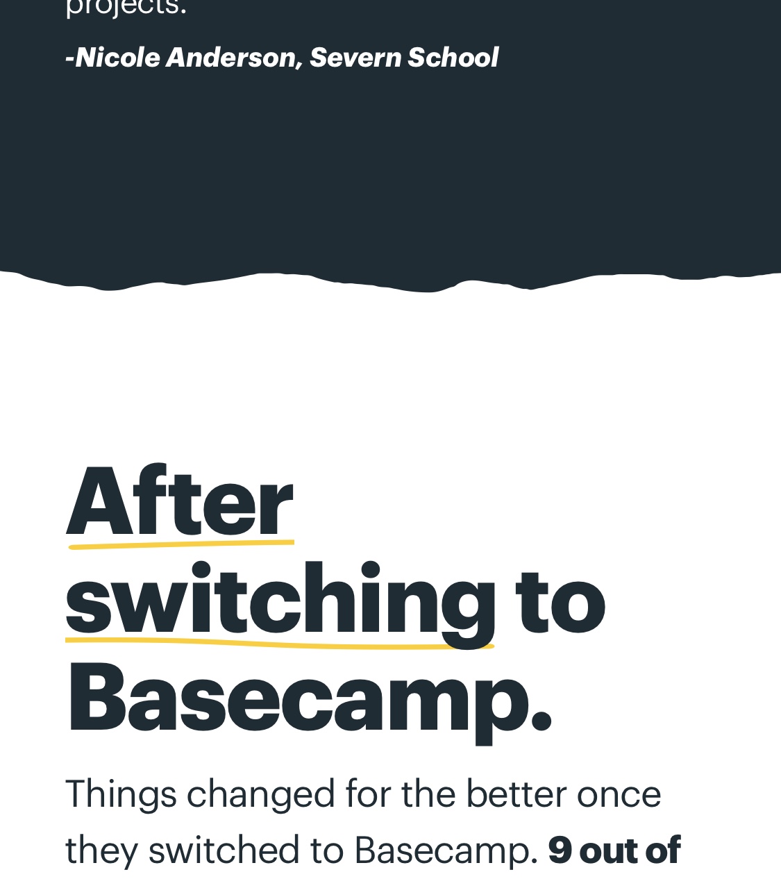
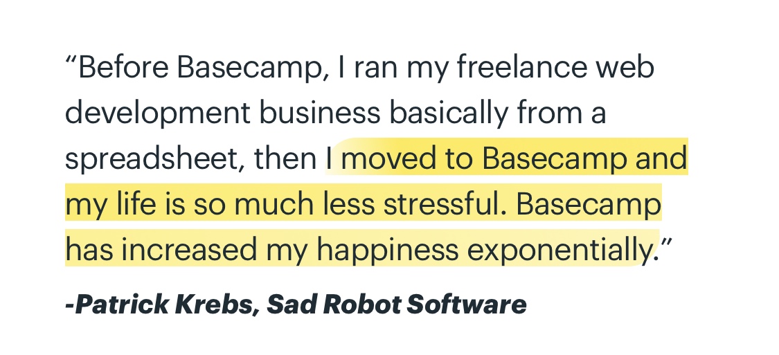
Highlighted text is styled as if they've used a real highlighter pen. There's a rounded left edge, where the pen first touched the page. The colour starts strong, where you've pressed down firmly, and fades away towards the end where you're pressing less firmly.