Airtable are competing against some big names that have been established for a long time. It's not surprise they put a lot of thought into their design.
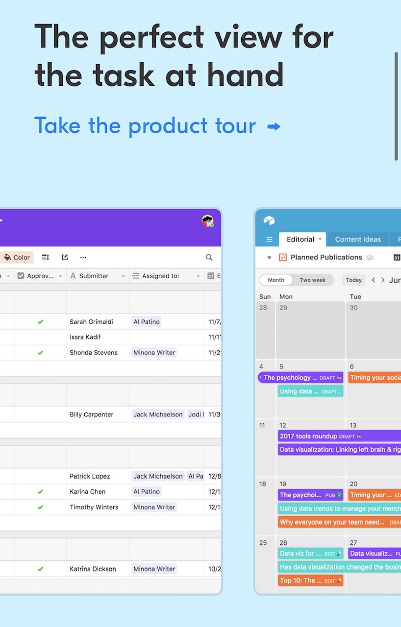
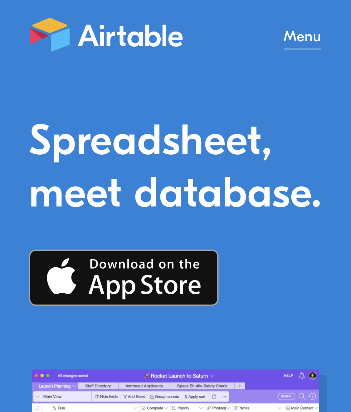
On the home page, they do something I like when there are detailed screenshots on a small screen: They don't try to fit them to the screen width. Instead, they let them breathe a bit more and spill off the edge of the screen. If you want to see more detail you can swipe them into view, which is engaging.
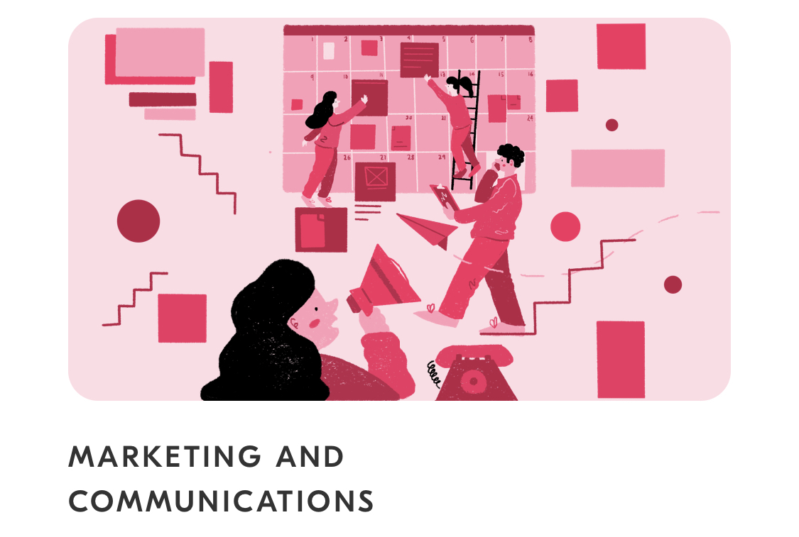
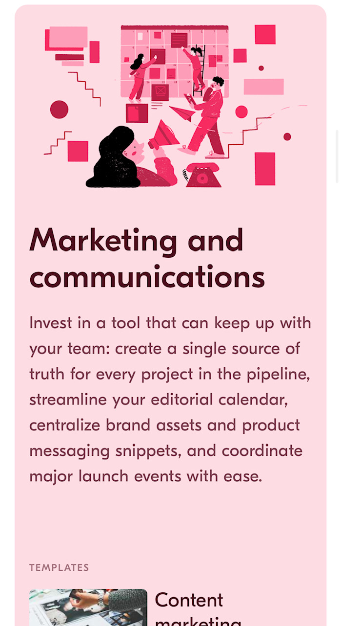
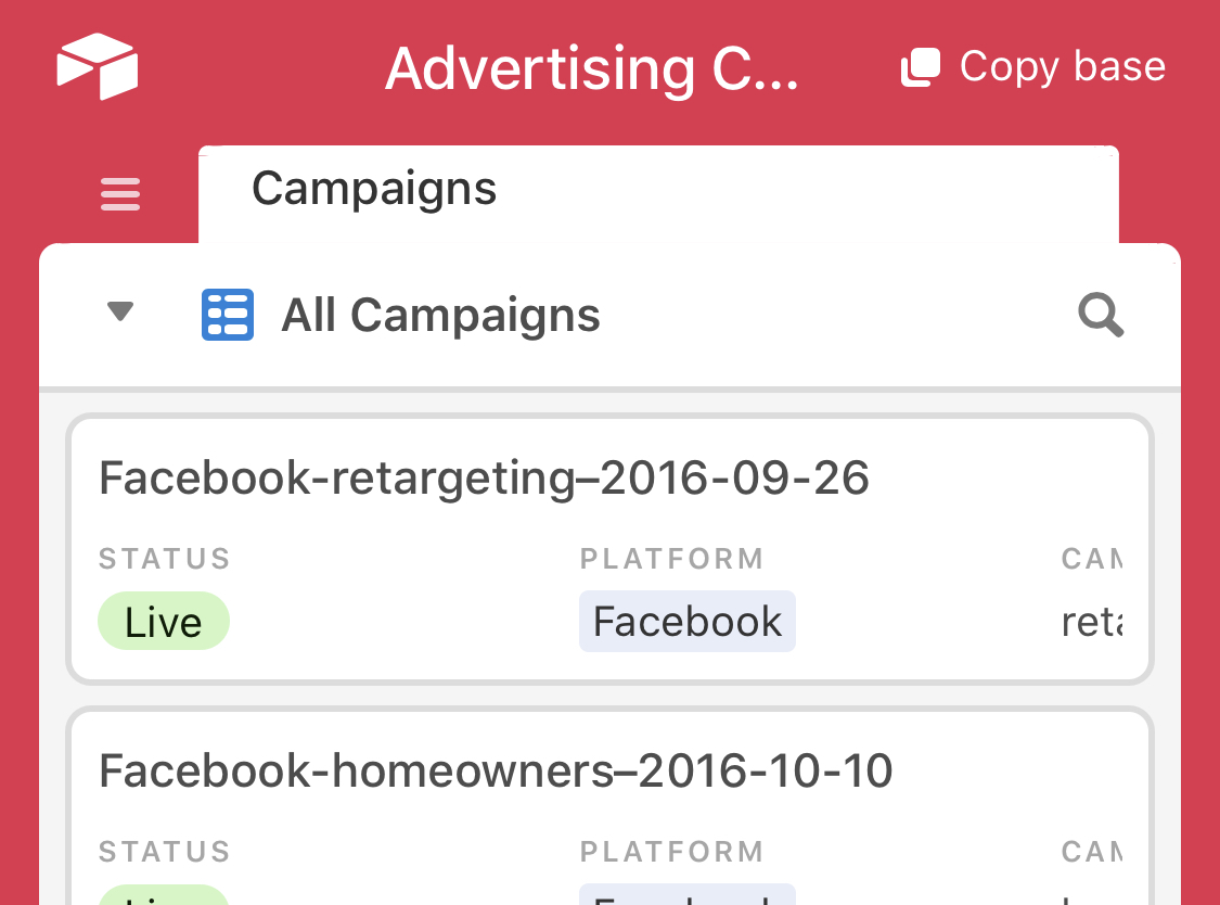
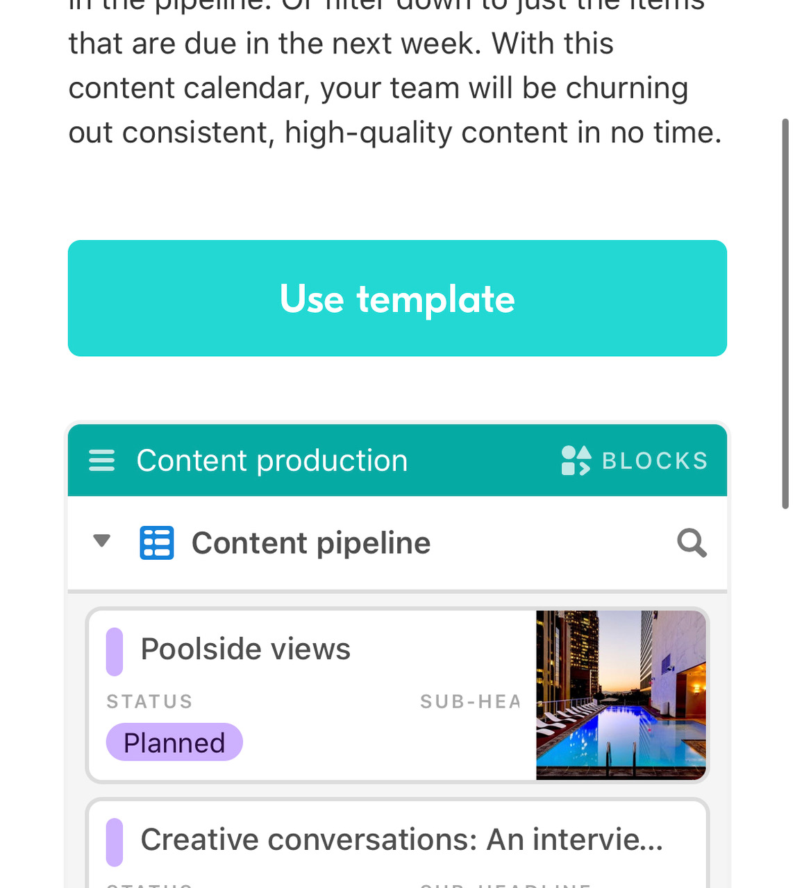
Airtable have put a lot of thought into colour and use case. It seems like each use case for the product is assigned a colour. Here, for example, the Marketing and Communication illustration on the home page is red. When you tap on it, you are taken to a red card with example templates for Marketing and Communication use cases. Tap through on one of those examples and the preview of the Airtable template is also coloured red.
Here's another example. An orange icon in the top left of the exampel use case leads to an orange-coloured call to action and Airtable example on the next page.
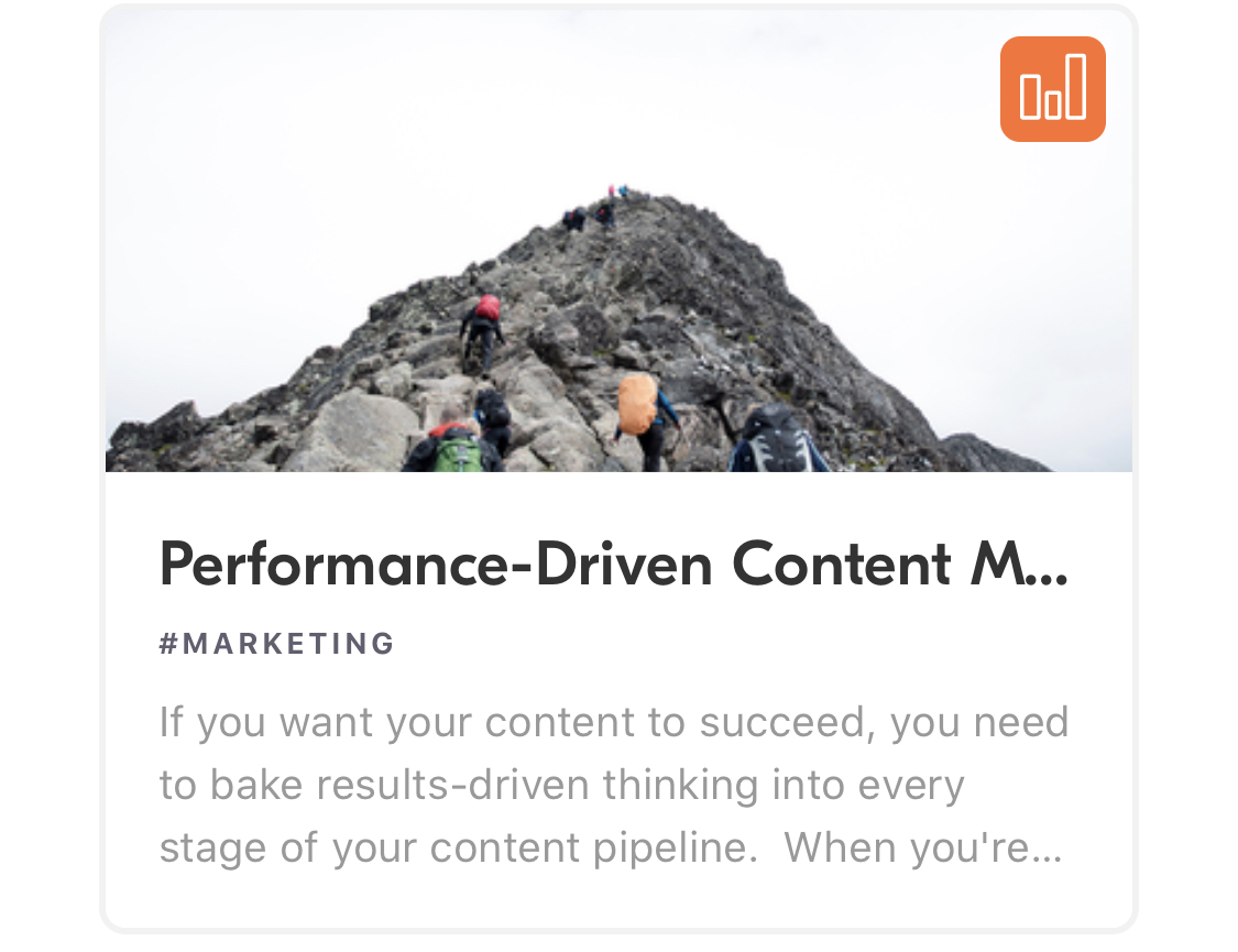
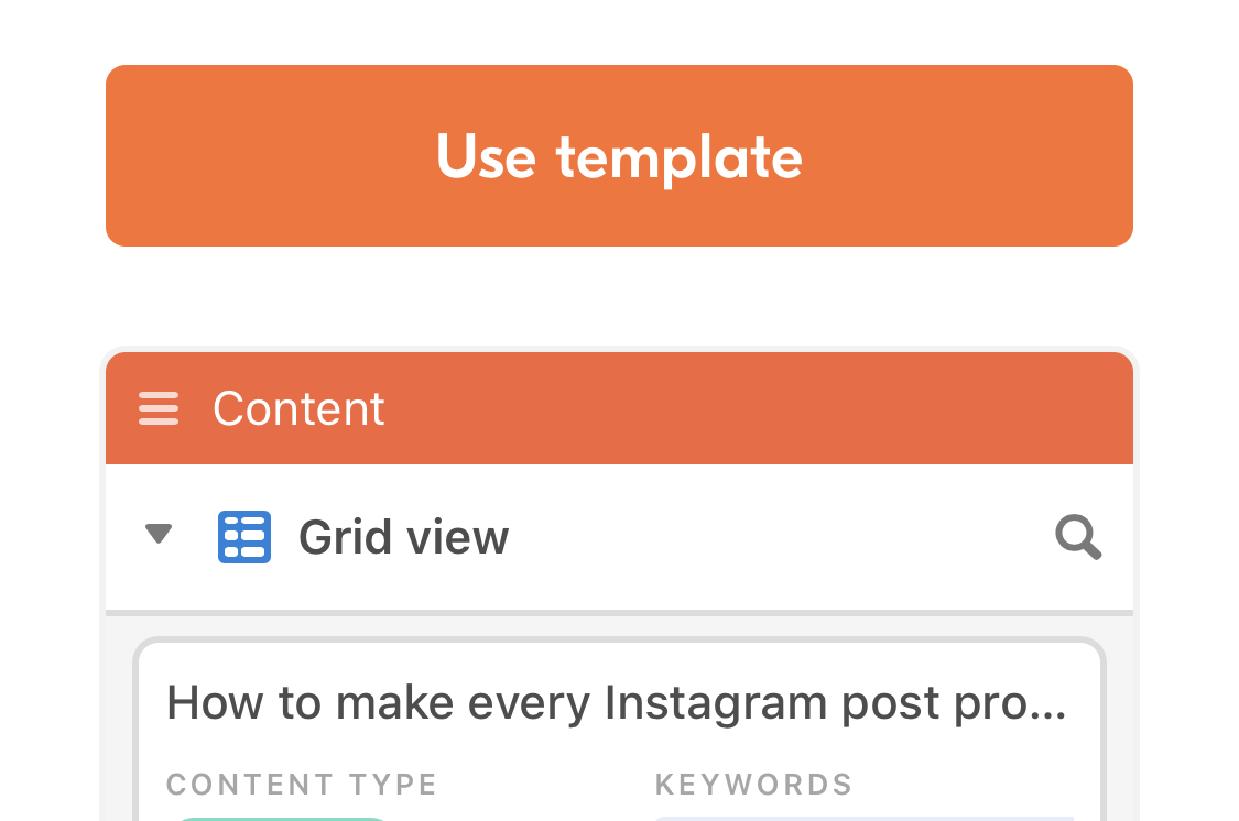
There are two slightly different designs for the call to action on the home page. Of course, this could be a mistake, but I like to believe it's so that the varied messages are more likely to draw people in.


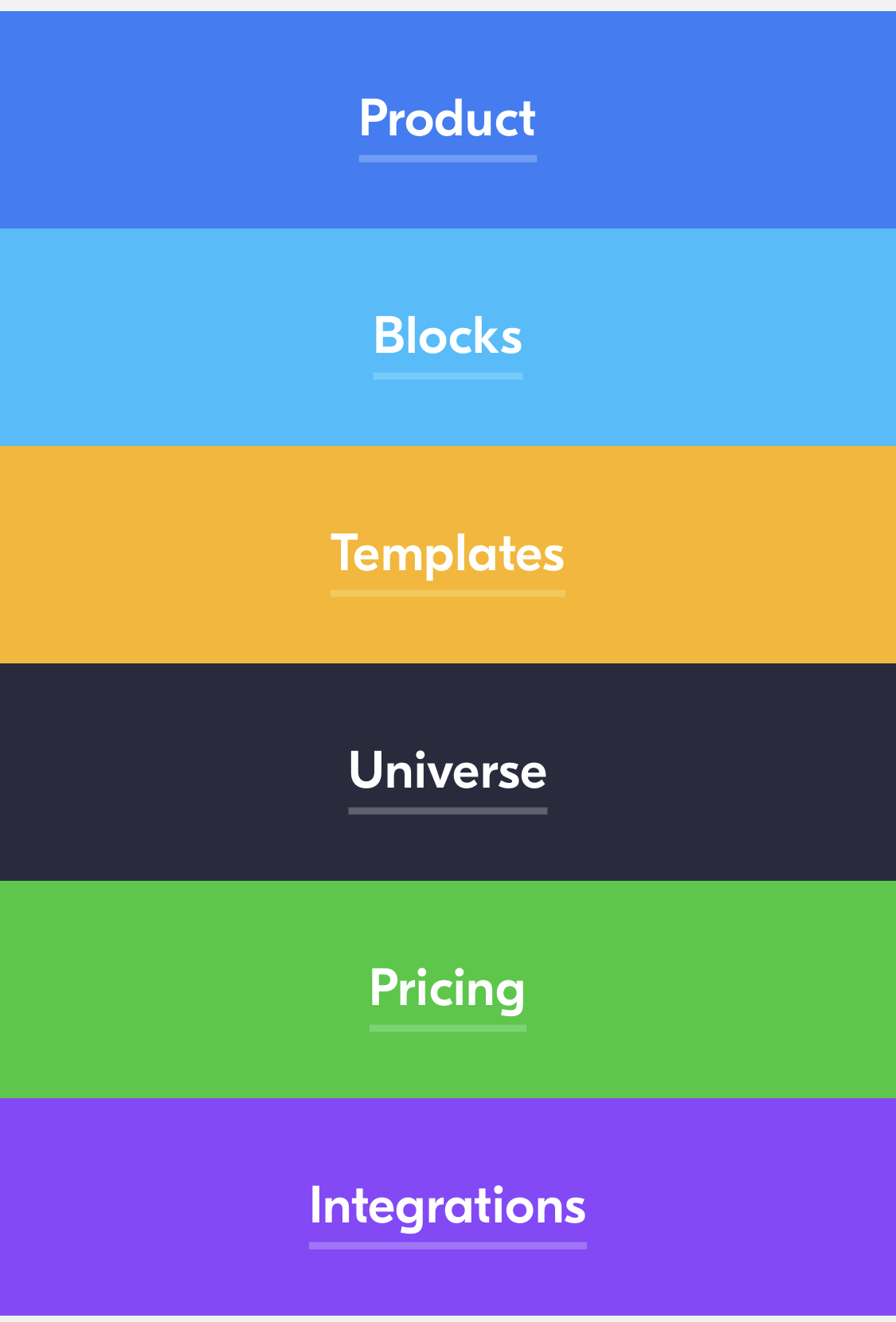
When you open the main menu, striking colours are used for the navigation item backgrounds. This is another example of Airtable's impressive use of colour for branding/themes. If you tap on the darker blue Product link, you're taken to a Product page with the same blue used as the background.
As an aside, Airtable don't often use drop shadows, but here's one. Notice that the corners are rounded, and there's no blur applied. Like the brand in general, the shadows are friendly and clean.
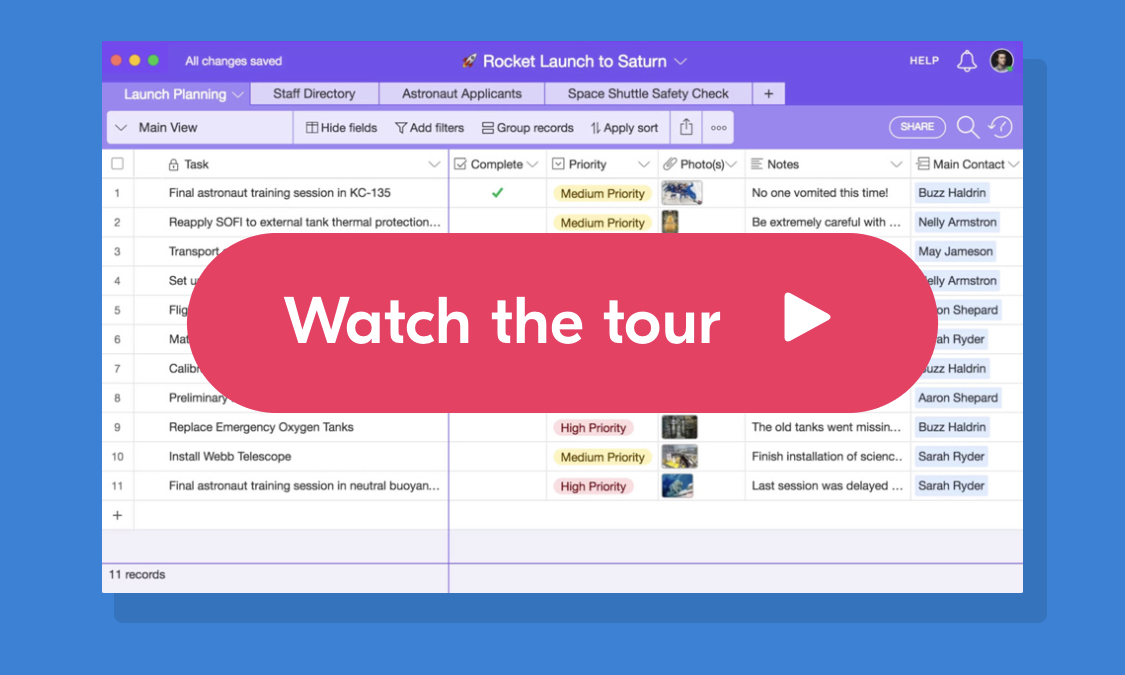
If you tap the "Universe" link in the menu, the same colour background trick as before is used. This time, though, they've put stars floating past in the background to help the theme.

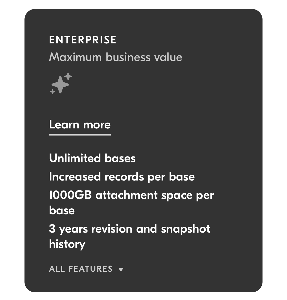
More examples of colour theming here. The Enterprise level of subscription uses a dark grey background. When you tap through to learn more, you're taken to the Enterprise landing page. This has the same dark grey background, but unlike the rest of the colour-themed pages, the background colour extends all the way to the footer. Clearly Airtable wants this page to feel like it's exclusive, which it is.
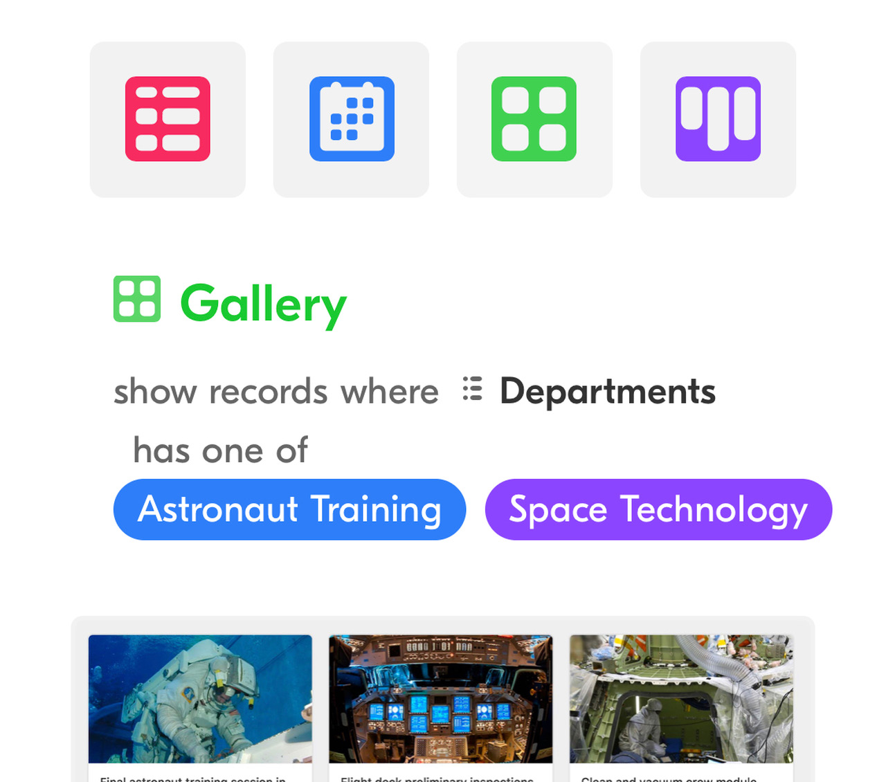
On the home page, there are examples showing how Airtable will let you filter tables. This hints at the power of the platform, demonstrates its use, and shows you in the language that the platform will be using.
More impressive than that, since Airtable can be embedded, the example templates they show you are fully-working Airtable bases, so you can jump right into it without needing to sign up.
Finally, I like that Airtable is using the word "Menu" as their menu button, rather than the less-easily-understood hamburger icon.
